This post was written by Tina Boe.
After three certifications, eight weeks, and 31 modules and I have made it through Data Coach’s Zero to Tableau Associate course! When I started all of this I had never used Tableau before. Now, I have graduated my skills from learning the essentials of Tableau, to the core components, and now I can say I have a strong grasp on the advanced skills of the program.
Catch up on my journey through Foundations and Practitioner certification before we round out the trio with Advanced. Check out my full dashboard here!

Going for Advanced!
This last portion of the Zero to Tableau Associate training program includes 6 lessons. The advanced lessons cover dashboard actions, reference objects, sets, level of detail calculations, maps, and advanced dashboarding tips and tricks. I already saved a few of the most noteworthy tips in my notes for future reference!

Joining The Data
As part of the Advanced certification rubric, you must demonstrate your skills in joining data sets to enhance your analysis of the topic. The challenge with this task was finding a second data set that contained a common field with which I could join the two data sets. I finally found data I could join using the field of “Ward Number” from the original Chicago Crime data. This secondary data set shows the population of each ward of Chicago from the last two censuses. It is also broken by race, which I was excited about as that could add another interesting element to my analysis.

I used Tableau Prep Builder to create the inner join between the two sets. I created an aggregation of the crime data set where I removed fields based off the level of granularity. I learned that when joining data sets, you want to have the same lowest level of detail in the information. For example, I removed “Block” because it shows a more granular level of information than the “Ward” field. I knew I was ready to run the flow when the data was clean, had the right level of granularity, and the extra unused fields were removed.
Scrolly-Telling a Story
As I’ve been learning Tableau, I have spent a bit of time exploring other creators’ visualizations on Tableau Public and I’ve noticed that scrollytelling is a trendy style of data visualization. I wanted to try out this technique with my advanced dashboard, so as I was brainstorming I laid out my ideas in sort of a ladder formation. My dashboard was split into 3 sections, each addressing a leading question that would guide the end-user through the analysis of the data.
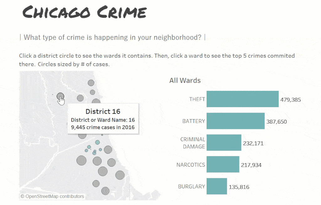
What type of crime is happening in your neighborhood?
This first section contains a map with a set action on each district. When you click the district bubble it expands to show you all of the wards in that district. When a ward is clicked, the corresponding bar chart shifts to show you the top 5 types of crime committed in that area. I chose to start with this break down of the types of crime because I think it is important to have an understanding of what kind of crime is happening around you so that you have more context when looking at when this crime occurs. This viz is followed by a box plot of year over year change in the number of cases of each type of crime. This shows the user which types of crime are on the rise and fall.

When is all this crime happening?
Now that we have established some background knowledge of the type of crime that is occurring we are better prepared to look at the trends in the timing of the crime. I started with the shortest break down of time and built from there. First we see the trend in crimes committed over the course of 24 hours, then we see the trend of when crimes are committed over the 12 months of the year. I utilized text objects adjacent to the visualizations to really guide the user toward the message that I wanted them to receive from viewing my dashboard.

How does crime change throughout the seasons?
Finally, I brought back some of the important analysis on seasonality from my prior two dashboards. I highlighted the fact that more cases occurred during the Summer months by using an emphasis color on Summer and grey on the other 3 seasons. The final viz uses the same color scheme, but in a line chart that shows the overall trend in the number of cases between the years 2001-2018.
Advanced Certified: The End
It took me about 8 weeks, working part time, to make my way through the Zero to Tableau Associate course. The material was challenging at times, but that was when I would turn to my Data Coach for some guidance. After completing this program, I can now say that I have strong skills working with many aspects of data visualization in Tableau such as finding data, data preparation, data analysis, visualization design, and best practices for displaying and posting dashboards. If you are looking for a way to differentiate your skills in data analytics, I would strongly recommend learning how to use Tableau with Data Coach‘s Zero to Tableau Associate course.
Thanks for following along with me through Foundations, Practitioner, and Advanced! You can view my final dashboard here.
Do you have more questions about Tableau? Talk to phData’s expert consultants today and have all your questions answered!


