

There’s a good reason not all of us are comedians. While every one of us is good for a well-timed pun or dad joke every now and then, there probably isn’t an opportunity to make a full-time career out of it. What makes comedy such a niche skill? For starters, it isn’t just about the punchline. Think about your favorite joke or the funniest thing anyone has ever said to you. What made it funny? Was it the punchline, or was it the way the joke was delivered? The crafty story-telling and delivery are often what turns any regular sentence into humor.
Similarly, data analytics isn’t always about finding a specific answer. For example, you may be trying to determine your best-selling product for last month. You could easily accomplish this task in a spreadsheet, but building out a comprehensive sales dashboard in Tableau would probably turn your punchline into a much more well-crafted story. In order to tell these stories effectively using data in Tableau, it’s important to understand the basic principles of dashboard design. In this blog, we’ll cover 5 beginner Tableau dashboard design tips that will help you take your dashboards to the next level.
What is Usability?
You might be thinking, “woah, woah, woah, I thought we were going to talk about Tableau dashboards?” You’re right, we are! But in order to understand the principles of good dashboard design, we need first to understand what usability is and why it’s important. Usability measures how easy a user interface is to interact with. When we break down what that means, we can split our focus into five different categories:
- Learnability
- Efficiency
- Memorability
- Errors
- Satisfaction
While primarily self-explanatory, these components together describe how easy it is for a user to accomplish tasks quickly, without errors, and ultimately come back to use the tool again.
If you’re creating a dashboard for a sales team to interact with and they have to spend several minutes filtering out information that isn’t relevant to them or their sales group, they’re likely to stop using it entirely and find a different way to get what they need.
Utility is described as how functional something is. When we combine the factors of usability and utility, we get the total usefulness of our product. While “if you build it, they will come” might have worked for Kevin Costner, it most definitely won’t work for your shiny new sales dashboard if users can’t find what they need, feel overwhelmed by the view, or it doesn’t answer the questions they came to answer. Thinking proactively about what additional features or insights your users might want is great, so long as the core analysis they are desiring is met first and foremost.
Now that we’ve covered the basic principles of usability, let’s dive into some actionable tips in Tableau.
Dashboard Design Tip #1: Decide What Users Need
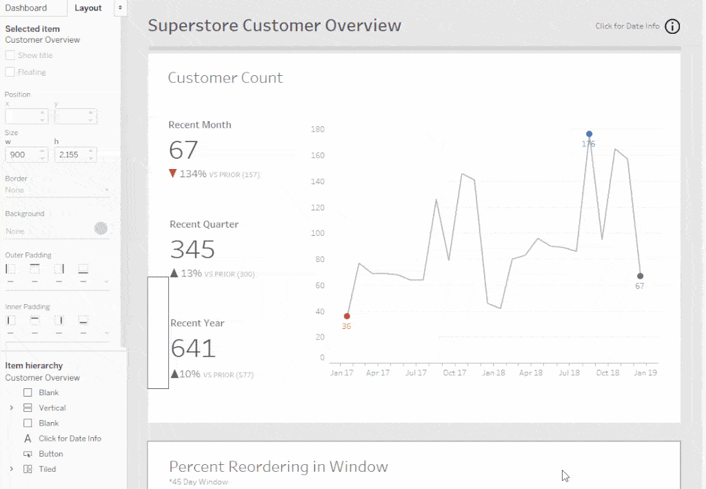
The first step to great dashboard design comes directly from our quick study on usability. Knowing your audience and what analysis they are trying to perform using your dashboard should be the cornerstone of the entire design. If they’re after a sales figure or profit margin, consider highlighting those with KPIs across the top or side of the view so they are clear and easy to find quickly.
A great rule of thumb for any data analysis is to start at a high level of granularity and guide your users down as they explore the data. In Tableau, this can be accomplished several different ways through parameter actions, hierarchies, or by utilizing the viz in tooltip feature seen below. Grouping all of the required metrics onto a single page is more likely to help your users accomplish what they need to quickly, but shouldn’t come at the cost of sufficient white space and spacing.
Dashboard Design Tip #2: Add More Space
One of the quickest ways to practice efficient dashboard design is to simply add more space. Even though it’s a simple change, it can make a huge difference in the overall user experience. Space allows for items to breathe, helps clarify what’s important, and strikes a balance between elements on the page.
A good data visualization increases the speed at which concepts are translated to viewers, so it is important to help guide your users by identifying what ideas are related. Let’s look at these two examples and decide which feels better:


While the first example isn’t exactly cluttered, the second feels cleaner, polished, and doesn’t leave users straining to view any important information or axis labels. When adding space, start with an uncomfortably large amount of space. Then slowly adjust down until it feels right. Pretend like you’re at the eye doctor choosing between option 1 and option 2.
Dashboard Design Tip #3: Utilize Contrast Effectively
Adding contrast to your dashboard can come in many different forms. Contrast can be present in the form of color, size, shape, or location. Knowing when and when not to use each of these can be the difference between having an extremely distracting view and one that gives the user what they need with little left to interpretation. Take this first example of utilizing color to guide analysis.

Immediately, the blue dots are going to draw the attention of our users. But what happens when we add a second color?

In this instance, users will likely be immediately attracted to the dark blue dots. Changing the colors of the dots every so slightly can heavily impact where your viewers’ eyes will go when looking at your dashboard. Always keep in mind tip #1 when adding or emphasizing points with color, and draw users to what they’re trying to find first.
Additionally, color can be used to quickly discern a positive or negative outcome. Things like green to red or blue to red diverging color palettes can help quickly identify a desirable or undesirable outcome in our data. Add size to that same picture, and now you’re telling an even more compelling story by representing the magnitude of the outcome.

Dashboard Design Tip #4: Find Lines
While there are certainly use cases for floating objects in Tableau, it’s important to provide structure and clear paths that guide users on how to analyze your dashboard. Let’s look at some examples of different alignment styles.


At first glance, the first example doesn’t seem too bad right? Then look at option #2. The second example lines up all of our KPIs, providing one hard line to follow all the way from the top down. By contrast, option #1 breaks up the flow ten different times!

While it may be tempting to center titles and large text, always consider built-in lines that exist in your dashboard design. Use axes from other visuals or graph lines to help look for the lines and guide readers through your content.
Pro Tip: Create a floating ruler. Sometimes adding the same number of padding on different dashboard elements does not mean they line up. Use a floating blank dashboard element with a border to help measure space and line up content.
Dashboard Design Tip #5: Add Instructions
The success of your dashboard ultimately won’t be measured on how pretty you think it is or how much time you spent aligning visuals or creating that slick circular sankey diagram.
Ultimately, the success will depend on end-user experience. Some of your users may work inside of Tableau every single day, and others may have their first experience in your dashboard. Regardless, if the user doesn’t understand how to consume or interact with the content, the information you’re trying to represent will fall flat.
Adding components that provide context to the data being shown, instructions on how to filter or slice the data, and even key insights to take away can all be provided via instructions. With a few clicks and simple instructions, we can set a clear path for the end-user to interact with the dashboard.
Closing
Like any good joke, data analysis is all about telling a story versus just giving someone a punchline. To do this effectively, there are several best practices that should be followed. Maintaining the persona of your end-users and the analysis they are trying to do should always come first, with our other design-centric tips coming second. Ideally, each tip will iterate on the previous one, making your story that much more compelling with each step.
Becoming an effective storyteller with data doesn’t happen overnight, and reinforcing skills you learn through practicing with different users and use cases will be crucial to go from basic data analysis to Tableau Visionary. The goal shouldn’t be mastery, but rather progress. Here at phData, we’re passionate about dashboard design and helping clients harness the potential of their data.
If you’re looking to inject expertise into your data visualization projects, reach out to us today!
FAQs
Getting started with the design process with a user or group can sometimes be intimidating. Even the best of us can struggle with communicating conceptual design ideas to an end user who maybe has never interacted with Tableau before. We often resort to describing putting big numbers across the top of the page, and maybe a few flashy bar charts showing distributions among categories. Regardless, there are a few great ways to create a simple and effective prototype for your users. In this blog, check out our top 5 mediums for communicating dashboard prototypes in a professional manner along with their associated pros and cons!
If you’re building a dashboard for a specific customer or organization, chances are you’d like to adopt a formal color palette or custom shapes and fonts into your Tableau workbook. While it may not be extremely obvious how to accomplish this task within Tableau desktop, you can actually edit the preferences file in the location on your computer where Tableau Desktop is installed. Be sure to have your shape files and hex color codes handy, and then head over to this post for step by step instructions to take your dashboard personalization to the next level!
This post was originally written by Katrina Johnson.


