

Although my day to day revolves around delivering analytics solutions to clients with Tableau, between the acquisition by Salesforce and some personal curiosity, I wanted to branch out and try to recreate a viz of mine in Power BI. I have had other jobs heavy in data visualization tools such as Spotfire and OBIEE, but I had never used Power BI before. I decided the best way to start out would be by creating a viz that I had already made in Tableau to see how close I could get my PowerBI recreation.

Getting Started
To begin this project, I started by downloading PowerBI (free) and going through all of their free online training. It is kind of amazing that their Desktop version is free with a Windows login. This kind of accessibility compares favorably to Tableau and their Tableau Public platform. After getting a feel for the general layout I got started on recreating my viz.

Importing Data
When you open up the Power BI screen you will notice that, unlike Tableau, it opens up directly to a worksheet like screen (sorry Power BI users, I will be using Tableau as my baseline here). From this screen you will be able to connect to your various data sources through the Get Data button in the Home ribbon at the top. You are able to look at the data tables you’ve imported using the button circled in red (below).

First Impressions
Let’s start where all good things in data viz start, the Show Me charts. There are definitely a good array of chart types here, including some that don’t come as standard in Tableau. I did find that Power BI’s charts are far less flexible so if you want to make a chart type that is not in Show Me (the Power BI equivalent) then you click on the three dots at the bottom and download from a marketplace where developers make different chart types available.

One big difference that I noticed while developing in Power BI is that there are no dashboard containers. Every tile is floating and its position on the dashboard can be controlled with the x and y position numbers in the Power BI version of the Marks Card. See below in the inset picture of the paint roller where you can adjust everything in the viz including background color, titles and borders.

For titles and other text, the text box function is in the toolbar in the Home ribbon.

Building the Running Total
To build the running total of HRs hit by player I first clicked the line chart in the Show Me area of Power BI which put a line chart on my dashboard. I then placed the Age @ HR field in the Axis area, which controls the x-axis, and then I dragged the Player field to the Values area, which is the y-axis. This field defaults to Count of Players.
In order to get a running count of the home runs (aka, running count of players) I right clicked on the Count of Players field and selected New Quick Measure at the very bottom of the pop-up. The screen that then pops up gives you a variety of calcs to choose from to apply to your field. This is very similar to the Quick Table Calculations option in Tableau. I scrolled down until I found the Running Total calculation.

Building the Running Total
I then went into the paint roller section of the worksheet pane and was able to edit what header titles and the axis units. I dragged the Player field to color and set the Big Three as red then everyone else gray. I was not able to group the players together to make this easier. If anyone knows how to Group in Power BI let me know!

Building the Avg by Age Comparison
In my Tableau version, I have a chart (below) showing the average amount of HRs by the Big Three vs everyone else at different ages. Unfortunately, I was not able to find a chart type in the Power BI online directory that let me replicate this.

I did, however, create a line chart from Count of Player in the Values field and Year, Month, Day in the Axis field that allowed me to see when the members of the 500 HR Club hit the most home runs from a historical perspective.
This quick and rudimentary viz type was very easy and straightforward in Power BI. The simplicity of building a chart was definitely a bonus of this visualization software.

Building the Small Multiple
Luckily, the Power BI online repository had a small multiples chart type that I was able to download and use for this dashboard element. The chart is a line chart instead of bars (and I don’t think you can change this, please correct me if I’m wrong), but I made it work.
I dragged the Player to the Small Multiple value so that the chart broke out my line charts by the player names, then added Age @ HR to Axis and Count of Player to Values. I tried to get the chart to have horizontal row banding like in my original, but I believe this chart type in Power BI only let me do vertical banding (not interested).
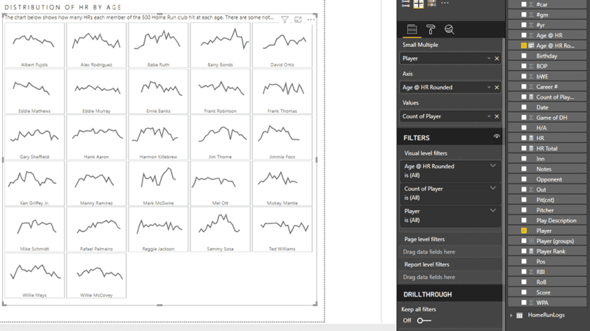
From a high level, ‘does this fulfill my utmost basic requirements’ perspective, the answer is yes, although I believe a lot of meaningful detail in my original was unable to be displayed. The one thing that I did like about this small multiple is the automatic alignment of the Player names at the center bottom. This enables the user to clearly see what field value they’re looking at located in the same place and not covering any of the chart area.
Saving to PowerBI.com
When the viz was completed, I uploaded my viz to PowerBI.com. The upload process was very similar to loading to Tableau Online, as I don’t think you are able to see public vizzes like in Tableau Public (again, could be wrong, please correct me if I am). The lack of a public facing community could be a negative if you are looking for community inspiration for your vizzes.

Last Few Things...
Overall, Power BI seems to be a pretty straight forward visualization tool that is fairly easy to learn, but with a low ceiling. The price point and fee structure will continue to be a nice selling point. The quick render times of large data sets is great for enterprise-scale operations and quick reaction on dashboard interactivity is a nice plus.
I am glad that I spent time learning Power BI as there were many things about it that I see as positives. I would liken Power BI to a Honda and Tableau to a Mercedes. The Honda won’t look as nice or give you all the things you want that you can find in a Mercedes, but it will get you from point A to point B and at a cheaper price.
Hopefully, this post was helpful in explaining some differences and similarities in the two viz tools as well as sparked some curiosity to learn other tools!
Have more Power BI questions? Our team of Power BI experts are here to help!


