In this blog, we will cover Line charts and Area charts. Creating these charts in Sigma Computing is easy and helps you understand your data better. To make one, set up your time and values on the axes, and Sigma does the rest by turning the numbers into a clear picture.
What is a Line and Area Chart, and Why Does it Matter?
In Sigma Computing, Line and Area charts are used to represent data visually. For instance, if you want to track sales over time, create a line chart that shows the sales as points connected by lines to easily see the ups and downs of sales over different months.
Area charts are similar to Line charts, but they fill the space below the line with color. So, if you’re looking at sales over time with an area chart, you can see the line representing sales going up and down and the area below the line showing the magnitude of the values.
In summary, Line and Area charts are visual representations of your data that help you see trends, patterns, and changes over time or across different categories. They make it easier to understand your data without going through many tables.
How to Create Line and Area Charts
Creating a Line or Area chart in Sigma Computing is a simple process that is easy to follow.
Follow these steps to visualize your data using a Line/Area chart:
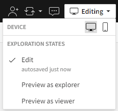
Step 1: To start using Sigma, log in to your account and go to the menu pane. Select “Create New” and choose “Workbook” from the options presented. This will open up a new workbook where you can start adding data elements. If you’re working in an existing workbook, ensure you’re in Edit mode before making any changes.
Step 2 – Connect to Data: Ensure that your data is ready for visualization by connecting it to Sigma, which supports various data sources such as spreadsheets, curated databases, and cloud storage.
Here are three ways to connect data to a visual element:
A child Viz Element from an existing Data Source (recommended):
On your existing element, select the Create child element icon, then Visualization
Note: Sourcing an existing element is the quickest recommended way to create a Viz Element.
A new Viz Element with new Data Source:
Access the menu pane and select Add New Element.
Select Viz Element
Use the NEW menu options provided to select a new data source element
A new Viz Element with existing Data Source:
Access the menu pane and select Add New Element.
Select Viz Element
Select an existing element using the IN USE or PAGE ELEMENTS menu options.
Sigma currently defaults the visualization element to a Bar chart. Let’s change it to a Line chart instead.
Line charts are useful tools for tracking changes over both short and long periods of time. When dealing with smaller changes, they are preferable to bar graphs. Additionally, Line charts are ideal for comparing changes that occur over the same period of time for multiple groups.
Step 4 – Define Axes: Assign the appropriate dataset fields to the X-axis and Y-axis. Typically, the X-axis represents the Date time, and the Y-axis represents measure values.
In the example below, we use Super Store data to depict Sales by Order Date. The X-axis represents each day of the week, while the Y-axis plots the sum of sales.
Create Area chart: To create an Area chart, you can follow a process similar to the Line chart in visualization. The filled areas between the lines create a clear visual representation of the changing magnitude of data points, making it easy for viewers to identify patterns and fluctuations.
In addition to filling the space, area charts offer multiple options for viewing data, making them useful for effectively comparing multiple categories or series.
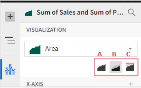
A: No Stacking – (Standard) – displays the measures as a simple area chart.
B: Stacked – Displays multiple measures in different colors.
C: Stacked 100% – Displays the relative proportions of multiple measures within a whole or 100% scale.
The image below shows an example of Stacked 100%. It displays the sales and profit by order date. The legends on the right side provide information about the color assigned to each measure.
The Line and Area chart visualization displays the total sales for each day, with the option to switch to monthly, quarterly, or yearly views. Additionally, the report can be viewed at a more granular level in seconds.
Step 5: Customize the chart: Sigma provides various formatting customization options to enhance the appearance of your Line or Area chart. You can adjust colors, labels, axis ranges, and other visual elements to match your preferences. Select the Element format (paintbrush) on the left navigation menu pane to open additional formatting options.
In this example, we will show you how to customize a chart. We’ll do this by renaming the title and adding min/max label points and axes titles. Then, we’ll adjust the visibility and angle of the X-axis labels for the Order Date field.
This modification will reduce overcrowding on the X-axis and add a creative touch. Additionally, we will format the measure colors to provide a visually appealing representation.
Depending on the data type you are working with, customizing the color scale or using different colors for specific categories may be optional.
It’s important to strike a balance between visual appeal and data integrity. When appropriate, customized color scales or categorical coloring should be used.
Step 6 – Publish and Share (Optional): After creating your Line or Area chart, you can easily publish it to your dashboard and export it in formats such as PNG or PDF.
Line/Area Chart Best Practices
Here are some best practices for creating Line or Area charts to avoid common errors affecting the user’s data interpretation.
Keep It Simple: Limit the number of lines, use clear labels, and maintain consistent scaling throughout the design.
Highlight Key Insights: Consider using annotations or colors to highlight significant trends or important points requiring attention.
Provide Context: Ensure that you include pertinent information that will help viewers comprehend the significance of the data.
Closing
In this article, we have covered the process of creating a Line and Area chart in Sigma. We have also discussed the different scenarios where these charts can be useful and highlighted their benefits.
If you have any further questions about Line/Area charts in Sigma Computing, contact our team of experts!
FAQs
When should we use the Stacked Area chart and the Stacked 100% Area chart?
When visualizing the contribution of different categories to a total value over time or across categories, stacked area charts and 100% charts in Sigma Computing can be useful. Here’s when you might consider using each:
Stacked Area Chart: A stacked area chart is a great way to observe the individual contributions of different categories along with the overall trend. This type of chart is ideal for presenting how each category changes over time and how it contributes to the overall total.
Stacked 100% Chart: A stacked 100% chart is a useful tool for comparing the proportional contribution of different categories to the total value. This is particularly helpful when the total value varies significantly over time or across different categories. The chart represents each category’s contribution as a percentage of the total, making it easier to compare different magnitudes.
In summary, a stacked area chart can be used to see individual contributions and overall trends, while a stacked 100% chart is better for comparing proportional contributions across categories or time periods, especially when the total varies.
When is the best time to use a line chart?
A line chart is the best choice when you need to display trends over time or compare data points chronologically. It’s perfect for demonstrating continuous data and highlighting patterns and changes over time.


