

When working with Sigma Computing, we have some great ways to show our data in creative ways that can capture our user’s attention. Versatility can be the factor that takes our Dashboards to the next level, and today we will be showing you how to do that by spicing up your charts with Dynamic labels.
In this blog, we will go over how to build a chart that contains different units of measure to analyze, including:
How to Make Your Chart
Making a Bar Chart
Making a Parameter
How to Make Your Chart Dynamic
How to Format and Make Your Chart Dual Axis
Additional Context for the Choose Function
Best Practices for Making Dynamic Chart Labels in Sigma Computing
How to Make Your Chart
Sigma offers several options to help you visualize your data. In today’s example, we will build a Bar Chart, as it is one of the most common ways to visualize our data and make it easy for our end users to navigate. To keep it simple, using the Snowflake “plugs_electronics_hands_on_lab_data” sample data provided by Sigma.
Making a Bar Chart
To start, we will create a visualization from the table we brought in:
Click the Create Child Element on the top right of your table
Click Visualization, and continue with the Bar Chart option that the Visualization defaults to

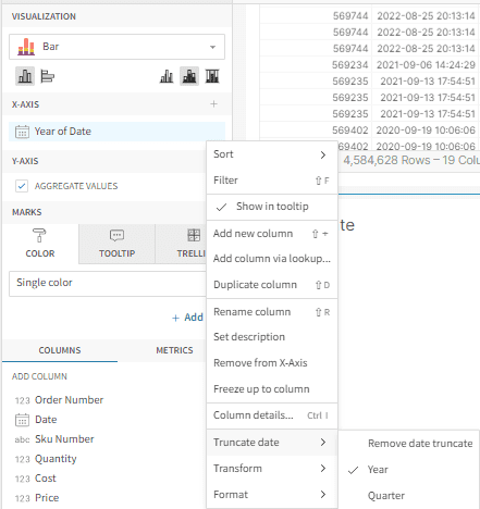
Add the Date to the X-axis and truncate it by Year to improve visibility in this example.
Making a Parameter
Make a Parameter by clicking the + sign to “Add Element” and select “List Values” under Control Elements.

Under the Values for the Control Element, select Number as the Value Type and create a value for each one of the following: Cost, Price, and Quantity.
(A quick tip: If you name your value with a number and the description with the name of your measure in alphabetical order, your parameter will perform faster)
Uncheck all of the control setting boxes

Name your Control ID. In this case, it’ll be called “Dynamic-Chart-Selection.”

How to Make Your Chart Dynamic
We will now build a custom Y-axis that will reference the Control Element we just created.
Add 3 New Columns to your Y-axis

We will call the first column Sum of Cost and use the formula Choose([Dynamic-Chart-Selection], Sum([Cost]))
We will call the second column Sum of Price and use the formula Choose([Dynamic-Chart-Selection], Null, Sum([Price]))
We will call the third column Count of Quantity and use the formula Choose([Dynamic-Chart-Selection], Null, Null, Sum([Quantity]))
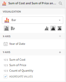
The image above shows what your Y-axis should look like now.
After following these steps, your Control Element should allow you to toggle between the three options you added in your Y-axis. However, we still need to make some formatting differentiations in the next few steps.

How to Format and Make Your Chart Dual Axis
We now have a chart with the Dynamic format that we need. However, Sigma only allows one number format (for example, dollar, percent, or plain number format) per axis, and we have dollar values and number values (non-dollar values) on the same axis. This does not follow data visualization best practices for correct and precise data labels, so we want to make our labels dynamic as well.
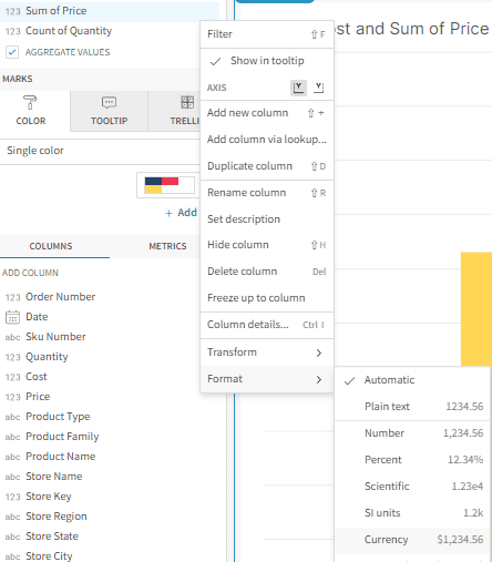
To format the Y-axis properly, we will need to
Change your Count of Quantity value to the Y-axis on the right, as shown below:

You can now format the Count of Quantity as a number and the Sum of Cost and Sum of Price as dollar values.
You now have a dual-axis chart with corresponding value formats and the power of interaction by making it dynamic, all bundled into one.
Additional Context for the Choose Function
As we created the functionality for the Y-axis, we used the Choose function that Sigma offers for formulas. There are other functions that are available for this type of functionality, like the Switch function, but we will go with Choose this time around. The formulas we created were:
Choose([Dynamic-Chart-Selection], Sum([Cost])) for Sum of Cost
Choose([Dynamic-Chart-Selection], Null, Sum([Price])) for Sum of Price
Choose([Dynamic-Chart-Selection], Null, Null, Sum([Quantity])) for Count of Quantity
There are two components for the Choose function: the Index, which references the parameter we created, and the Values, which references the values contained in the parameter. As you can tell, every time we created a new measure, we began to add Null values after the Index. The reason for these Null values is to give the values a pecking order to choose from based on the parameter. Since the Sum of Cost was the first value in the parameter structure, we don’t need Nulls in the formula, but the Sum of Price needs one Null because it was second, and the Count of Quantity needs two Nulls because it was third in the parameter order.
Best Practices for Making Dynamic Chart Labels in Sigma Computing
Always format and label your measures properly to make sure your users get a clear understanding of your chart.
Use different colors for the different measures so that they are easily identified.
Use as many choose and parameter options as you may need through the use of the pecking order and the help of the Choose function and Nulls for the order as well.
Interested in more tips and tricks for Visuals in Sigma?
Check out episodes 5 and 9 of our Sigma Made Simple Series.
Conclusion
Sigma offers us some great options to visualize our data in more dynamic ways so that we can offer more layers of depth. With a few simple steps, we can include a lot more information into one chart. The end result will give our end users more versatility without making navigation more complicated. We hope these dynamic chart labels help boost your dashboards as you continue on your path to taking your data and Sigma presentations to the next level.
FAQs
At this moment, you can only add up to 2 different measure formats due to the restriction of the axis available and the fact that each axis only allows one format type at a time.
Bar charts demonstrate a clear picture of your data broken down by one characteristic and value. Because of their simplicity, they make it easy to follow patterns in the data. Visualizations like bar charts matter when analyzing data. To learn more about perfecting your bar charts, check out our phData blog: How to Create Better Bar Charts in Sigma Computing.
Sigma offers a great tool that automates alerts based on a schedule or whether certain conditions on a single data element are met. This option will give you the option to send your export through different delivery methods: Email, Slack, Google Sheets, Google Drive, and the ability to add it to Cloud Storage. To learn more about sharing and scheduling reports, check out our phData blog: How to Share and Schedule Reports in Sigma Computing.
Sigma Computing’s Metrics is a powerful tool for simplifying this complexity and making it easier for business users to access and understand data. Metrics can help organizations simplify and standardize their analysis by pre-determining common or atypical calculations. To learn more about how to simplify your data through Metrics, check out our phData blog: What Are Metrics in Sigma Computing?


