

Data visualization plays a crucial role in understanding and analyzing complex information. Bar charts, in particular, offer a concise and intuitive way to present data in a visual format. By representing categories as bars along a horizontal or vertical axis, bar charts allow our brains to compare values, identify patterns, and spot outliers quickly.
In this blog, we will delve into the intricacies of creating impactful bar charts using Sigma Computing. I’ll guide you through the step-by-step process of harnessing Sigma’s intuitive interface to transform raw data into visually appealing and insightful bar charts.
Expect us to cover topics such as selecting data sources, choosing the appropriate chart type, customizing bar charts, and effectively utilizing Sigma’s features to present data-driven narratives that resonate with your audience. By the end of this post, you’ll have a comprehensive understanding of how to craft compelling bar charts using Sigma Computing’s powerful tools.
Understanding Sigma Computing
Before we dive into creating a bar chart, let’s familiarize ourselves with Sigma Computing. Sigma is a powerful cloud-based data analytics platform that empowers users to explore and analyze data in a user-friendly interface. It provides a range of tools and features to visualize data effectively. Learn more about Sigma’s Visualization Library here: Intro to Visualizations Documentation.
Why Use Bar Charts in Sigma Computing?
Bar Charts are commonly used in data visualization due to their simplicity, versatility, and ease of interpretation. They provide a convenient way to present and compare values across various data categories using a common baseline. Given their ease of use, bar charts are highly suitable for diverse applications within organizations, including:
Comparing sales by product to identify top performers or trends
Analyzing survey responses to understand the distribution and dominant choices
Monitoring progress toward goals or milestones
Presenting demographic information
Sigma offers robust features and functionalities to facilitate the creation of bar charts. With Sigma, users can leverage:
User-friendly interface: Intuitively design and customize bar charts according to the user’s specific needs. Users can quickly understand and navigate through the interface, improving their efficiency and productivity. Seamless drag-and-drop functionality provides empowering users to effortlessly add and manipulate data fields.
Additional Visual Options: Data aggregation, filtering, and sorting provide users with the ability to perform in-depth analysis and exploration. They can easily drill down into specific subsets of data, facilitating the extraction of actionable insights and enabling faster and more accurate decision-making processes.
Advanced customization options: Colors, fonts, labels, and visual elements contribute to the overall aesthetics of data visualizations, making them visually appealing and engaging. This helps capture the viewer’s attention and encourages further exploration of the data. Thoughtfully chosen colors, fonts, and labels can aid in conveying information effectively.
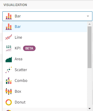
How To Make Bar Charts In Sigma
Creating a bar chart in Sigma is a straightforward process. Follow these steps to visualize your data using a bar chart:
Step 1: Access Sigma: After logging in, navigate to the menu pane and select “Create New”. From the options presented, choose “Workbook”. This action will initiate the opening of a new workbook where you can start adding data elements. If you are working in an existing workbook, ensure that you are in Edit mode.

Step 2: Connect to data: Ensure that you have the necessary data ready for visualization. Sigma supports various data sources, including spreadsheets, curated databases, and cloud storage. Need to connect Sigma to Snowflake? Learn how here: How to connect Snowflake to Sigma.Here are three different ways to connect your data element to a visual element:
A child Viz Element from an existing Data Source (recommended):
On your existing element, select the Create child element icon, then Visualization
Note: This is the recommended option because it is the fastest way to create a Viz Element sourced by an existing element.

A new Viz Element with new Data Source:
Access the menu pane and select “Add New Element.”
Select Viz Element
Use the NEW menu options provided to select a new data source element
A new Viz Element with existing Data Source:
Access the menu pane and select “Add New Element.”
Select Viz Element
Use the IN USE or PAGE ELEMENTS menu options provided to select an existing element.
Sigma defaults the Viz Element to Bar Chart, so you shouldn’t need to change anything.

Stacked bar charts and stacked – 100% bar charts are also located within the bar chart-type visualization.
Orientation
Option 1: Vertical Bar Chart
Option 2: Horizontal Bar Chart

Bar Type
A: No Stacking – (Standard) – displays multiple categories or groups as separate, non-overlapping bars side by side.
B: Stacked – the total value is represented by the full length of the bar, while each segment within the bar represents a subcategory or component of that total.
C: Stacked 100% – shows the relative proportions of multiple categories or groups within a whole or 100% scale.
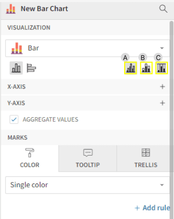
Step 4: Define the axes: Assign the appropriate fields from your dataset to the X-axis and Y-axis. The X-axis typically represents the categories or groups, while the Y-axis represents the corresponding values.
In the example below, we use an Airline dataset to depict the Average Departure Delay (in minutes) by Day of the Week. The X-axis is represented by each day of the week, while the Y-axis plots the average departure time delay value in minutes.
Notice that the chart can either be presented as a vertical – not stacked bar chart or a horizontal – not stacked bar chart. Depending on the visual space, either chart is appropriate to use in this case.
Unsure which orientation to choose?
Check out our Best Practices post for additional details!


Step 5: Customize the chart: Sigma provides various formatting customization options to enhance the appearance of your bar chart. You can adjust colors, labels, axis ranges, and other visual elements to match your preferences. Select the Element format (paintbrush), located on the left navigation menu pane, to open additional formatting options.

In this example below, we will demonstrate the customization process by removing the axis labels for Minutes and the gridlines from the Y-axis. We will then proceed to adjust the visibility and angle of the X-axis labels for the Day of Week field.
This modification will help alleviate overcrowding on the X-axis while adding a touch of creativity. Additionally, we’ll add data labels to the bars to provide direct value representation. Finally, we’ll format the color to align with a single color, ensuring a cohesive and visually appealing representation.

Remember that customizing the color scale or using different colors for specific categories may be optional, depending on the data you are working with.
Remember, the goal is to strike a balance between visual appeal and maintaining the integrity of the data: Use customized color scales or categorical coloring when it makes sense for your use case.
Step 6: Publish and Share (Optional): Once satisfied with the bar chart, publish your dashboard. From your dashboard, you can export it in different formats, such as PNG or PDF, share it with colleagues, or embed reports.
Bar Charts Best Practices
Here are some best practices to keep in mind while creating bar charts to avoid common mistakes that impact your end user’s interpretation of the data:
Appropriate Scaling: Ensure that the scale of the Y-axis accurately represents the data values. Improper scaling can distort the visual comparison between bars.
Visual Balance: Avoid using misleading visual cues, such as disproportionate bar widths, too many colors, or colors that are too similar, as they can distort the perception of data.
Clear labels: Clearly label the axes, bars, and any additional elements in the chart to provide context and prevent confusion. Labels should be applied to either the bars or the axes, but not both.
Shared space: Avoid overcrowding the chart with too many categories or excessive data points, as it can make the chart cluttered and difficult to interpret.
By being mindful of these common mistakes and best practices, you can create accurate and meaningful bar charts that effectively communicate your data insights.
Closing
Bar charts are a valuable tool for visualizing categorical data and comparing values within different categories.
In this article, we explored how to create a bar chart in Sigma, discussed scenarios where bar charts are useful, and highlighted the advantages they offer. By leveraging Sigma’s capabilities, you can create customized bar charts that effectively communicate your data insights and facilitate better decision-making.
If you have any further questions about bar charts in Sigma Computing, reach out to our team of experts!
FAQs
The decision to use a horizontal bar chart or a vertical bar chart depends on the specific context and the information you want to convey.
For example, when representing time or sequential data, vertical bar charts are commonly used. The vertical orientation helps create a chronological progression, allowing viewers to follow the temporal order easily to follow the temporal order easily.
However, horizontal bar charts may be easier to read for most audiences since the small-to-large layout mimics how most languages read left to right. Additionally, a horizontal bar chart might be a better choice if the category names are extended or too long to fit on the x-axis of a vertical chart.
Ultimately, the choice between a horizontal or vertical bar chart should be based on what best suits your data, the readability of labels, the ease of comparison, the representation of time or sequence, and the available space for visualization.
Sigma offers trellis charts as a powerful visualization tool that enables users to explore and analyze data in a multidimensional manner. With trellis charts, users can effortlessly create multiple small charts, each representing a subset of data, arranged in a grid-like layout.
See more information about trellis charts here.
For example, by changing the aggregation type from Sum to Average, you can modify how the data is summarized and presented in your analysis.
Locate the measure whose aggregation you want to change. Right-click on the measure column header or click the downward-facing arrow to open the context menu. In the context menu, select "Set Aggregate,” then select the appropriate aggregation, and the chart will automatically update.
Sigma allows for values to be aggregated or grouped at several different levels within a table. To change the level of aggregation, add whichever columns you’d like to the group by section of the parent table element.
Click here to learn more about changing level of aggregations in Sigma: Aggregating Tables in Sigma.
A child element provides a quick and efficient method to generate supplementary elements based on existing elements within the page. When crafting a child element, the newly created element will utilize the identical data source as its parent element.
To begin, identify the desired parent element. Hover your cursor over the element, specifically near the upper right corner, and observe the appearance of an icon box. Within this box, you will find the option to "Create Child Element." Click on this icon, and proceed to select the desired type of element you wish to create.


