

In part 1 of this blog series, you learned how to build a simple hierarchy filter,
and in part 2, you learned how to build a filter for a long hierarchy by keeping certain hierarchy sections collapsed by default.
In this blog, I will show you how to use the hierarchy filters in dashboards by creating an accordion menu. Using sets speeds up the performance and enables a few useful options in many scenarios.
Dataset:
Use the Tableau workbook you used for the previous parts to follow along.
Step 1: Understand the Basics
On a new sheet, create a bar chart by dragging the Category and Sub-Category fields in the Rows shelf and adding Profit in the Columns shelf.

As sets are used, you have three options to use the hierarchy filter in your views.
Option 1
Drag the [Sub-Category Set] in the Color section of the Marks card. Right-click on the pill and tick on Show In/Out of Set. You will get this.

You can now color the bars based on which sub-categories are in the set. Play around with the dashboard containing the hierarchy filter and how it changes this sheet. This can be used when you want to show all marks but highlight the ones selected in the hierarchy filter.
Option 2
Remove the set from the Color section and drag it to the Filters shelf.

This will, by default, filter out the sub-categories not in the set when the option of ‘Show Members in Set’ is ticked when right-clicked. You could also tick on ‘Show In/Out of Set’ if you want to show the dimensions not added in the set. You can use this option when using the hierarchy filter as a regular filter.
Option 3
Create the following calculation.
					//Sub-Category Filter
INT([Sub-Category Set])
Next, double-click on the SUM(Profit) pill, write [Profit] * [Sub-Category Filter], and hit Enter.


This will make the Profit for the sub-categories not selected in the hierarchy filter as zero. The solution for the challenge added for Tableau’s WOW2023 – Week 32 is also based on this. This might seem futile in this case, but when the view you build is not based on the dimensions you filter, this is the only option you have to preserve the table’s layout. Check out scenario 4 from this blog for more details on this.
Please note that the Sales were added in the hierarchy filter for additional context. It does not have any impact on the filtering.
Step 2: Create the Titles
There is little use in having 3 dashboards, each with one hierarchy filter. You would need all three in one place in an actual business dashboard. Since each hierarchy filter occupies the entire vertical space in the dashboard, only one can be shown at a time. This is easy with the advent of Dynamic Zone Visibility.
The easiest way to implement that here would be to add one title sheet for each of the three hierarchy filters and use that.
Start by creating the following calculation.
					//Sub-Category Total Selection
"Sub-Category (" +
STR({COUNTD(IF [Sub-Category Set] THEN [Sub-Category] END)})
+ "/" +
STR({COUNTD([Sub-Category])})
+ ")"
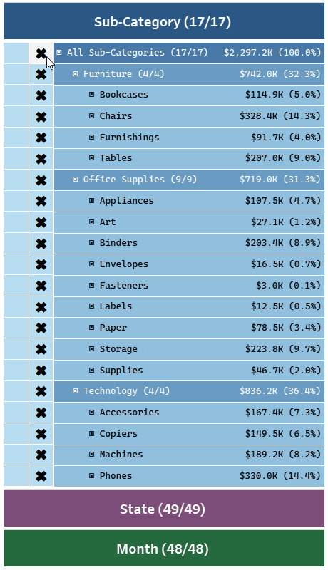
This will show a fraction of the number of sub-categories selected over the total number of sub-categories. This will be your title for the first hierarchy filter.
In a new sheet, double-click the Columns shelf to open a blank pill, and write 1 in it. Set the Marks type to Bar, and drag the calculation you just created in the Label section of the Marks card.

Alias the 1 pill as Sub-Category, set the bar size to the maximum value, edit the axis from 0 to 1, hide the Columns header, and format the rest of the sheet to your liking. You should get something like this. Rename the sheet to “Sub-Category Title.”

Now, drag the Measure Names field to the Detail section of the Marks card. Create a parameter and set up a parameter action, as shown below.


With this, clicking on the bar will add the Measure Name, in this case, “Sub-Category,” in the parameter.
Additionally, create the following calculation for toggling the visibility in the dashboard.
					//Sub-Category Visibility
[Hierarchy Filter Selector] = "Sub-Category"
Repeat the same process and create the other two Title sheets.
Step 3: Build the Dashboard
Unhide all the sheets used in the 3 dashboards. Create a new dashboard as per the layout shown below.

Blue: Horizontal Container
Red: Vertical Container
Yellow: Title sheet
Gray: Blank object
Refer to this blog for some tips on working with containers. Also, fix the height of the three title sheets to at least 40 so that the text is visible.

After this, add the Add, Remove, and Hierarchy sheets in their respective Horizontal Containers. You will get something like this.

Now, assign the correct Visibility calculation to each of the three horizontal containers.

Next, edit the parameter action for the dynamic zone visibility to run from the dashboard; rename it as shown below. Remember to select only the three title sheets in Source Sheets.

With that, the dynamic zone visibility will work as expected, and you have now configured an accordion menu for the hierarchy filters!!
After that, reconfigure the remaining set actions and parameter actions as explained in the previous two parts to run from this dashboard. Also, set up the filter actions for disabling highlighting wherever needed.
Step 4: Add more Context
Some Months will have zero sales after filtering for a specific State and Sub-Category. The only option to highlight this is to limit the number of options available for filtering by not showing the combinations that do not exist. But this runs the risk of some insight being lost.
Leveraging the power of Option 3 from Step 1, you can get the best of both worlds. You can calculate the Sales for each hierarchy filter based on the other two sets. The nodes with zero sales get flagged, but the overall number of options will remain the same!
To do this, create the following calculation.
					//Sub-Category HF Sales
[Sales]*INT([Month Set] AND [State Set])
Replace this calculation with the [Sales] pills in the Sub-Category Hierarchy sheet.

When only one State is selected, the Sub-Category hierarchy filter shows how much each Sub-Category and Category contributed to that State’s Sales! This is a variation of the technique from this blog. Conventionally, you must look at a separate chart to get this context.
Similarly, create calculations for the other two hierarchy filters’ [Sales] pills replacements and add them in the respective hierarchy sheets.
You can also experiment with other ways of showing this additional information, like adding a specific symbol for rows with 0 sales, disabling the add/remove buttons for these rows, or changing the selection calculations only to sum up the non-zero values. You must have come across this type of filtering mechanism on online shopping platforms, too.
You can create other views/charts and add them on this dashboard. Then, using the technique of combining the sets using AND in conjunction with the step 1 options, try creating different combinations of filters and highlighters.
Conclusion
I hope you enjoyed this blog series showcasing a new way to build hierarchy filters. It enables more options to filter/highlight your views and adds more context to the filters in a way that is not normally possible.
The best part is that it does not require any performance-draining functions. This makes it very practical to use when you need to build something like this for an actual business dashboard. Try it out and come up with your own variants of this!
If you want more information on Hierarchy Filters in Tableau, contact our team of experts!


