

One of the main challenges with building dashboards is to show the right amount of detail in a dashboard to stay insightful, but at the same time, it is not overwhelming to look at for the users. Also, different business users will often need different levels of detail when viewing the same dashboard. Due to the limited real estate available on the dashboard, adding extra detail to the charts is not possible every time.
What if you could make a chart occupy more of the dashboard space when a button is clicked and revert it when another button is clicked? With the extra space, additional detail can be easily added on demand without overwhelming the users. Tableau Visionary Samuel Parsons created an amazing visualization showcasing this earlier.
In this blog, you will learn a much simpler and cleaner way to build that functionality for your dashboards.
Although the brunt of this blog will be hinging on the dynamic zone visibility feature to create the dynamic zooming experience, there is a bonus section towards the end in which you will learn a hacky way to achieve similar results without it in some scenarios.
Dataset
You can follow along with the Orders table of the latest (2020-2023) Superstore dataset.
Step 1: Create the Charts
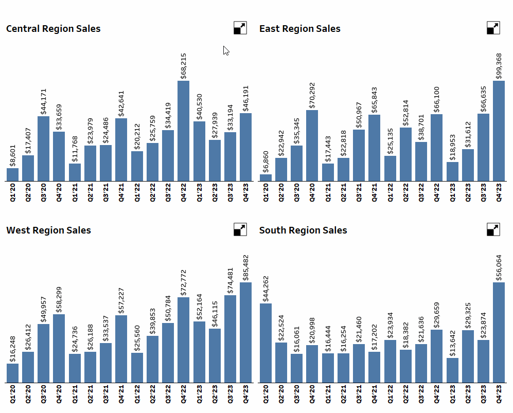
To keep things simple for understanding, imagine that you have to build a dashboard with 4 bar charts, one for each Region, and clicking on a button next to a chart will expand that chart to occupy the space of 4 charts. Clicking on another button will revert the dashboard to its original state.
First, on a blank sheet, right-click, drag Order Date in Columns, and then double-click (an alternative to single click to select and click OK at the bottom of the menu) on the Green Quarter (Order Date) as shown below.

Convert this to Discrete. Add Region in Filters and select Central. Then drag Sales in Rows.

Add some default formatting to the Sales field, rename the sheet to Chart Central, and format the sheet to your liking. You will get something like this.

Duplicate this sheet three times and change the filter to get the charts for the other three regions — Chart East, Chart South, and Chart West.
Step 2: Create the Shapes
A new sheet will be needed to house the shapes to maximize the charts, as we need to configure some parameter actions.
First, create a parameter as shown below.

This will decide which of the 4 bar charts should occupy more space or whether all charts should be visible.
The shape that must be shown will depend on whether all four charts are visible or just one is zoomed in. To check that, create a calculation as follows.
					// Zoomed State
[Zoom Selector] != "All"
On a new sheet, change the Mark type to Shape, add this calculation in the Shape section, and set the fit to Entire View.

When the parameter is at All, the Zoomed State will be False. Select a shape of your choice that denotes Zoom-in/maximize. You can download shapes (preferably as PNG because they are transparent) and add them to the Shapes folder of My Tableau Repository in your system and access them in the Shape section of the Marks card.

Change the Parameter to something other than All, and this will change the Zoomed State calculation to True, and select the shape you want as your minimize icon.

Rename this sheet as Shape Central, go to Chart Central, and apply the filter to this new sheet.


To toggle between the maximized and minimized states on the button clicks, create the following calculation.
					// Zoom Selector Value
IIF([Zoom Selector]="All",[Region],"All")
Add this calculation in the Detail section of the Marks card and then set up a parameter action as shown below to test if the toggle works as expected.

Make sure to add the Zoom Selector Value in the Source Field.
Click on the shape and check if it is toggling the value in the parameter between “Central” and “All” with each click. Also, check if the shape changes correctly.
This calculation is what makes the technique so efficient. Clicking on the symbol will add different values to the parameter based on the current value in the parameter.
Next, turn off all tooltips from this sheet. Also, hide the cards for any legends, filters, or parameters that are shown.

There is no way to hide everything all at once, but you can refer to tip six from this blog by Tableau Visionary Kevin Flerlage to do it quickly.
After this, duplicate the sheet for the other three regions, just like with the charts. Make sure to reapply the Region filter from a chart to the corresponding shape sheet.
Step 3: Build the Dashboard
Create a new dashboard. You will need to add your sheets in containers so that it is possible to set up the dynamic zone visibility effectively. For this, use the dashboard layout shown below.

Red: Horizontal Container
Blue: Vertical Container
To quickly build this layout, follow this process. Start by adding the outermost container, insert a blank object in it, then add a vertical container, add the next vertical container by dropping it at the intersection between the blank object and the first vertical container, and finally remove the blank object.
Whenever the objects inside a container should be equally sized, use the Distribute Contents Evenly option. To do that, double-click on the handle of one of the two vertical containers so that Tableau selects the parent horizontal container, then select more options, and then tick on “Distribute Contents Evenly.”
Adding the blank object prevents the two containers from being perfectly overlapped. Dropping objects on the border between two objects already in a container ensures that it will always fall into the container you want.
Repeat the same process to add two vertical containers in each of the two vertical containers.
You should end up with an Item Hierarchy like the one shown below.

In addition to this, each of the innermost vertical containers must have the following layout.

Red: Horizontal Container
Blue: Vertical Container
Green: Region Chart
Yellow: Region Shape
Gray: Region Text Object
Another pro tip to easily nest containers is always dragging the following object (especially if it is a container) after the blank one in a container near the edge it is designed to split.
Drag a blank object first to add the horizontal container in one of the innermost vertical containers. Then, drag the horizontal container near the edge the vertical container is designed to split: horizontal edges.
Drag a horizontal container near the edge of the innermost vertical container to see why it is necessary.


If you do this, Tableau will change your vertical container to a horizontal container!
Undo the last steps till you are back at the original item hierarchy. Drag the horizontal container along the top horizontal edge (you can also do the bottom edge, but dragging it near the top edge will add the horizontal container to the top of the innermost vertical container) of the innermost vertical container.

This will yield the expected result.

To summarize, whenever you use a container, always add a blank object, and then add the next object near the edge the container is designed to split. Once the first two objects are in, the container type will not change, but to ensure that new objects get correctly added in the container you want, add them on the line separating the two objects in the container.
Now, in the dashboard, give the new horizontal container a fixed height of 60 pixels.
Add a blank object in the horizontal container. Then, drag one of the shape sheets (e.g., Central) towards the right edge of the container so that it gets added towards the right.

Add a text object with a text like “Central Region Sales” in the container on the line dividing the blank object and the shape sheet.

Remove the blank object from the horizontal container.
Next, add the Chart Central sheet near the line separating the blank object and horizontal container.

Remove the blank object from the innermost vertical container, and you should get something like this.

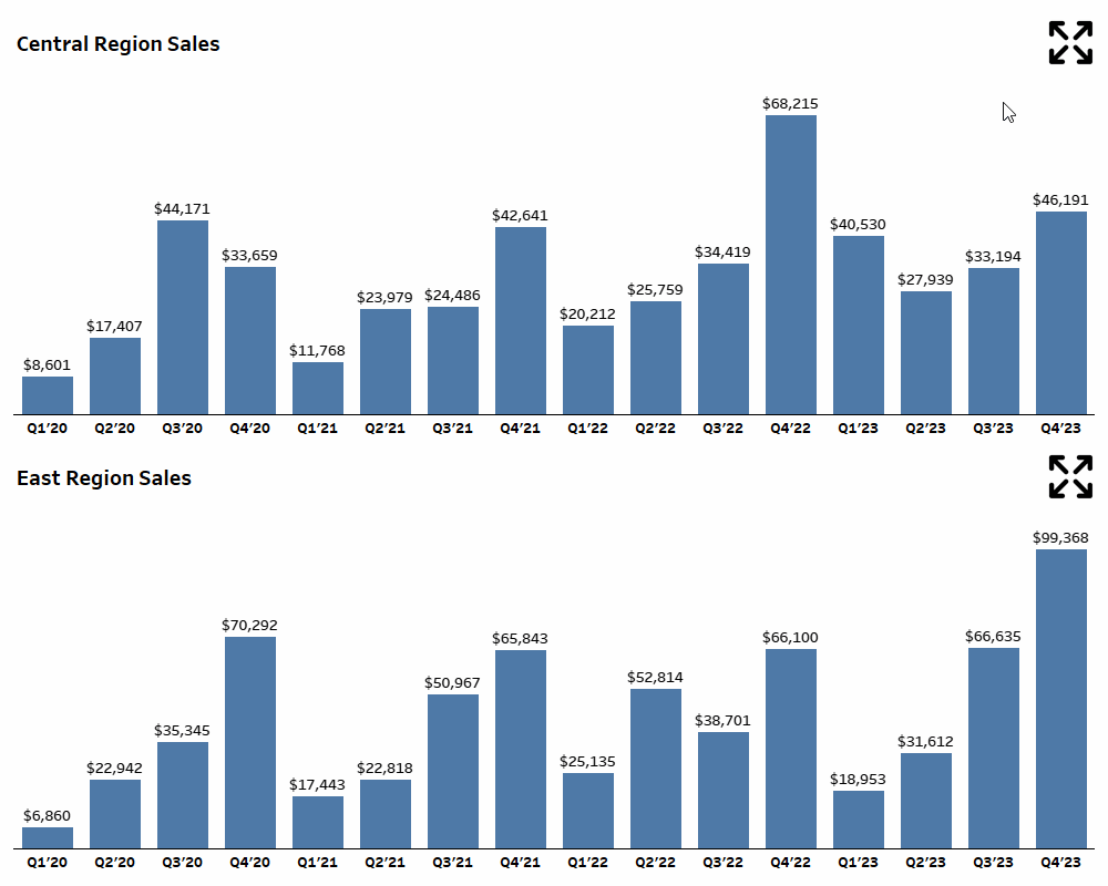
Hide the title for both sheets. Repeat the procedure for the other three regions. Do some basic formatting in the dashboard. You should end up with something that looks like this.

Step 4: Set up the Actions
When the shape next to Central is clicked, the other three regions should not be visible. Also, the vertical container containing East and South should be hidden. Only then will the Central region expand to the entire space on the dashboard.
To do this, create the following calculations.
					// Visibility Central
[Zoom Selector] IN ("Central","All")
					//Visibility East
[Zoom Selector] IN ("East","All")
					// Visibility South
[Zoom Selector] IN ("South","All")
					// Visibility West
[Zoom Selector] IN ("West","All")
Next, create the following calculations for the left and right vertical containers.
					// Visibility Left VC
[Zoom Selector] IN ("Central","West","All")
					// Visibility Right VC
[Zoom Selector] IN ("East","South","All")
Now, you have everything you need to set the dynamic zone visibility. Go to the dashboard, select the six vertical containers (double-click the handle shortcut to jump to the parent item in the Item Hierarchy), and select the corresponding Boolean calculation.

Go to Actions and remove the actions that got duplicated.

Edit the original action as shown below.

When “Source Sheets” is set to Dashboard 1, all sheets will get included in the action by default. Deselect the 4 Chart sheets and leave the 4 Shape sheets checked.
And Voila! You now have dynamic zoom!! Play around with the dashboard and see for yourself.
The Zoomed State calculation can show additional details in any sheet by creating a calculation like this.
					// Additional Detail
IF [Zoomed State] THEN [Category] END
Add this in the Color section of the Marks card of any of the Chart sheets. This will make the Bar Chart a Stacked Bar Chart when zoomed in.

Alternatively, you can add it to the Rows or Columns shelf to have one bar for each quarter and category. The possibilities are practically endless!!
Bonus: Zoom without Dynamic Zone Visibility
Build a dashboard with the following layout.

Blue: Vertical Container
Red: Horizontal Container
Green: Region Chart
Gray: Region Text Object
You should have something that looks like this.

Now select the top vertical container and tick on the “Add Show/Hide Button.” Shift+Drag the button in the horizontal container of the bottom vertical container.

Repeat the same for the other container. This will work exactly like the zoom you learned with dynamic zone visibility! You can also edit this button to set different shapes for when the item is shown (Maximize shape) and hidden (Minimize shape.)
While this is a very nifty trick that comes in handy when the Tableau Desktop version you are using does not have Dynamic Zone Visibility, there are a few drawbacks:
Since every object needs its own show/hide button, this cannot be used when more than two objects need to be dynamically zoomed in.
There is no provision to add extra details in the zoomed-in view.
That said, one area where you can use this without an issue is when one of the items you want to expand is a table with many rows. Users can click the maximize button and see more of the table at a time.
Conclusion
Phew! That was a biggie!! Hope you enjoyed learning this technique and the bonus towards the end. Changing the values passed in the parameter based on the current value rendered many calculations, parameters, and actions that are usually needed to make something like this redundant.
Also, since the same sheet showed the maximize and minimize shapes based on the parameter, there was no need to float particular objects to cover up things. This is what made everything much easier to implement and clean. Try it out for yourself and create unique ways to add extra details to your visualizations!
If you want more information on Dynamic Zooming in Tableau, contact our team of experts!


