September 12, 2020

26 Ways to Enhance your Tables in Tableau

By Luke Stanke

If you develop dashboards and work with data visualizations regularly, then you probably find yourself loathing the moment you are asked for a table of data. You probably think to yourself: “why do they want a table?!”. 

The reality is that people love tables. They offer a consolidated form to input several key metrics, identify trends and outliers, and make decisions without having to click around or run multiple reports.

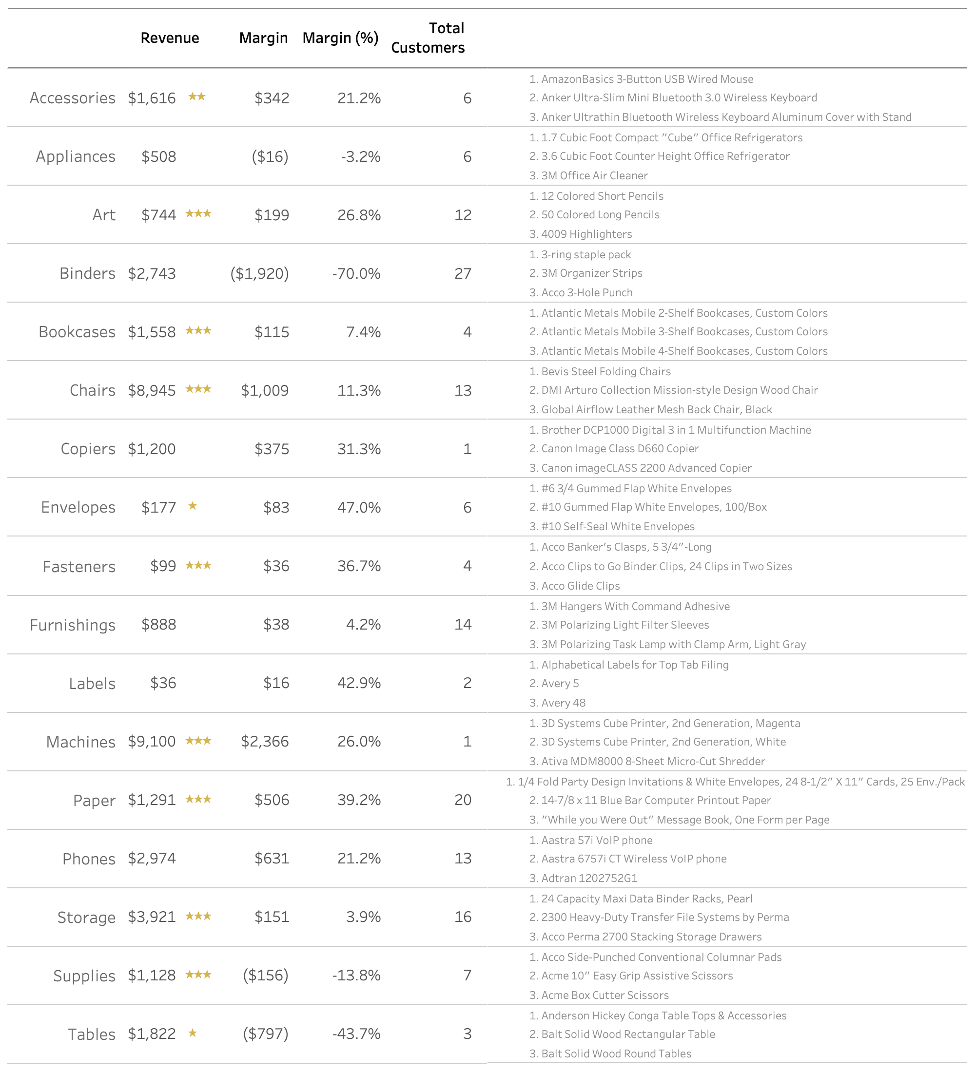
And just because they want a table doesn’t mean you have to give them *JUST* a table. First, be sure to follow some of the tips for our Ultimate guide to Tables in Tableau. At minimum, it will help with formatting your tables.

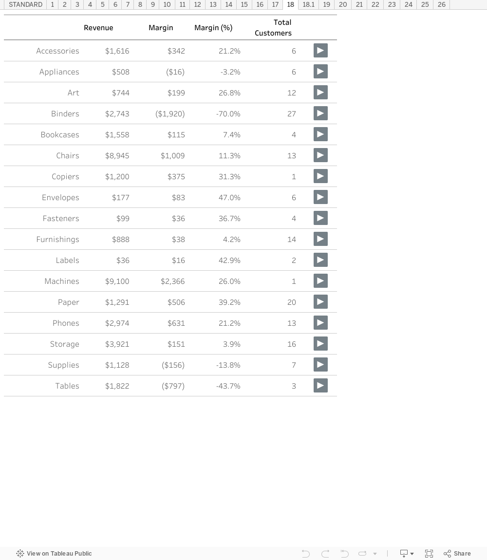
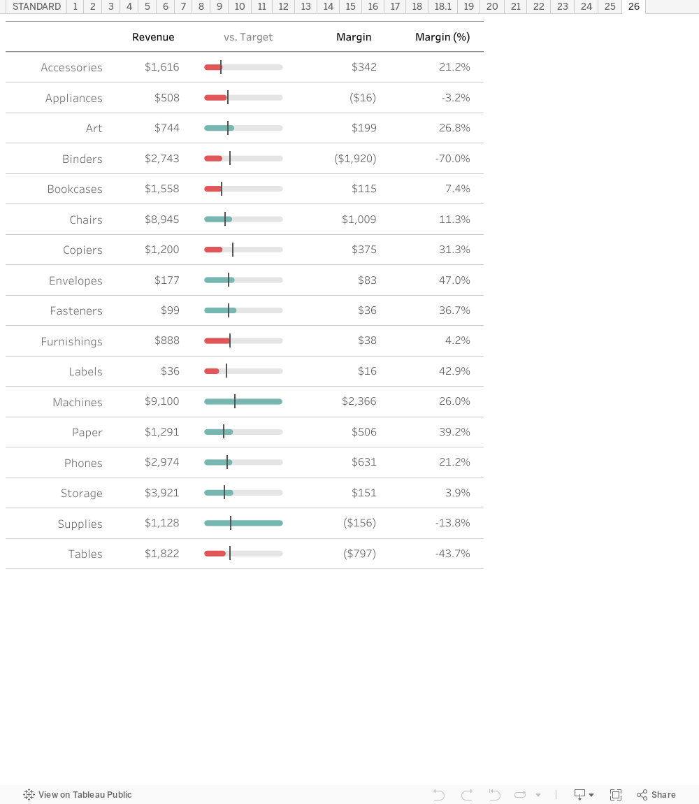
Before we jump into the 26 examples, let’s start with a base table. You’ll notice we have a few metrics: Revenue, Margin as total, margin at percent, and total customers. This is broken down into 17 sub-categories.

Let’s start with our base table!

Getting started with Tables?

The tips in this post are useful, but you’ll want to read our 5-part series on creating advanced tables to have it all 

Ultimate Guide to Tables →

Table pagination →

Row Density →

Filtering with Tables →

Custom Table Headers →

Tip #1: Bold Text

By changing the font style your audience can call out key values–in this case values hitting their targets.

Tip #2: Text Color

The same could be done with just a change in color. Here, non-profitable sub-categories are red.

Tip #3: Highlight Table/Heat Map

I like to break up my tables with a single column heatmap/highlight table.

Tip #4: Top/Bottom 3

Instead of highlighting all values you could highlight the top and bottom values.

Tip #5: Status Dots

Add dots in a single column showing the status of each sub-category.

Tip #6: Indicator Dot

Or a single indicator dot. In this case it’s highlighting values NOT hitting their monthly target.

Tip #7: Additional Text for Context

Adding additional text in a cell provides context to a value or label.

Tip #8: Arrows as Text

With arrows both direction and color can highlight progression of a value. We can place these arrows in as text.

Tip #9: Arrows as shape

Or change the shape of the column to arrows and highlight values the same way.

Tip #10: Bar charts

One of my favorites is adding an in-line bar chart.

Tip #11: Two-sided bar charts

In this example I’ve experimented with positive bars to the right of the text and negative bars to the left of the text.

Tip #12: Cleveland dot plot

An alternative to bars are Cleveland dot plots. 

Tip #13: Sparkline

Sparklines can be used to show monthly patterns. Here we use red and blue dots to highlight the local minima and maxima.

Tip #14: Zero-centered Sparkline

One alternative sparkline is centering the first value at 0%. This allows to track percent change from the original value.

Tip #15: Spark Bar

In addition to spark lines, you could use spark bars. Here you see a nice month-over-month bar chart for percent of margin.

Tip #16: Icon in header

I often use some sort of icon or image in the header to help distinguish members.

Tip #17: Shape highlight (a la fivethirtyeight)

I also like to place rounded rectangles around values to break up a series of columns

Tip #18: "More" Arrow

Perhaps my favorite is providing a more arrow that includes a go to dashboard action plus a parameter to drive to a custom dashboard.

Tip #19: Rank

A simple way to break up things is by showing the rank before any values in the table.

Tip #20: Rank with Change

While I like rank, I prefer to include change in rank from one time period to the next. This provides even more context to the value.

Tip #21: Stars

Sometimes i like to add stars to show projections. These combine the traits of bar charts with dot indicators.

Tip #22: Filled Dots

Filled dots are identical to stars but also showcase the potential of values not filled.

Tip #23: List in a Table

Sometimes additional context is needed by listing values. Here I show the top 3 selling products in each sub-category.

Tip #24: Filled Rank

One alternative to the rank chart is to add rank and color.

Tip #25: Top 3 with Icons

Or just to show the top 3 values.

Tip #26: Percent to Progress

Finally, a great option is to show a percent-to-progress chart directly in the table.

The following are just examples of how you can make tables pop. To take a closer look feel free to download the workbook here.

Data Coach is our premium analytics training program with one-on-one coaching from renowned experts.

Accelerate and automate your data projects with the phData Toolkit