

When you think about tables in general, we often don’t think about the importance that the header provides. The header can be more than a title. It can provide us context, it can tell us how the data are sorted (and allow us to sort the data), and it might even provide us more detail.
And when we think about table headers in Tableau, they provide a title and a sort.

In this post we’ll create a custom UI for headers in tableau.
There are many benefits to this header style (which we’ll actually discuss in the next post). We’ll build the example using {Sample – Superstore}.
Before we get into the tutorial, it’s important to understand that the header we are creating is just a sheet that is formatted using a dimension with 3 members. We’ll use the dimension to do all of the work for us. Just to be clear: your dataset needs at least 3 rows of data to make this header (but that shouldn’t be an issue if you are making a header).
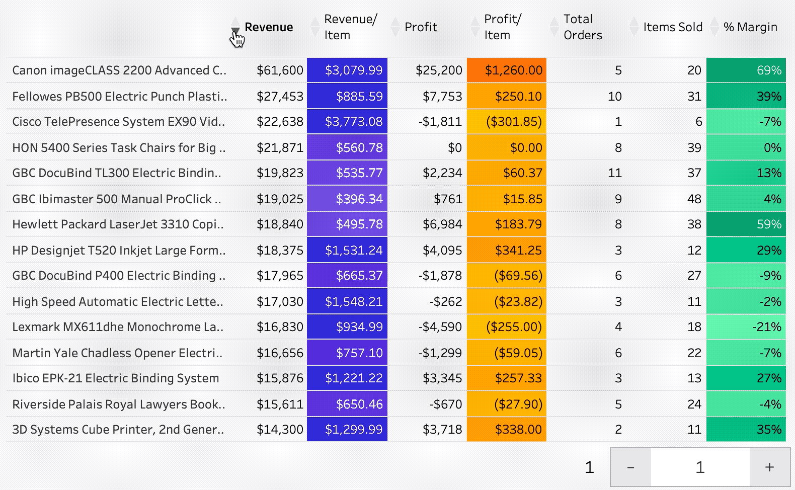
Here is the sheet we’ll be creating:

Building this header will take time but the payoff is completely worth it. Not this is probably not the answer for gigantic tables with lots of measures, but if you are making data strategically available through tables: this is your solution
Also, if you take a look at the image above: there are 7 measures listed on columns. There will be one per measure you plan on putting in your table. And remember: you have to create this same set of calculations for each measure you add. So there will be work involved.
Step #1: Build the column values.
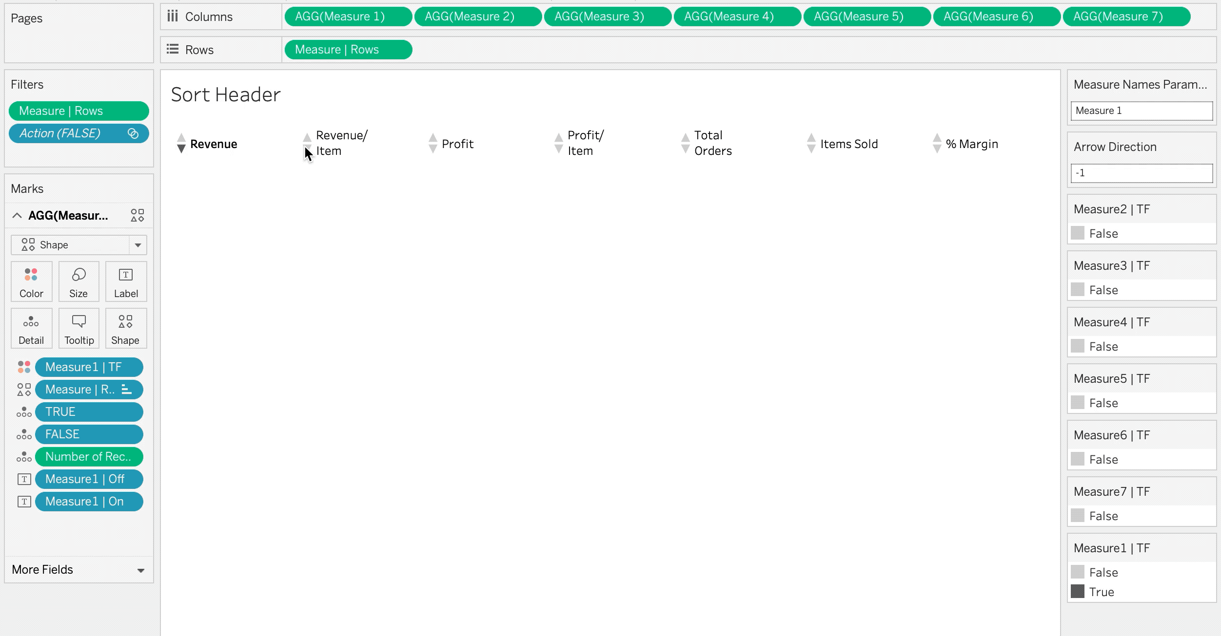
For every measure you add to the header you will need to build a new calculation. My best recommendation is to not name these by the fields they will represent, rather label them as “Measure1”, “Measure2”, ect. This will make it easier if/when you have to change the measure. For our column value create a new calculation called [Measure1] and set the value to MIN(0.0). You will do this for all of your measure calculations.
// Measure1
MIN(0.0)
That means as you add measures you’ll just name them [MeasureN] and set each t0 MIN(0.0).
Create as many as you need and add them to columns.
Step #2: Build the row values.
To create the rows value you will only need one calculation. For the calculation you will need to pick a dimension with at least 3 members. Create a calculation called [Measures | Rows] and place it on rows.
// Measure | Rows
IF [Category] = "Furniture"
THEN -1
ELSEIF [Category] = "Office Supplies"
THEN 1
ELSEIF [Category] = "Technology"
THEN 0
END
Add this calculation as continuous to rows. Also add the calculation to filters and remove the null values. Also change the mark type to shape and add [Measure | Rows] to shape. Change the shapes to filled up, filled, down, and for the 0 value set the value to a transparent pixel (which you can add as a custom shape).
This gives you unformatted arrows with no text.
In the next section we’ll master arrow color.

Step #3: Add actions to drive sorting and color
You’re going to create two string parameters with no values in the parameters. Call one [MN Parameter] for measure names and the other [Category Parameter]. where we’ll update this parameter with a category value (the same one that gives us the arrows). Add [Measure Names] and [Category] to detail of all of your marks cards.

Add [Category] to detail.
Add dashboard (and worksheet) actions so that when a [Category] is selected it updates the [Category Parameter]. Add a second action so that when [Measure Names] is selected it updates the [Measure Names Parameter].

These actions are critical to the next two parts of functionality we add: highlighting arrows and bolding text. You are going to create 3 calculations to execute this functionality: one for the arrow ([Measure1 | tf]), one for the selected measure ([Measure1 | On]), and another for the deselected measure ([Measure1| Off]). Here are the three calculations:
// Measure1 | TF
IF [Measure Names Parameter] = "Measure 1"
AND [Arrow Direction] = [Measure | Rows]
THEN [TRUE]
ELSE [FALSE]
END
// Measure1 | On
IF [Measure | Rows] = 0
AND [Measure Names Parameter] = "Measure 1"
THEN "Revenue"
END
// Measure1 | Off
IF [Measure | Rows] = 0
AND [Measure Names Parameter] != "Measure 1"
THEN "Revenue"
END
TRUE and [FALSE] is equal to FALSE. Edit the text so that the two measures are on the same line and bold the on text.

Edit the color. If you add more measures to columns your color will be false. Click on one of the marks for that measure and the colors should change and you should be able to match them.
Step #4: Build the sort calculation
You have a functioning sort header, but you need to have the actions tie to to the sort in the table. You can do that with I’ll do this with two calculations. First let’s use measure names to drive the aggregation (title it [Sort Base]):
//Sort Base
CASE [Measure Names Parameter]
WHEN "Measure 1" THEN SUM([Sales])
WHEN "Measure 2" THEN [Revenue/Item]
WHEN "Measure 3" THEN SUM([Profit])
WHEN "Measure 4" THEN [Profit/Item]
WHEN "Measure 5" THEN COUNTD([Order ID])
WHEN "Measure 6" THEN SUM([Quantity])
WHEN "Measure 7" THEN [Profit Ratio]
WHEN "Measure 8" THEN INT(MAX([Order Date]))
END
Be sure the text in WHEN matches the measure name and the calculation matches how you want to sort.
//Sort
IF [Category Parameter] = "Office Supplies"
THEN -[Sort Base]
ELSE [Sort Base]
END
Now just edit the sort of your table to sort on this calculation.

Step #5: Bring the header and the sheet together on a dashboard.
Remove the padding between the header and the table. Adjust the left and right padding so that the sections of the table align with the headers.
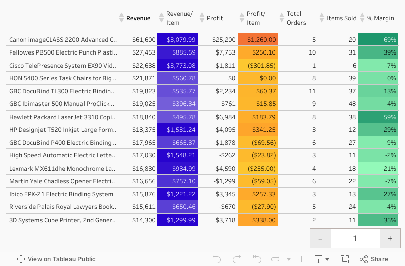
This produces the following dashboard:


