

- What chart type is used the most when displaying data?
- What chart type is the hardest to design?
- What chart type is the least customizable?
The answer to all these questions is the same; it is the table. Since the beginning of time the table has been the most hated form of data visualization. For analysts, trying to communicate something special about their data gets lost almost in an instant. And whether we’re using Tableau or PowerBI most information is still shared in this form.
One thing is for certain: it’s not just the savvy analyst who thinks tables are soul-sucking to create: almost all digital-centered designers think the same too. But here’s the reality: people use tables. They use them because it informs their decision making. It’s our job as practitioners to provide them with the tools that allow them to do their job. If that means making tables, then we should make tables!
We’ve started this series because there is no definitive source for helping to create tables in Tableau. Rather than wait for product improvements we’ve decided to take tables head-on. Over the course of this series we will show you different ways to improve the design of your tables so that they are more engaging for your users. By the end of this series you will be building dynamic tables that highlight key insights while retaining the format of a table. This first post goes in-depth on how experts in user experience and user interface think about creating tables. From there we’ll see exactly what’s possible in Tableau, identify gaps, and hopefully create new solutions.
A quick search of the web on designing data tables will point out one thing: designers have spent a lot of time thinking about how to design tables. In fact, thousands of articles to sift through.
So what makes a great table?
Principle #1: The purpose for the table is extremely clear
It’s easy to provide a table of data for any audience, it’s another thing to figure out the exact needs of the audience and then tailor the output of the table so that key insights are highlighted while additional data provides context. Maybe that key value is total customers. Maybe it’s a change in customer from the previous month. Maybe it’s the change in total customers from the previous month compared to the same change a year ago (delta of a delta). How we develop tables with customer data will look different for each of these three objectives!
Principle #2: Tables need to be extremely flexible and adaptive
- sort rows
- re-order or add columns
- resize columns.
- freeze row and column headers.
- change the density of the number of rows displayed.
Principle #3: Tables need pagination

Principle #4: Tables need filters (but filters shouldn’t be the star)
We’ll also come back to this one as a separate article in our series.
Principle #5: Tables should be able to perform bulk actions
Principle #6: Tables need context.

Principle #7: Tables formatting needs to maximize readability.
The reminder of this post will be dedicated to the components that help maximize readability of tables.
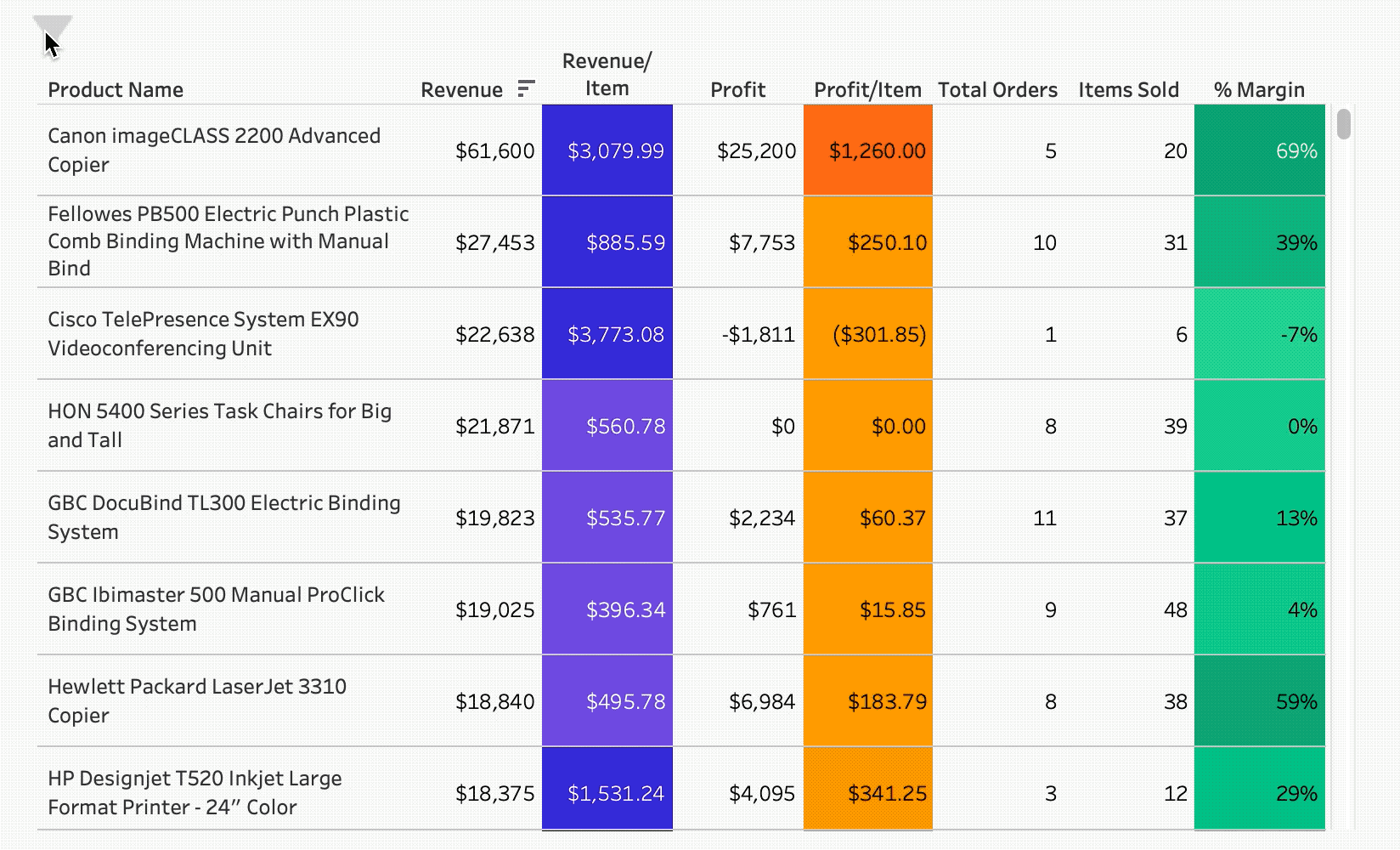
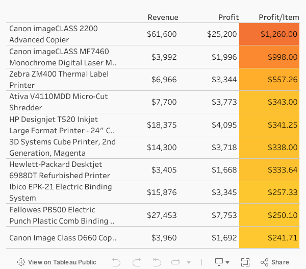
Let’s start with a table we are all guilty of making at some point in our careers: the small-font, information-dense table.
In this example we’re not thinking at all about the end-user or how we could design the table to improve decision-making using the table. Our only thoughts are: how can we cram information into this table so I don’t have to think about it ever again. But tables can be useful. And we shouldn’t care about space because we basically have as much space as we want; it’s digital, it’s not paper, so don’t be afraid to use pixels for good.
So what are some easy things we can do to maximize readability of our tables?
Tip #1: Make font sizes readable.
Tip #2: Distinguish headers from the body.
Tip #3: Add spacing and padding to rows in the table.
Tip #4: Choose table-friendly fonts.
What's next?
In the next posts, we’ll dive into each of the different key principles.


