

In this post we continue our ultimate guide to tables in Tableau by discussing how to change the number of rows displayed in a table using Tableau.
As we discussed in the last post, sometimes our tables are too long in Tableau and we want to reduce the number of rows we show at a single time to our audience. We can do this with pagination (like the previous post) but we can also can do this by specifying an action on the number of rows to show! This blog post will show you how how to create this:

This action is great when paired with pagination (from the previous post). If you haven’t caught on, I really, really, think you should combine both to make amazing tables!
This solution requires 2 sheets: one for the table and one for the control. If you are continuing from building from the previous post you can move to Step #3.
For this example you’ll utilize the Sample – Superstore dataset.
Step #1: Build the base table
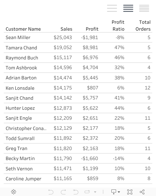
Add [Customer Name] to rows. Sort this dimension descending using sum of Sales.
Next you’ll create the measures that will be on the table. You’ll then use [Measure Names] and [Measure Values] to build the table.
This table includes total sales, total profit, profit ratio, and total orders. Sales and profit are base measures, but you’ll need to build profit ratio and total orders. Here is profit ratio:
					// Profit Ratio
SUM([Profit])/SUM([Sales])
And total orders:
					// Total Orders
COUNTD([Order ID])
Now bring [Measure Names] to columns and [Measure Values] to text. Be sure that SUM(Sales), SUM(Profit), Profit Ratio, and Total Orders are in the [Measure Values] card.

Step #2: Build the framework for the control
You’ll first create a parameter that will indicate how many rows to show. For this example you’ll specify 15, but you can change it later.

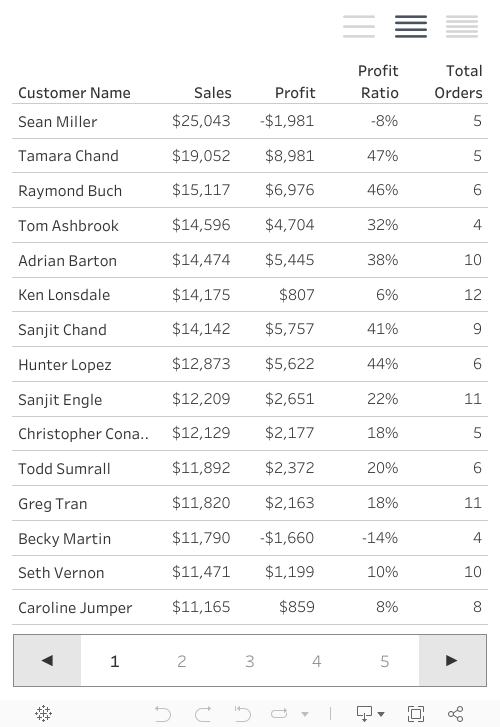
From here click-and-drag [Customer Name] to filters. Execute a Top N filter on sum of [Sales] and select [rows to show] to filter to the top.
Step #3: Build the controls
You’ll create a new sheet called Controls. For this example we are going to use the power of our own data to create a placeholder that will ultimately drive the changes in the number of rows shown. Since our control has 3 options we need to pick a dimension in our data with at least 3 values. In this case we are going to use [Category].
Create a calculation called [rows to show | update]. This calculation will drive your parameter updates to [rows to show] when we build our dashboard. When Furniture is selected 10 rows will show, when Office Supplies is selected 15 rows will show and when Technology is selected 20 will show. Don’t worry: you won’t see any of this on the dashboard.
					// rows to show | update
CASE [Category]
WHEN "Furniture" THEN 10
WHEN "Office Supplies" THEN 15
WHEN "Technology" THEN 20
END
Create an additional calculation called [rows to show | tf] which will be used to highlight–with color–the selected control.
					// rows to show | tf
[rows to show | update] = [rows to show]
Let’s build this thing! Place [Category] on columns. Change the mark type to shape. Place [Category] on shape. Add [rows to show | tf] to color. Add [rows to show | update] to detail as continuous value.
If you don’t have the following: create a calculation called [TRUE] where the calculation is TRUE and calculation called [FALSE] that is FALSE. Add these calculations to detail.
Now update your shapes with the following:


Assign Furniture the 3-bar menu, assign Office Supplies the 4-bar menu, and assign Technology the 5-bar menu. These correspond with the density of the charts.
Don’t forget to also update the color so that the true value is a dark gray and the false value is a light gray. Remove borders and lines. Drop the category header, as well.

Step #4: Build the dashboard
Add the two sheets to the dashboard. I’m placing the controls above the table, but they could go below as well. Format so the buttons are big enough to operate with. I’ve got left- padding on the dashboard at 325px (and the dashboard is 500px wide).

Step #5: Build the interactivity
Now you will add interactivity with the controls. You’ll also add the automatic deselecting of marks.
Add a parameter action. When you select a value on the control update the [rows to show] parameter with the [rows to show | update] measure.

Also add a filter action. On select of the control sheet on the dashboard update the control sheet itself where TRUE is pushed to FALSE.

This produces the following dashboard:
So whats the final result with pagination and row density control? This table:
What's next?
In the next posts, we’ll dive into creating next-level filters for tables.
Do you have more questions about Tableau? Talk to our expert consultants today and have all your questions answered!


