Chart Talk! is a series of posts exploring when and how to use different charts and design principles, primarily in Tableau (although general principles can be applied anywhere). In this series we will discuss appropriate use cases for a given chart and provide detailed explanations on how to build them in Tableau.
For this first installment, we will go over a favorite of mine: Small Multiples. While not a specific type of chart, such as a bar chart or scatter plot, small multiples is a technique for displaying an array of charts in a grid format. Small multiples are also commonly referred to as trellis charts, lattice charts, grid charts, or panel charts.
The term “small multiples” was first popularized by the noted academic Edward Tufte, who wrote:
At the heart of quantitative reasoning is a single question: Compared to what? Small multiple designs, multivariate and data bountiful, answer directly by visually enforcing comparisons of changes, of the differences among objects, of the scope of alternatives. For a wide range of problems in data presentation, small multiples are the best design solution.
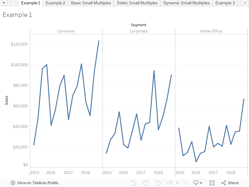
Let’s look at the chart below, built using the Superstore data set in Tableau. In this chart we have three line charts, one for each partition in the Segment dimension. Since the y-axis, Sales, is the same across all segments, we can instantly see how the three segments compare to one another.

A simple small multiples grid in Tableau. We can easily compare sales across each segment.
The example above shows how a small multiples grid can facilitate comparisons across a small number of partitions. But what happens when you want to compare, say, 16 elements at once? Having a single row or column with 16 individual elements might be okay in some cases, but in general it will be too cluttered to be the best solution.

A small multiples grid with 16 partitions. This view is too cluttered.
Instead of having all elements of the small multiples in a single row or column, consider arranging them in a two-dimensional grid. By arranging the panels into a 4×4 grid, we can much more easily read the charts in the individual panels. One downside to this arrangement is that it becomes more challenging to compare data across rows. For instance, for the most recent time period, which state had higher sales: Michigan or Arizona?
When designing a visualization, you have to make sure that the design you choose is appropriate for how it will be displayed and for who will be consuming the visual.

The same data as before, but now in a 4×4 grid.
So, how do I build a small multiples grid?
There are several ways in which a small multiples chart can be built in Tableau. Which you choose to build is largely dependent on what your desired end product is.
No calculated fields required
At their simplest, you can build a small multiples grid in Tableau in just a few seconds – with no calculated fields required. Using the Superstore data set, let’s say you want to see how sales have varied over the months, split by segment and category.
Begin by click-and-dragging Segment and Category from the dimensions list onto the columns and rows shelves. Then, click-and-drag Order Date onto either the columns or rows shelf. By default, Tableau will set it to YEAR(Order Date). You can change this by right-clicking the Order Date pill and selecting your desired date level. For this example we will use the continuous MONTH(Order Date) to see how sales have changed month-by-month. Finally, drag Sales from the measures list onto the opposite shelf from Order Date. Tableau will automatically give you SUM(Sales), but this can be changed by right-clicking the Sales pill and selecting your desired aggregation.

Your view should be similar to this.

Tip: Drag Order Date onto the columns/row shelf by clicking and holding the right mouse button. When you release it, you will immediately have the choice of which date level you want to display.
Other than polishing up formatting, we’re done. It’s that easy. From here we can quickly see how various product categories are selling in each of the three segments.
The image below is my final product, after applying formatting changes to the grid. Download the Tableau Public workbook to follow along if you need assistance.

A formatted and complete small multiples grid.
Static Rows and Columns
In the previous example we created a small multiples grid from two dimensions. But what if you want a rectangular grid from only one dimension? In this case, we will need to create two calculated fields. Each of the calculations will tell Tableau exactly where to place each member of the dimension in the grid.
In example above we looked at the top 16 states according to sales. To create the grid, create the following two fields:


The numbers in each line of the calculation indicate which row/column each state should be placed in. Tableau counts from the top left corner, so California will be placed in the upper-left-most panel, while Arizona will be in the bottom-right.
Begin to create the grid by dropping the Rows and Columns calculated fields onto the rows and columns shelves, respectively. Follow this by dragging State onto the Details mark, Sales onto the rows shelf, and MONTH(Order Date) (continuous) onto the columns shelf. Your view should look like this:

This is clearly not right yet. Since we only explicitly defined the placement of 16 states, that means that the other states were automatically assigned a NULL value. Since we don’t care about those other states in this view, right-click where it says NULL on either the rows or columns in the grid and select “Exclude.” Now your view should only have the four rows and columns that we defined earlier.
At this point all that is left is to format the grid to your liking. We recommend hiding the column and row headers, at a minimum.
The static method of creating a small multiples grid is fast and easy. However, the panes are limited to whatever has been coded into the calculated fields. If you want dynamic flexibility in the grid, move on to the next section.

Formatted static small multiples grid.
Formatted static small multiples grid.
The final way we will discuss to build a small multiples grid is slightly more complicated, but since it does not explicitly code elements in certain rows and columns, is more flexible.
Before we get started: if you’re using the Superstore data set in Tableau, filter the states to include only the 16 states listed above. We will explain why later.
In this method we will also build two calculated fields, one to define rows and one for columns. They are as follows:

Bring these two calculated fields onto the rows and columns shelves as we did in the previous section. Make sure both are set to discrete. Bring on the MONTH(Order Date) and SUM(Sales) as before.

This doesn’t seem right…
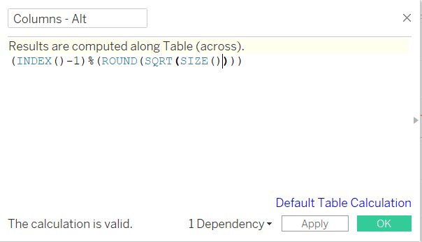
What went wrong? Notice the columns and rows calculations are green, indicating that they are continuous. Right-click each and set them to discrete. You’ll notice that it still doesn’t seem right. That is because we must bring a dimension onto the Detail mark and set each of the dynamic calculations to compute using that field.
Let’s bring State onto the Detail mark and set columns and rows to compute using it.
Your small multiples grid should now look like this:
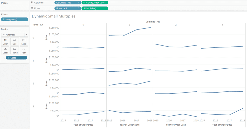
By default, Tableau sorts the states alphabetically.
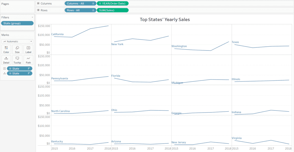
At this point you can go ahead and do whatever formatting you need, and call it a day. But what if you don’t want the states sorted alphabetically? Say you want to sort them according to sales in the most recent period. To do that, use the following formula:

It is important to note that the date level in this formula needs to match the date level in the view. Once you’ve created this calculation, right-click on State on the Detail mark, select “Sort” and sort by the sum of the field we just created in descending order. In Tableau 2018.3 it should look like this:

As mentioned above, there is a reason why we filtered to show only 16 states. With the dynamic row and column formulas, if any values in a partition are NULL, then the calculation doesn’t work correctly. Multiple different elements will appear in the same pane, which is not what we want. It is important to filter and/or aggregate dates to a higher level to ensure there are no NULL values present. In our example Order Date had to be aggregated to the year level, because some states had no sales in some quarters, months, days, etc.
Wrap Up
In this edition we looked at small multiples and how to create them in Tableau. Although the examples looked at line charts, you are certainly not limited to those for small multiples in Tableau. We encourage you to play around with the technique to find what works for your situation. Find the Tableau Public link below to see our work and examples of other small multiples.
Ready to add expertise to your data visualization projects? We are ready to help!