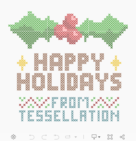
Our team wants to wish you a happy holiday and a prosperous new year!
For the holidays, we thought it would be fun to recreate a classic holiday sweater or cross stitch design in Tableau! Want to know how to make your own? It’s really pretty simple.
Step 1: Design it in Excel
Using an excel spreadsheet, use the Fill Color of each cell to outline the design you want for your cross stitch. I used a few actual cross stitches as reference. The colors are for giving yourself a guide for what you want to see in Tableau.
Once you have a design you like, label each color you use with either the name of the color or an indicator that you can use to color in Tableau. The labels are what we will use to actually link a color to a space in the cross stitch, so it is important you label each of them.
I’m not the best artist, but in the spirit of giving, feel free to download my Happy Holidays excel if you need a starting point.
Step 2: Pivot it
We’re going to use X and Y coordinates to plot your design into Tableau. To do that, we’ll need to pivot the data into those two columns. I’m using Alteryx to do this because I love Alteryx, but nearly any tool (including excel itself) could do the same thing.
In the workflow, which is screenshotted below, I am inputting my excel design and adding a RowID to support the transpose and create our first coordinate.
I’m using the RowID as a key coordinate in the transpose, with the rest as data items. After the transpose, the resulting “Name” value will be your end X coordinate and “Value” will be your colors. Now let’s go ahead and output as a simple excel or csv and head over to Tableau.
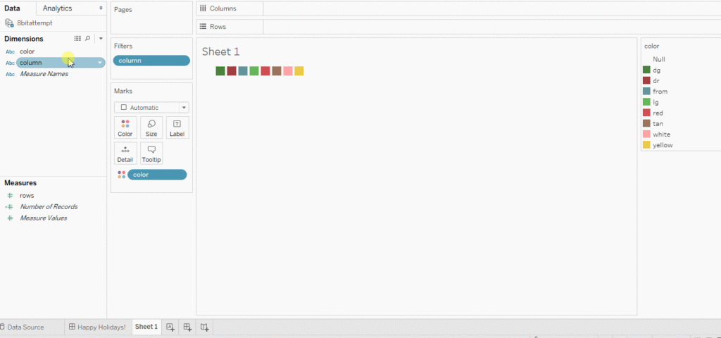
Step 3: Put it in Tableau
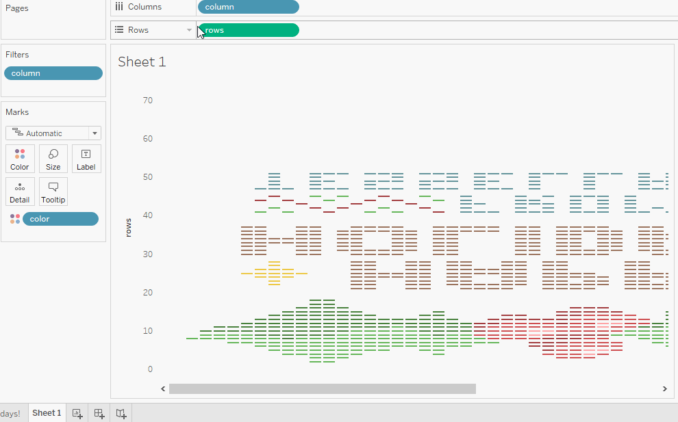
After importing your data, place your x and y coordinates on their respective axes and your color value on the color mark. Tableau auto-imported my rows as a measure, so I’m marking them as a dimension to stop the aggregation.
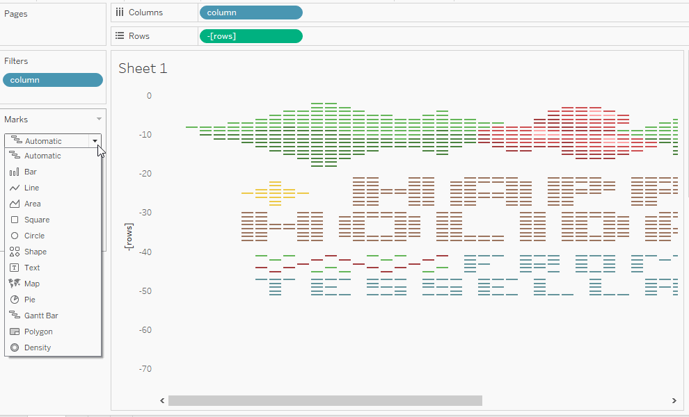
Looks great! Except it’s upside down. Oops. I’m just adding a quick in-line calculation to make it negative.
Now let’s change our Mark type to Shape and the shape to an “X”. This will give us a proper cross stitch look.
Now all we have left to do is hide the axes and any leftover lines, and change the color mark to the palette you prefer. And you’re done.
Need more help making your Tableau dashboards a work of art? Our knowledgeable team of Tableau experts is here to help!