

The Drill down control in Sigma Computing is a great tool that takes users from a very general overall view of data, down to a more granular view.
Drill downs offer users the option to dive deeper into the nitty gritty of their data with a simple click of the mouse. Control Elements such as this one give you the option as a Creator to offer your Viewers more interactivity.
For this walkthrough, we will be creating an example from the sample MLB dataset provided by Sigma on the sample Snowflake Data Cloud connection to drill down two levels, from Mlb League to Division, to Team.
To get started on your drill down control, you should first identify a hierarchy in your dataset that could be used in a drill down. Ask yourself, “How can we start off by showing the information to users at a macro level that will cover the main idea, while adding further context through more micro details if they choose to explore further?”
Step 1: Creating a Visualization for the Drill Down
To get the drill down control set up, select the table that contains the information that you will be using. To add a table:
- Click the + “Add element…” button on the top left of the page
- Click Table and select the table that contains the data you will be using
Once you have your table selected, follow these steps:
- Click the “Create child element” icon at the top right of your selected table
- Click “Visualization” to create a visualization from the data contained in your current table of choice
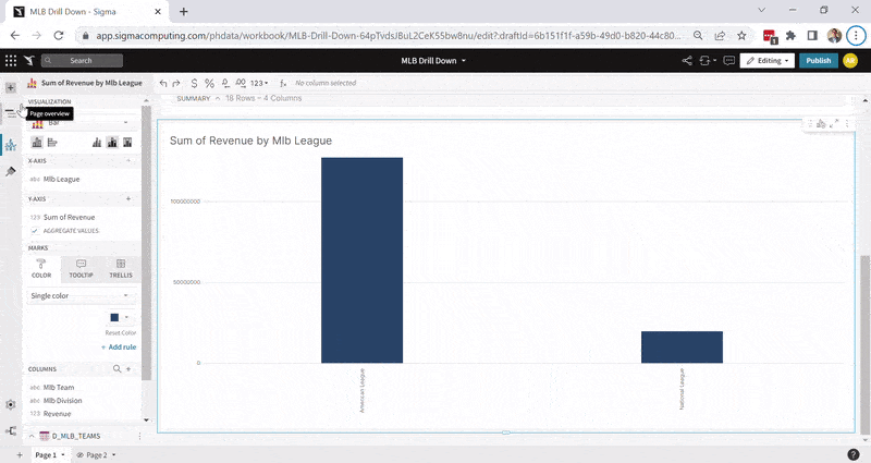
- Select the type of visualization; in this example, we will use a bar graph
- Add the data you need to create your visualization. In this case, we will add “Mlb League” to the X axis and “Revenue” to the Y axis.

Step 2: Initial Drill Down Control Settings
Having your new visualization created, you can now create the drill down control like this:
- Click the + “Add element…” button on the top left of the page. You will have many options available, including the one you will click, the “Drill Down” option under the Control Elements section.
- You will have a new control box appear where you must configure the Settings and Targets tabs. Under Settings select the Value Source drop-down, which will give you the option to select the Data Source or Data Element you desire. In this case, we will continue to use the table that we used to create the visualization.
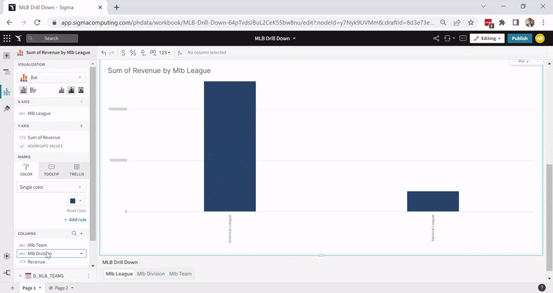
- You can now add your Drill Categories, which determine how in-depth you want your granularity to go. These categories will be the columns you want to drill into. In this example, we will need to go from League to Division to Team, so using the plus sign for Drill Categories we can add these three columns.
- You can also name your drill down control under Control ID. Renaming the control ID will help your users understand the purpose of the control.
Step 3: Adding Targets to your Drill Down
In the Targets tab we will connect to the visualization we created. The target is the visualization element we want to be affected when clicking the different drill down options.
Click the “+ Add Target” button, and select the name of the Data Element visualization that you want to drill into. Each category in the Target should match the name on its respective drop-down list. If it doesn’t automatically populate, you can use the drop-down menu to select the correct option.
Your Drill Down should be all set up now. You can now head to the drill down options you created in your control to see how you can expand the detail of your visualization. The image below shows how we match the categories to the drop-down options.

Step 4: Color is a Great Tool for Quick Visual Distinction (Optional)
In the example below, our hierarchy structure flows from revenue data at the League level, which offers two results. We can then drill down to the Division level which breaks down the data into three results, and lastly, the team level offers 18 total results.
To take it one step further and help distinguish more detail visually, we can add Mlb Division to color in our bar graph visualization. This will help us identify what amount of revenue came from which Division at the League level, and at the Team level we can see what Teams belong to which Division as well.
Closing
The Drill Down control is great for offering flexibility to a broad range of end users; from the curious to the deeply analytical ones. Having your data organized, as well as easily accessible is key to encouraging your users to be well informed.
Data that is easy to navigate will help you arrive at your end goal more efficiently. Another useful tool to help you filter data is offering Date Filters in your workbooks. You can check out more on how to use Date Filters in Sigma with our blog detailed blog post.
FAQs
The drill down option will allow you to add as many layers as you would like, however, the idea of the drill down option is to add value when it is needed and it makes sense. When data becomes so granular that the details become overwhelming and difficult to read, it might make sense to look for an alternative. Perhaps splitting off the in-depth details to a table instead will make it easier to read and analyze. The goal is to facilitate the interpretation of the data to the end user.
Drill downs are designed to be used for visualizations, so they will not work for tables. However, a similar concept can be created for a table through Grouping, which is an option that Sigma offers us to group everything that falls under a certain category inside one column. Under this grouping option, we also can create Grouping Calculations which in essence become subtotals that help us summarize portions of the columns in our table. A second option would be using a pivot table which is another Data Element option that Sigma Computing offers us.


