

Fitting all the details you want displayed about a certain data point in your report can be a struggle. Often, it’s getting to that next level of your data’s granularity that is the tricky part.
You can use drill throughs, but users may not be entirely comfortable with this more complicated feature. Instead, tooltips can be a powerful, yet simple way to display more detailed data without too much hassle. Tooltips are commonly referred to as the information that pops up when hovering over a data point in a report or a dashboard.
Thankfully, Power BI allows you to embed report pages as tooltips when hovering on your dashboard (Tableau users know these as “viz in tooltips”). In this blog I will give you step by step instructions on how to create them!
What is a Report Page Tooltip?
A tooltip is anything that pops up when hovering or clicking on a chart element within your report or dashboard. These pop-ups often give you more detail about whatever part of the chart or table you are focusing on. As you can see below, in the standard Power BI tooltip, the fields that are within the visualization show up in your tooltip. You can also add fields to go in your tooltip in the field next to the red arrow.

Tooltips are very important to any visualization as they allow users to see very granular details about the charts on your report. Using tooltips properly can be the difference between an end-user understanding a report or being thoroughly confused by it. A report page tooltip is not just going to show your default tooltip values, it will actually show a different report tab within the tooltip area. Thankfully, Power BI makes it easy-to-use report tab tooltips.
Step #1: Determine Tooltips Needed
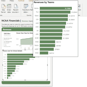
The first step in creating a good report tab tooltip is determining where a report tab tooltip makes sense. In the example below, we have a bar chart that shows revenues by NCAA Conference. A natural next level of detail is to show the revenues by the schools that comprise each conference.

Besides being a feature that your end-users will find cool, this is useful because it allows your users to see both your top level of aggregation at the same time as your next level down.
Step #2: Create Report Tabs for Tooltips
As the name implies, report tab tooltips require a tab in your report that will be used specifically for your tooltip. First, let’s set up our tooltip page. Create a new report page, then click on the Format ribbon of the Visualizations pane and go to the Page Information section. Turn the Tooltip toggle On.

Next, in the same pane, go to the Page Size section and select which size you want your tab to be. There is a drop-down option for tooltip which will automatically format your tooltip to 320W x 240H pixels. You can also choose a Custom size. In our example, because the bar chart is slightly larger, we set our height to 400 pixels.

Now let’s add the chart type you want to see when hovering over the chart in the primary tab. This is where we will include the next level of granularity in our chart. In this example we used the School field to create a bar chart showing the revenues by school. Even though at first our chart on the tooltip tab is much longer than the space we’ve allotted for, we know that when the primary page filters down this chart that it will size appropriately to the page.

Now let’s add this tooltip to our primary page!
Step #3: Adding Tooltip to Primary Page
Navigate your primary page and click on the chart you want to add the tooltip to. Go to the Format ribbon and scroll down to the Tooltip section. In the Type drop-down you want to select the Report Page option so you know the tooltip will point to a tab in the report.
Next, select which page you want referenced in your tooltip. In the example below, we named the bar chart showing team revenues as the Teams Tooltip page. You can see that we’ve selected that page in the drop-down below.

Now hover over the different bars in your bar chart and you will see the breakdown of revenues by schools in that conference. If you go to the Fields ribbon, you can see that the report page is now in the tooltip section. By hovering over the conference in the original bar chart, the tooltip tab is filtered down using that conference value showing only the schools associated with that conference.
The last thing you will want to do is hide the tooltip pages that you created so that they don’t show up as individual pages in your report when you publish it to Power BI Service.
Thanks so much for reading! If you’re interested in learning more about Power BI, be sure to visit our Youtube page and follow along our blog. If you need expert help, don’t hesitate to reach out!


