

Tooltips in Power BI are a simple feature that is often underutilized. If leveraged correctly, they can give your reports and dashboards that extra oomph your users didn’t even know they wanted. The purpose of this blog is to not only show you how to set up standard tooltips but also to show you how to create tooltips that take your reports and dashboards to the next level by adding an extra layer of context.
What are Tooltips?
Tooltips are a sophisticated way of providing additional contextual information to data points on a visual that may be missing on the surface when simply looking at the visual. If activated, a tooltip will appear when a user hovers over a data point on a visual with their cursor to reveal the specified details about that specific data point.
How to Customize a Standard Tooltip
Let’s say we have a simple visualization that displays Sales by Region. If we hover over one of the columns on the visualization, the tooltip will display the Sales for that particular Region for the year 2019 – as shown below. Tooltips should default to being turned on; however, if you don’t see them, there is a toggle switch in the formatting panel.
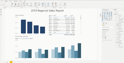
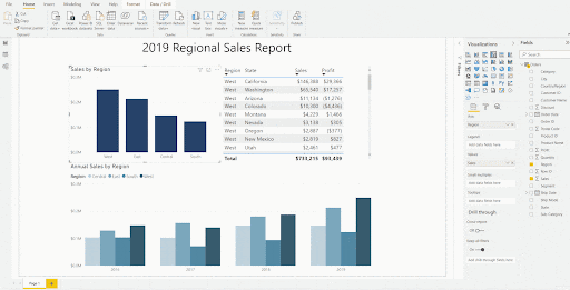
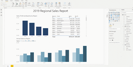
Sales and Region are available by default in the tooltip because they are the fields used to create this visualization. If we want to show additional detail in the same tooltip, for example, Profit and Quantity, we simply need to drag those fields from the list onto the Tooltips section of the fields panel – as shown in the example below.
Pro-tip: anything in a visualization’s additional properties (ellipses on the visualization) can be used with any of the values you have in your tooltips, including:
- Sort by
- Export Data
- Show as Table (example in the GIF below)
How to Create a More Robust Tooltip
If having the extra fields in your tooltip simply isn’t enough, we can specify entire sheets or other visualizations on a sheet to appear as a tooltip. To accomplish this, follow the steps below:
1. Add a new sheet with the formatted visualizations needed as the tooltip (I titled this additional sheet “Tooltip”).
2. Without having any of the visualizations on your Tooltip sheet selected, open the Page Information section of the formatting panel and toggle Tooltip to On.


As long as the connections in the data model are set up correctly, the detail in the tooltip will automatically filter to the data points that your users hover over.
In Closing
Tooltips are an easy way to provide additional context to your reports without using limited canvas space. They can also be strategically leveraged for more than just a popup window with more detail. Add fields to your tooltips so you can sort visuals by more than what’s already on them, and so you can export or view the data as a table with the additional fields. Whether you’re using the default tooltip, adding more fields to the standard tooltip, or using visualizations from another sheet as your tooltip, it’s an important feature that can only enhance the usability of your reports and dashboards.
FAQ
As of now, that is not a supported feature. You would need to recreate that visual in the same workbook as the tooltip it’s needed in.
Yes. The Tooltips sheet size is perfect for one visualization. However, if you want multiple you can use a different sheet size and add them (be careful not to use too many as there is a maximum size for tooltips).


