

What are Isotype Plots?
Isotype plots are a blend of visual language that emphasizes quantitative data with symbolism that is often associated with descriptive imagery. If you wanted to simplify it its very similar to a pictogram.
This is such a good use of ISOTYPE. https://t.co/xW3Pe3xyoI pic.twitter.com/j7NZWaYF1q
— Elijah Meeks (@Elijah_Meeks) August 31, 2020
The example above by Jason Forrest and McKinsey is a great example. But how do you do this in Tableau?
Caveat: You need at least 10 values per member to create this chart type (unless you are going to have a different number of images displayed). This shouldn’t be an issue if you are showing averages because any less would be inappropriate to report on. If you’ve got data that is already rolled up to a single row of data, then this will not work for you.
Step 1: Create the Background for the Isotype
Create a calculation called Isotype.
					// Isotype
FLOAT(IF INDEX() <= 10 THEN INDEX() END)
1a. Add Isotype to columns.
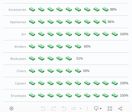
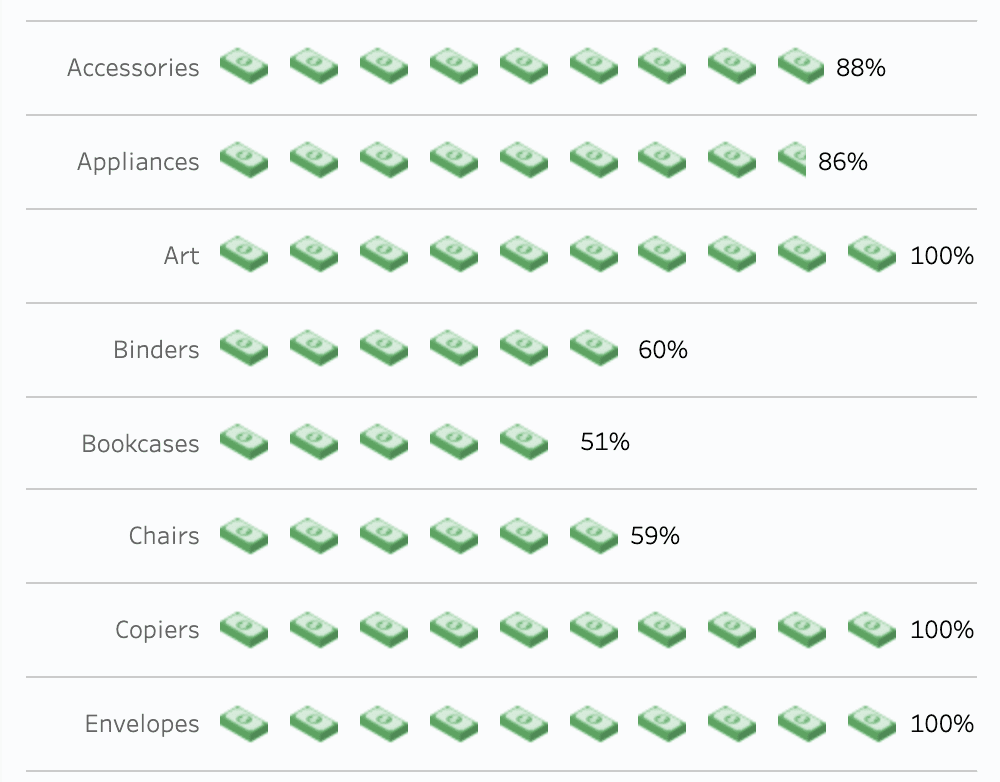
1b. Our example shows the percent of orders that were profitable by Sub-Category.
1c. Add Sub-Category to rows. Also add Order ID to detail on the marks card.
1d. Edit the table calculation on Istotype and select Order ID.
1e. Change the mark type to shape and choose a custom shape.
1f. Set the range from 0.5 to 11.5.

Step 2: Create the Focal Metric
Create your metric: percent of orders that are profitable. This is a percentage that ranges from 0% to 100%. Call the field Order | Profitable.
					// Order | Profitable
COUNT(IF [Profit] > 0 THEN 1 END)/COUNT([Orders])
Step 3: Create the Block
The block will cover some (or all or none) of the pictures that are on the worksheet. We’ll also show labels (which are difficult) Create a calculation called Block.
					// Block
FIXED [Sub-Category] : 10*[Order | Profitable]}
3a. Add block to columns.
3b. Create a dual axis.
3c. Set the axis from 0 to 11. Do NOT synchronize the axes.
3d. Set the mark type to gantt.
Step 4: Add Detail to the Block
The labels can be challenging but you can use a little trick to make the labels more intuitive. Create a calculation called Orders to show.
					// Orders to show
IF [Order ID] = {FIXED [Sub-Category] : MIN([Order ID])}
THEN "A"
ELSE "B"
END
Add this calculation to the Block marks card.
Step 5: Size the Block Bars
We’ll size the gantt bars now. Create a calculation called size.
					// size
IF [Order to show] = "A"
THEN 0
ELSE 10*(1 - {FIXED [Sub-Category] : [Order | Profitable]})
END
Add to size on the gantt bar chart. Match the color of the bar to the background.
Step 6: Add Labels
Create a calculation called Labels.
					// Labels
IF [Order to show] = "A"
THEN {FIXED [Sub-Category] : [Order | Profitable]}
END

Add the calculation to label on the gantt marks card and right align the text.
The result is an isotype.
Thanks so much for reading! Need more help making your Tableau dashboards a work of art? Our knowledgeable team of Tableau experts is here to help!


