Welcome to the 8th post on improving parameter design in Tableau. So far we have discussed:
- how parameter formatting hasn’t improved over time and gave one possible design solution and wrote a how-to on the topic.
- the need for toggle buttons for boolean values and give an example.
- the need for linked parameters–how parameters interact with each other and respond to each others values and build it with multiple sheets.
- how to create a slider that you can format. This used external data but was linked via a parameter action.
- the need for vertical sliders and how to create them.
- how to create multiple-select parameters.
- the need for horizontal listed parameters and need for more design sophistication with rounded corners. We covered off both ideas in a single how-to post.
For this blog post I wanted to extend our post on multiple-select parameters and apply the same use case to legends on a dashboard. Right now legends are pretty static in Tableau. Unless you edit the base xml of the file you are always going to end up with a square with a description of the value to the right.
While the legend is serving it’s purpose, I believe that it can be significantly improved on using parameter actions. I think the legend should be more interactive. We should have the ability to turn a set of marks on or off with a click of a button. Note: Currently selecting a value highlights that value–this is a nice feature, but it’s still a little clunky with the black outline around the selected values, in my opinion.
In this tutorial we will build the following parameter-driven legend that will allow to select or deselect any value in the “legend”.
Step #1: Build a visualization where you will eventually apply the parameters.
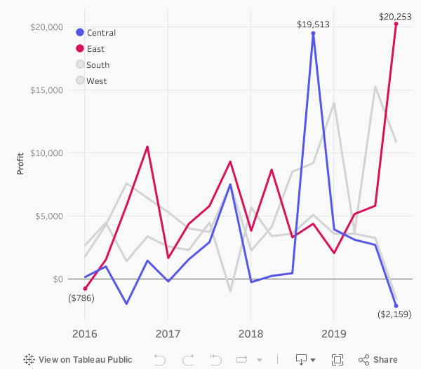
For this example we’ve built a line chart of profit by quarter and colored by sales region.

Step #2: Create string parameter.
Type in each member of the [Region] dimension. Add a comma with no space between each member; East,West,Central,South.
Name the parameter [Region Multi].

Step #3: Create a calculated that links the parameter to the original calculated field.
Let’s call this calculation [Region Multi | TF]. Here is the calculation:
// Region Multi | TF
CONTAINS([Region Multi], [Region])
This calculation looks in the parameter for any text that matches with a region label. We will want to show a value in the parameter when it is selected. We’ll do that with our next calculation.
Step #4: Create a calculation that shows a member when it's in the parameter and says "OFF" for all members not in the parameter.
Here we will leverage the previous calculation to drive which regions we will see. This calculation will ultimately drive our color decisions on our dashboard so let’s call it [Region Multi | Color].
// Region Multi | Color
IF [Region Multi | TF]
THEN [Region]
ELSE "OFF"
END
Step #5: Build the legend.

Step #6: Create the parameter action calculation.
This is the calculation that will ultimately drive our parameter actions. We want the ability to remove member from the list when it’s there or add a member if it’s not there. Let’s call the calculation [Swap Region]:
//Swap Region
IF CONTAINS([Region Multi], [Region])
THEN REPLACE([Region Multi], [Region]+",","")
ELSE [Region Multi] + [Region] + ","
END
Once you’ve created the calculation, add the calculation to the detail of both marks cards.
Step #7: Build the dashboard.
Add both the chart and the legend to the dashboard. Format appropriately. You will likely need to float the legend over the chart you would like the legend to appear. You can remove the original legends.
Step #8: Add a parameter action on the dashboard.
Setup the parameter action so that when you select a value on the legend sheet the [Region Multi] parameter will update with the [Region Region] calculation.

Step #9: Add a filter to automatically deselect the slider after a click.
This is one of my favorite techniques for automatically deselecting marks. You can read about it in detail here.
First create two calculated fields. One called [TRUE] with the value of TRUE and the other calculation of [FALSE] with a value of FALSE. Add these calculations to detail the legend visualization.
Add a filter action. Select the color sheet on the dashboard. Run the action on select. Set the target dashboard to the color sheet–not the dashboard. Show all values when clearing the selection. Target filters will be [TRUE] for source and [FALSE] for target.

Step #10: Only show labels when they are in the set.
For the last part of the post I only want to show labels when they are turned on. I can do this by utilizing our [Region Multi | TF] calculation. Let’s call the calculation [Profit | Region Multi]:
// Profit | Region Multi
IF [Region Multi | TF]
THEN [Profit]
END
Let add this calculation to text of the line plot. Let’s also replace [Region] on color with [Region Multi | TF].
That’s it! We’ve created our interactive legend!
Takeaways
The current legend functionality of highlighting values. This post shows you how to turn off and on colors of a legend using parameter actions. We will wrap up our series on improving parameter experience in our next blog post!


