

Tableau dashboards display data visualizations that answer your business questions about a specific use case, business, or industry. One of my favorite parts about using Tableau for visualization is the freedom and flexibility to customize my dashboards. Tableau has a great selection of color palettes, shapes, and more built in to make a beautiful dashboard, but often you need something more tailored to your use case and your company. In this post, I will outline some of the ways to customize your Tableau dashboards by implementing:
- Custom Shapes
- Custom Color Palettes
- Custom Fonts
In this post, I’ll be using a dashboard I made for Tableau Public as an example, but these techniques can be easily applied in a business setting to abide by a company’s branding conventions and color palettes.
How to Use Custom Shapes in Tableau
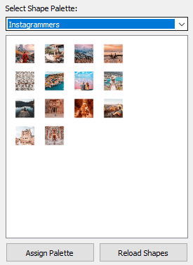
Shapes are some of my favorite tools to add modern design elements to my dashboard. For example, in my Instagram dashboard, I wanted to create a grid that would look similar to an Instagram feed. Using shapes allows for more interactivity, such as filtering, than a traditional image would.
In a business context, you can use shapes like arrows, check marks, or other call outs to draw attention to certain data points or encourage navigation or drilling into the data.
Once you have the shape you’d like, navigate to your “My Tableau Repository” folder and find the “Shapes” directory. You can save or paste your image files in this directory, or create a new directory to organize your shapes. In this case, I’ve started an Instagram directory.

The next time you open your shapes window, click “reload shapes” and you will find your custom shapes ready for use!
How to Use Custom Color Palettes in Tableau
You always have the option to change your color, whether it is sequential, diverging, or categorical, in Tableau Desktop. However, you have a lot more control and flexibility if you create your own custom palette using your Tableau preferences document.
Your Tableau preferences document can be found in your “My Tableau Repository” folder. Right click this document and open it with a text editor, such as Notepad or Notepad++.

If you’ve never edited your preferences document, you’ll find a pretty empty XML file. You’ll want to add the following lines:
					<workbook>
<preferences>
This is where your custom color palettes will go.
</preferences>
</workbook>
Your custom palettes should use the following syntax:
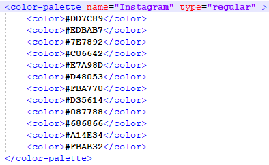
					<color-palette name="Your Palette Name" type="type of scheme" >
<color>#HexCodeForColor1</color>
<color>#HexCodeForColor2</color>
<color>#AsManyColorsAsYouNeed</color>
</color-palette>
Palette types include:
- regular (categorical)
- ordered-sequential (sequential)
- ordered-diverging (diverging)
Here’s an example of the finished categorical color palette I used for my Instagram dashboard straight from my preferences document.
After you have the palette you want in your document, save it and restart Tableau Desktop. Then you’ll find all of your new custom palettes in the color mark!

PRO TIP – If you’re having trouble finding a set of colors that you like, think of a website or photo – anything you can screenshot! – that you might want to emulate. Take a screenshot, paste it into any photo editor, and use the color picker tool to pull out colors that you like and get their HEX code. For the above palette, I used the color picker to create a palette off of my Instagram shapes.

How to Use Custom Fonts in Tableau
Of all of these, custom fonts can be the most difficult because depending on how and where a visualization is rendered, fonts will look differently on different computers. That is why when using custom fonts, it is usually best to do all of your writing in a photo-editing program, rather than in Tableau. It doesn’t need to be anything fancy; I use Paint.NET because it’s easy to use and free.
I like to source my fonts from Google Fonts, because it is free and quick to find something you like. Of course, for Instagram I chose Pacifico because that is the font used for their logo. Once I have the font I want, I use my editing software to start typing out what I want.

PRO TIP – I always like to use a transparent background so I have flexibility with my sheet color and where I place the text. To achieve the transparent background, create a blank layer on your photo project where you will type whatever you would like on your dashboard. Then, delete (X) the “Background” layer so there is nothing behind your text.

Once you have the text saved, place it on your dashboard as an image object and you’re good to go – no need to worry about pesky rendering!

Closing
Adding custom shapes, color palettes, and fonts are a great way to add finishing touches of branding to your dashboards. You can use this practically to ensure your Tableau work aligns with your company’s branding, or for fun Tableau Public vizzes like these!
Need more help making your Tableau dashboards a work of art? Our knowledgeable team of Tableau experts is here to help!


