

So you want to build a color palette for Tableau? This post isn’t going to show you how to add a custom color palette. You can read about that here. This post also isn’t going to go in-depth with color theory and doesn’t allow you pick colors based on some of those ideas.
This post will take you through a process of how color palettes are built for our clients by discussing the recent palette created for #WorkoutWednesday.
Tip #1: Get your hands on any official brand standards
Always start with existing style guides or brand standards that exist for an organization. If it exists it’ll give you some base colors. Most brand standards will give you the base corporate colors and font(s) to use. Good brand standards provide additional colors that you can use in charts (use these!). Great brand standards include text that articulates what energy or emotion they are attempting to elicit from their audience.
Understanding how you are attempting to convey a message is at the heart of building a color palette. Are you trying to convey a level of seriousness? Modernity? Casual? Energy? This sort of documentation exists somewhere–and hopefully, it’s in the brand standards. If not, you are going to be doing some detective work.
Even if this document exists, they often contain limited colors available for building data-driven visuals. These colors are often logo/brand-focused. I like to use these colors in the visualizations, but as accents that bring the brand together across multiple visualizations. What’s often missing is 8-12 colors that we can easily distinguish on any visualizations. And that’s the focus of this post: creating that palette of 8-12 colors that makes your data-driven visualization really shine.
When creating the #WorkoutWednesday color palette I know it needed to be fun, approachable, and evoke a sense of community. This meant most colors needed to be bright or bold. But not all the colors can pop (as you’ll find out).
Tip #2: Use existing tools to aid color selection
You’ll want to start by selecting three favorites. You’ll need to define some colors you are going to use and see all of the time. To do so, I use a couple of sights for inspiration:
- cooler.co for existing palettes and randomly generated color palettes.
- Color Mind also for AI-driven color palettes.
- Canva for when you have an image that you want to get colors from.
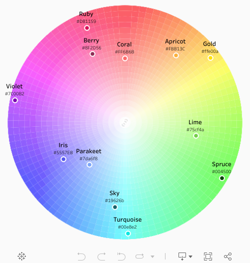
Once you’ve got some base colors you can start picking colors. I use a modified color wheel to help guide most of my decisions. I often like to select twelve colors: one color in each of the wedges. This doesn’t happen all of the time but it’s a great place to start to choosing colors that distinguish themselves from each other.

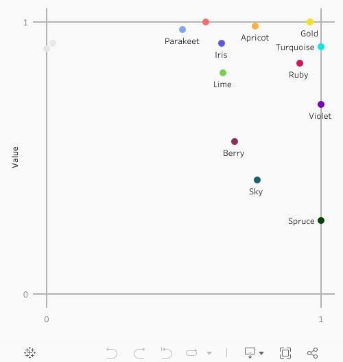
It’s important to understand that color usually involves three dimensions so plotting it on the chart above won’t provide the full picture. Above I have plotted color on Hue and Saturation. But color is more than two dimensional–in fact I could have also plotted by Value.

Tip #3: Plot your colors, even as they evolve
I’m always plotting my colors. I plot my colors in two separate charts over three dimensions: Hue and Saturation and Saturation and Value. First by Hue and Saturation:
And then by Saturation and Value:
Tip #4: Check accessiblity
Unless you are color blind you probably never think about this. In fact about 8% of the world is color blind and it is far more prevalent in males than females.
Good news: there are some awesome websites out there to aid in this. I personally use COLORHEXA and search individual colors. I then plot all of those individual colors side-by-side to make sure that every color is distinguishable across most types of vision (99.9%).

From left-to-right are the most- to least-prevalent vision types. In this case only two colors: the fourth color down and the sixth color down are seriously close in similarity for protanopia and deuteranopia.
Tip #5: Include darker shades, lighter tints, and similar monochromatic colors for accents and highlights
For this tip, I once again go back to my favorite site COLORHEXA and start to build out 2-3 colors that are lighter than our base colors (tints) and 2-3 colors that are darker (shades). Monochromatic colors are colors with the same hue. Again, these are useful when you might be comparing values within a particular subset within a subset.
Selecting these colors is more art than science. Try to avoid comparing your tints and shades across other colors on your palette–rather build your tints and shades so that the base color will really stand-out.

Here is an example of how it could play out:
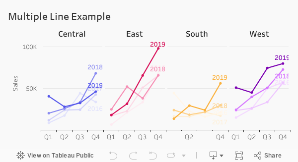
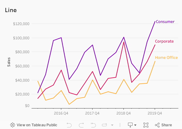
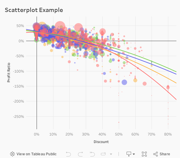
Tip #6: Test out your palette with some basic visualizations
I like to build a bar chart, a line chart, a scatterplot, and pie chart just to make sure it’s up to shape.
Tip #7: Share and iterate with others
I think this goes without saying but let’s say it: make sure you are sharing with others. You do not work in a vacuum.
Tip #8: Create clear documentation
If you are going to create something for everyone to use like a color palette for data visualization, then you’ll need to create clear documentation (we just said above that there’s often not enough documentation)! Make sure it is clear what the colors are and how to use them. Build out the color palettes in Tableau for users!
Takeaways
In this blog post, we showed you how we go about building color palettes:
- Select 8-12 colors that are clearly distinct from one another.
- Check the palettes for colorblindness
- Select additional tints, shades, and monochromatic colors to enhance charts.
- Document!
We did not cover the creation of gradient color palettes. This will be discussed in the future.


