

In this article, we will go over the six (nearly) universal rules that can apply and make your life easier when putting together simple data sets for reporting and analytics tools. We’ll cover the rules in more detail, including good and bad examples of each.
The Six Golden Rules are:
- Numerical measures should be in distinct columns
- Do not partition by categorical dimensions
- Numerical measure fields should be additive
- Exclude extra fields
- Summarize data to the appropriate level
- Do not include aggregate calculations in underlying data
These six rules are meant to be starting points for data source design beginners. They work particularly well in the scenario where you are bringing file-based data into data and analytics tools. There will be exceptions to these rules. However, these can help you get a great path to start your analytics journey.
Why are the Six Golden Rules so Important?
Sticking to these six golden rules can save you a lot of headaches when it comes to using your data in an analytics platform. It will make your data more versatile, which will allow you to make more in-depth analyses. However, one of the most overlooked aspects of organizing your data through these rules is how your performance will improve.
The more our data sets grow, the more data that has to be processed. By not overloading your platform with unnecessary data, you will optimize performance as well.
What do the 6 Golden Rules for Structuring Data for Analytics Tell us?
Rule #1: Numerical Measures Should be in Distinct Columns
Distinct Measures tells us that each numeric measure field should have its own column. For our first rule, we have the following use case: “I want to create a data visualization report that compares Sales to Goal.”
Bad Data Example

In this first table, Sales and Goal are within the same column. To make this data usable, we would have to apply a filter or calculation in most tools to separate out this data.
Better Data Example

The data in this second table is easier to use because the details for Sales and Goal are in different columns. This allows us to use the data independently.
Rule #2: Do Not Partition by Categorical Dimensions
Do not partition a single categorical dimension into multiple fields. For our second rule, we have the following use case: “I want to create a data visualization with a line chart that shows the trend of sales across years.”
Bad Data Example

In order to create a line chart, we would need a data field to compare sales data to. That field doesn’t exist because the years for the data are in the headers. This is called partitioning by a measure and is not ideal in most scenarios, especially when creating visualizations.
Better Data Example

Even though we have more rows in this new table, the data is easier to use within most data and analytics tools. This is due to the fact that we can see a trend of Sales for each Year, or for all three years with an aggregation if we chose to do so.
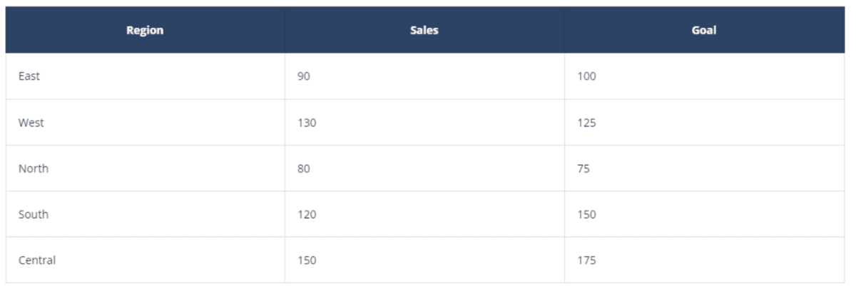
Rule #3: Numerical Measure Fields Should be Additive
All numerical measure fields should be additive to aggregate them to higher levels. For our third rule, we have the following use case: “I want to create a KPI indicator to show total sales across all of my regions.”
Bad Data Example

The data in this scenario would be difficult to use because a Grand Total row was included. If we decided we wanted to Sum the Sales column to determine our sales KPI across regions, we would return the total Sum of all the Regions plus the Grand total row as well. This would double the actual correct amount of the sum.
We would need to filter out the grand total row before aggregating to find out the sum. Other aggregation types like maximum, median, and mean can also lead us to this same scenario and cause us to be incorrect.
Better Data Example

By removing the grand total row from the data before importing it to the analytics tool, we can perform accurate aggregations on that field within the tool.
Rule #4: Exclude Extra Fields
Exclude unneeded fields that you will not be using. For our fourth rule, we have the following use case: “I want to create a bar chart that shows sales by regions. I will not use goal data in my analysis”
Bad Data Example
The data in this scenario would be perfectly usable as nothing seems to be wrong with it, but if we take a closer look at the use case request, we will see it is not optimized. Most data and analytics tools will import metadata about every field in a data set, whether that field is used or not.
Bringing in all the data can actually slow down development and analysis, as it can increase load times. Just because all the data is available doesn’t mean it is necessary for the request you are working on.
Better Data Example

It is recommended to remove any field that you are not going to use. If you think about it, leaving only one additional field might not make a difference, but if you remove 25, 50, 100, or even more unnecessary fields, you will likely see some performance increases in most tools. You are now dealing with a smaller data load and that will make a difference, especially on larger datasets.
Do not get caught in the temptation of leaving in all of the available fields just because you might need them in the future. Most tools make it easy and flexible to add a new field later down the line, so any field you left out can always be added later.
Rule #5: Summarize Data to the Appropriate Level
For our fifth rule, we have the following use case: “I want a hierarchy at the total, region, and state level. I will never show values at the city level.”
Bad Data Example

The data in this scenario is perfectly usable, but once again as in the previous example, it is not optimized. One of the factors that most commonly slows down data tools is the number of rows in the underlying data set. We want to limit that total number of rows whenever possible, but also by being conscious that we should not limit the functionality of the tool we are using.
In the scenario above, we do not need the data at the City level. Aggregating it up to the State level would be perfectly sufficient.
Better Data Example

The data set in this second table is more optimized as it has fewer rows after we removed the City field. We are now aggregated up to the state level, and the total number of rows has been optimized.
Rule #6: Do Not Include Aggregate Calculations in Underlying Data
Add Calculated Fields Appropriately! When creating calculations in the underlying data set, make sure the output does not break any of the other rules. For our sixth rule, we have the following use case: “I want a show profit ratio at the aggregated levels of state, region, and overall.”
Bad Data Example

The data in this table includes an aggregated field through Profit Ratio, making it difficult to use. This column is an issue because it is a calculated field of Profit divided by Sales. Though it is correct for the State level, it is also limiting us to that level. We cannot aggregate that field to figure out the profit ratio for other levels, like Region. We are breaking our metric aggregation rule.
To maximize usability, it is best to create this type of calculation within the data and analytics tool, not in the underlying data.
Better Data Example
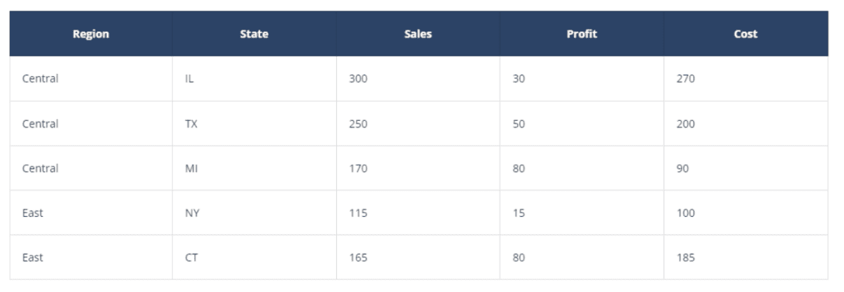
In this second table, we added a new calculated field that gives us more detail but doesn’t limit us as the previous one does. Our new calculation here is Cost, which is a calculated field of Sales minus Profit. This is a more appropriate field to have in the underlying data, as the output of this calculation does not break our aggregation rule.
We could aggregate Costs to higher levels and still have an accurate representation of Cost. In this scenario, we would be able to use that Cost field for both Region and State.
Closing
Developing the habit of following the Six Golden Rules for Structuring Data for Analytics can take your work to the next level by optimizing your analysis and improving load times on your Dashboards. Be purposeful with your data, and you will begin to see the results of your data preparation effort.
If you enjoyed this blog, we recommend you check out the Data Fluency Core Learning Plan, as well as many other Analytics-related courses offered by our Data Coach platform.
Our Data Fluency learning path goes beyond the basics of data literacy to drive excellence in the ability to read, interpret, communicate, and analyze data. Our courses will help you foster a truly data-driven culture that benefits an entire organization, not just your data analytics team. This learning path is perfect for both aspiring analysts and data consumers looking to excel in their understanding and application of data.


