Imagine you get a request for a report where the end user can see the quantity, sales amount, and profit of every product your company has sold in the past six months. The only other requirement is that they need to be able to export that entire list in a specific tabular layout.
They’ve tried to do this with the existing report created with Power BI Desktop, and they can only see a small subset of the data from the table visualization when they export the report page as a PDF. Based on the request, you search for how to create a tabular report that spans multiple pages, and you come across paginated reports.
In this blog post, we will introduce you to paginated reports in Power BI and show you how to create one using Power BI Report Builder.
What is a Paginated Report?
A paginated report is a specific style designed to be exported and/or printed. It can be highly formatted, meant to fit nicely on a page, and is ideal for tabular reports. One of the most essential features of a paginated report is that it will yield as many pages as necessary to print/export every row of data in your table. This is useful for a table or list (maybe an invoice or a receipt) extending beyond a single page.
According to Microsoft, when you are designing a paginated report, you are creating a report definition that specifies where to get the data (i.e., data source), what data to retrieve (i.e., dataset), and how to display it (i.e., format and visualizations). The report definition is a template for your report’s look and how you want it to work. Then, when an end user runs the report, that definition/template is populated with data.
Creating paginated reports in Power BI is only possible with Power BI Report Builder, which is explicitly designed for that purpose. Where Power BI Desktop reports emphasize visualizations and charts that the end user can interact with, Power BI Report Builder (paginated) reports emphasize the ability to export your data in a specified format.
When saved to your machine, a paginated report will have the .rdl (report definition language) file extension. In the example below, the file we are working with in Power BI Report Builder is the .rdl file.
How to Create a Paginated Report With Power BI Report Builder
We will walk you through the steps of creating a simple paginated report consisting of one table visualization. The data source I am using is an Azure SQL database with superstore data. For this example, we will create the report requested in the introduction (sales data for each product over the past six months).
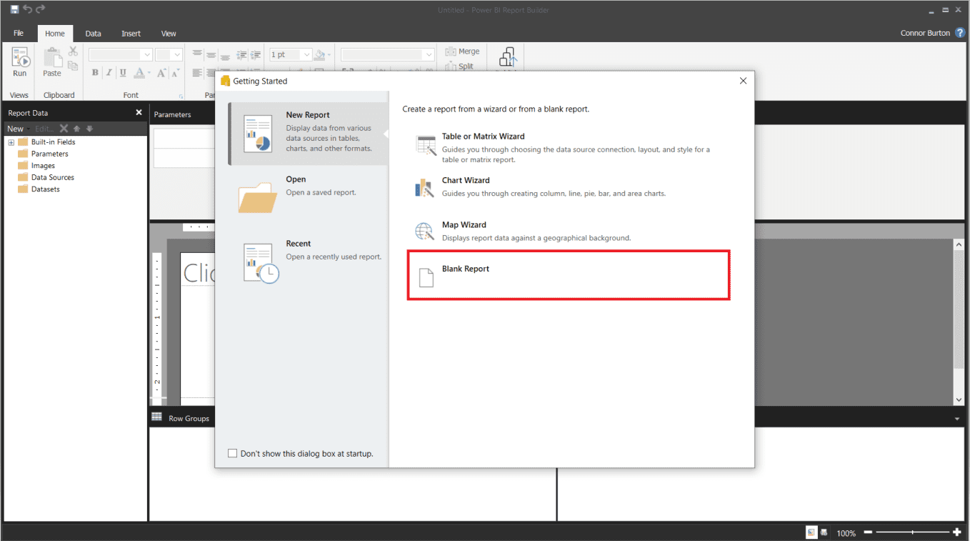
Step 1 - Open Power BI Report Builder
Open Power BI Report Builder and select the Blank Report option. You could also choose one of the Wizard options, where Report Builder will help you build a visualization, but we will start from scratch.
Step 2 - Connect to Data
This is where we will create the data source. In the Report Data pane on the left side of the page, right-click on Data Sources and then select Add Data Source… and the window below will appear. Change the connection type to your data source type – we use an Azure SQL Database.
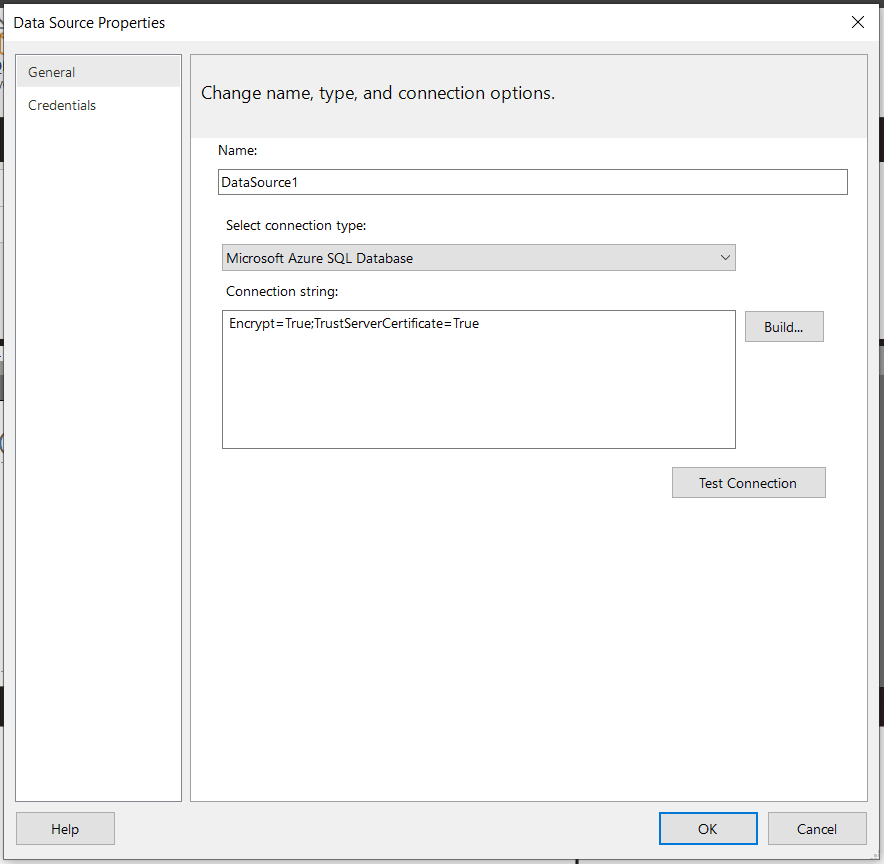
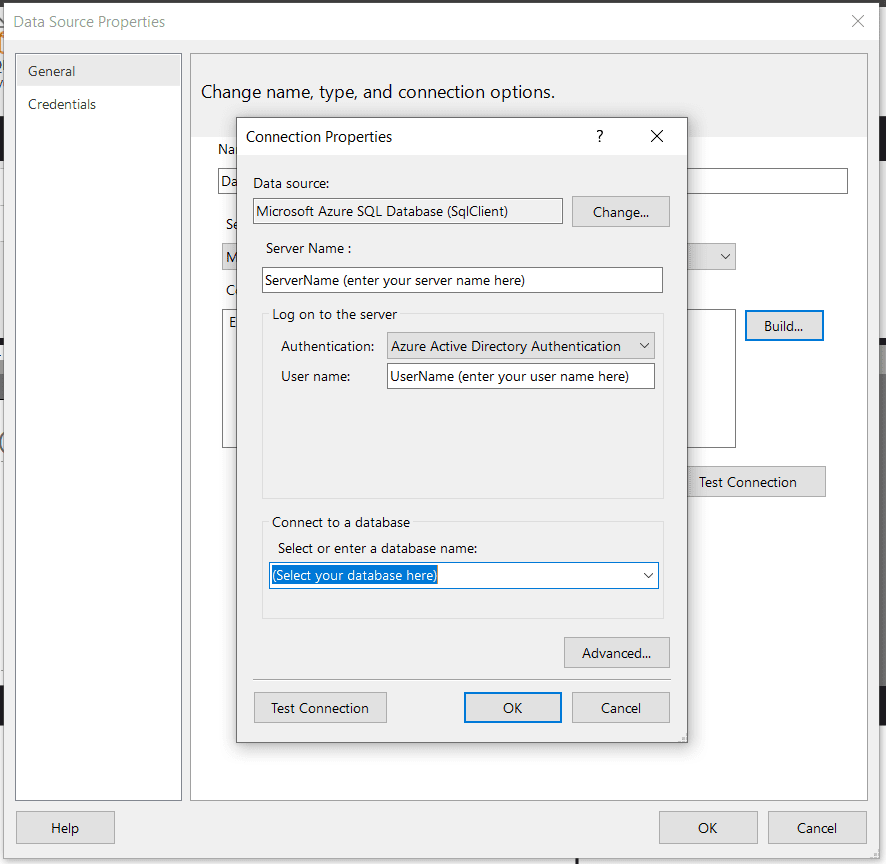
Click the Build button to configure your data connection properties. After entering your Server Name, User name (or other credentials), and database name, click OK.
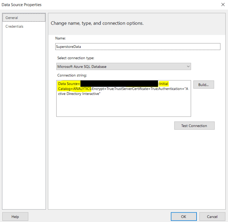
The connection string will automatically update based on what you enter for the connection properties. The Data Source in the connection string will be your server name, and the Initial Catalog will be your database name. You can also change your dataset name to something more relevant – We went with “SuperstoreData” for the example. Click OK.
We can now see the Data Source in the Report Data pane on the left side of the screen.
Step 3 - Create a Dataset
Now, we need to create a dataset using the data source we just created. We can utilize Report Builder’s Query Designer or write custom SQL code to get the required data. The Query Designer is an excellent option if you aren’t as uncomfortable writing your code.
Remember that the query language depends on the data source type. For example, if the data source is an Azure SQL database, then the query language would be SQL, but if the data source is a Power BI dataset, then the query language would be DAX.
Right-click the Datasets folder icon in the Report Data pane, then click Add Dataset… and the window below will appear.
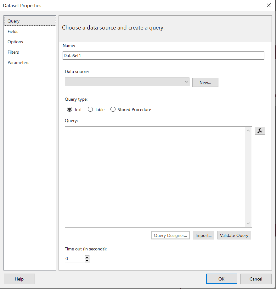
Enter a name for the dataset and select a data source.
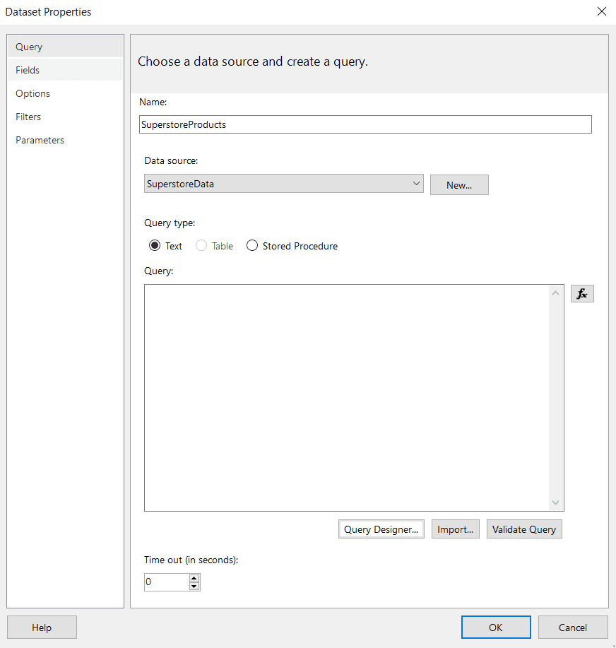
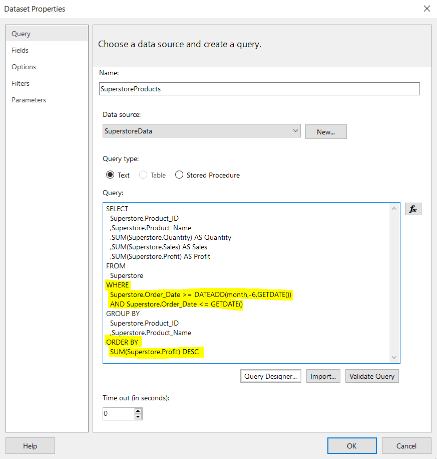
Click on the Query Designer button. Based on the requirements from the request, we need the following fields from the past six months: Product_ID, Product_Name, Quantity (sum), Sales (sum), and Profit (sum).
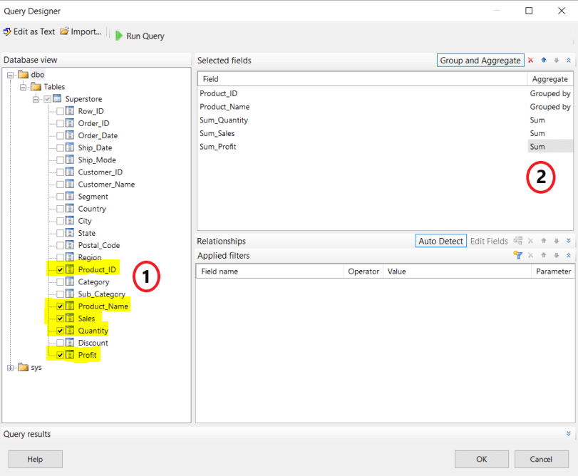
First (#1 in the image below), we select the database and table and then select each of the columns that we need. We still need to filter the data only to show the past six months, but there is no way to add a WHERE clause in the Query Designer. We will need to manually add this to the query after we are finished in the Query Designer.
Next (#2 in the image below), change the Aggregate option to Sum for the Quantity, Sales, and Profit columns. The Aggregate option for Product_ID and Product_Name will change to Grouped by by default. Also, the name of the fields that we are aggregating will automatically adjust to include the aggregation type (for example, Sales was changed to Sum_Sales). Click OK.
After clicking OK, the Query Designer will automatically write the SQL query. We removed the Sum_ prefix from the column aliases. This query will be stored in the .rdl file and executed only when someone runs the report. The data returned by the query is not stored in the file.
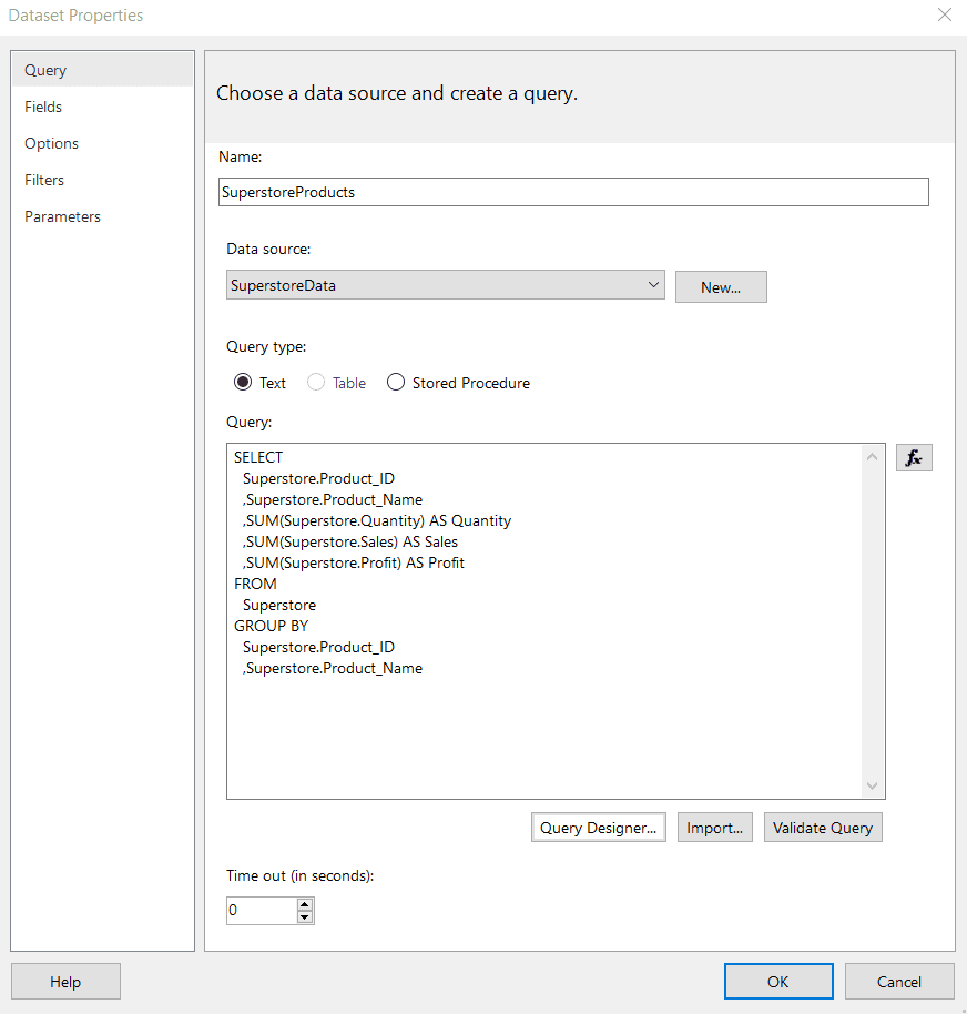
As mentioned above, we need to manually adjust the query to filter the data only to include the past six months. Additionally, We added an ORDER BY statement to sort the data descending by profit. Both of these changes are highlighted in the image below.
Instead of using the Query Designer, you could type your SQL code directly into the Query box. Again, this is up to you and your comfort level in writing a query in the specified language.
We recommend clicking the Validate Query button to ensure the query runs without errors. Click OK to create the dataset.
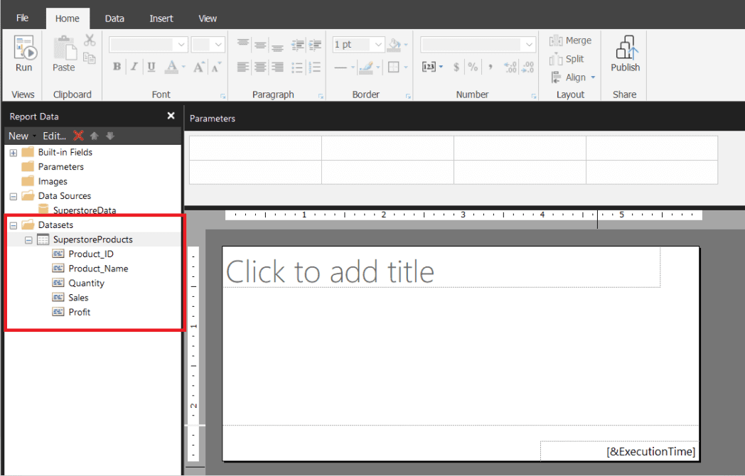
The dataset is now available in the Datasets folder in the Report Data pane.
Step 4 - Build the Table Visualization
The next step is to create the table visualization. We can do this manually or use the Table Wizard, which builds the table based on the fields we select for it. This comes in handy when creating a table with many columns, but we are only interested in a few columns for this example, so we will make the table from scratch.
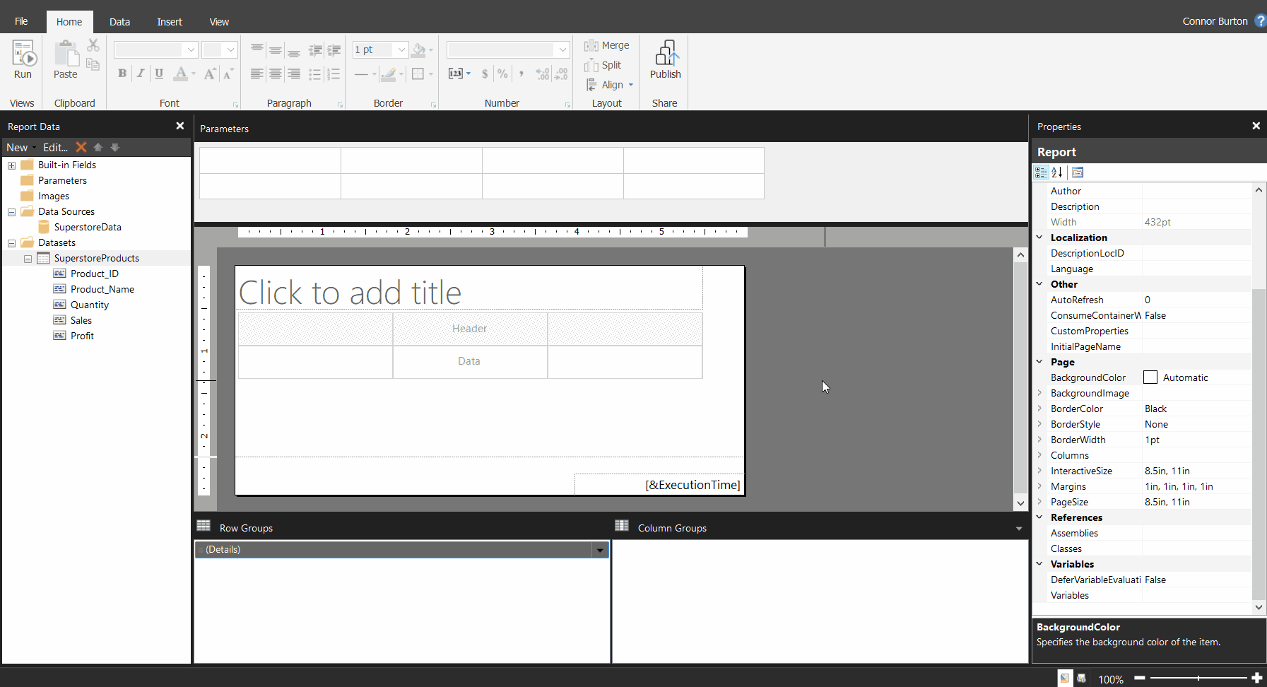
Click the Insert tab in the toolbar at the top of the page, then select Table, and then Insert Table. Simply click and drag your mouse on the design surface. By default, it creates a table with three columns.
We have five fields that we want to display, so we need to add two columns to the table. Click anywhere in the table, right-click the gray box above any column, select Insert Column, and Left or Right (which side you add the column to doesn’t matter since the table is currently empty). Repeat this one more time.
We will take a quick break from the example to discuss row and column groups. You may have noticed the Details group that appeared in the Row Groups section.
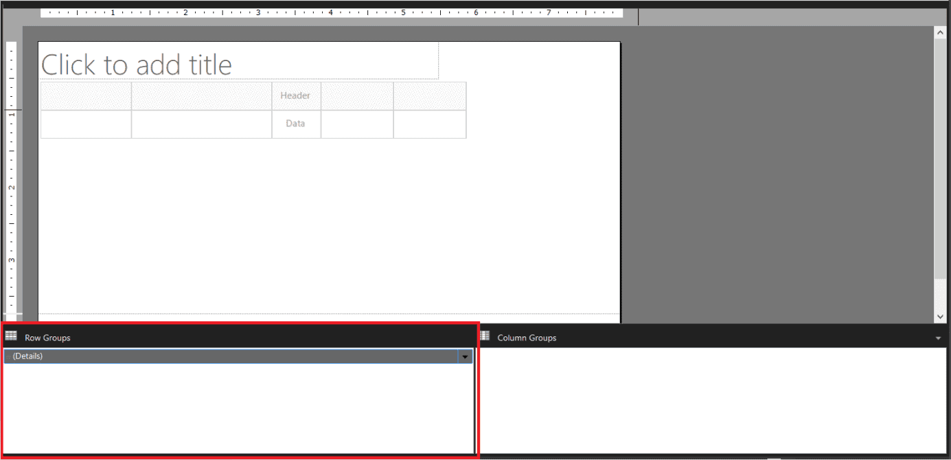
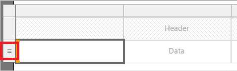
By default, a Details row group is also created when we create a table instance. This row group consists of all data from the report dataset. This means the table visualization will output one row for every row the dataset query returns. This is signified in the table with the three small lines in the gray box to the left of the data row (see image below).
Since we grouped the data by Product_ID and Product_Name in the dataset query, the dataset returns one row per product. Therefore, bringing the fields into the table visualization will consist of one row per product. Had we not done that grouping in the query, the table would have one row for every row in the data source.
Row and column groups can be used to organize data into groups that work similarly to hierarchies. Groups could be helpful if we wanted to group products by their category (office supplies, furniture, technology, etc.).
We could add the category column to the dataset query and then create a row group to group the products by their categories. Then, the report’s end user could see sales metrics by product category, and they could drill down one step further to see the metrics by individual product.
Back to the example. Now that the table is set up, we can add fields. There are several ways to do this, but we will drag the fields onto the table. This shows us what fields will be displayed in the table, but the data won’t appear until the report runs.
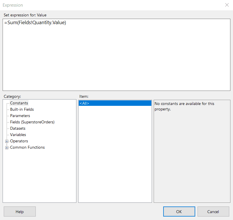
We are almost done with the table creation! We want to ensure the Quantity, Sales, and Profit fields are being aggregated in the table. This step isn’t necessary because of how we wrote the dataset query, but we wanted to show how this can be done. Right-click on the [Quantity] box, select Expression…, and then type Sum() around the existing expression value and click OK.
You can explore other functions in the Common Functions dropdown in the Category section of the Expression window.
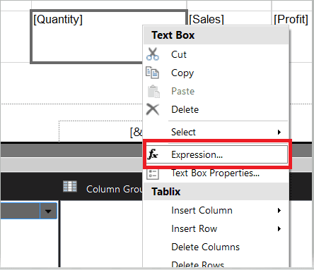
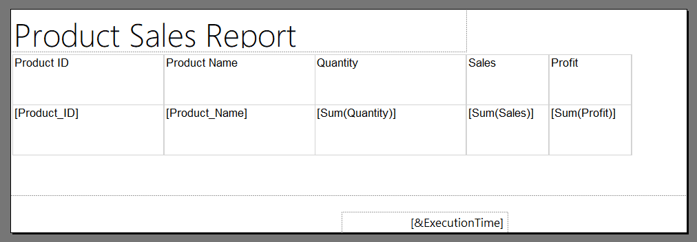
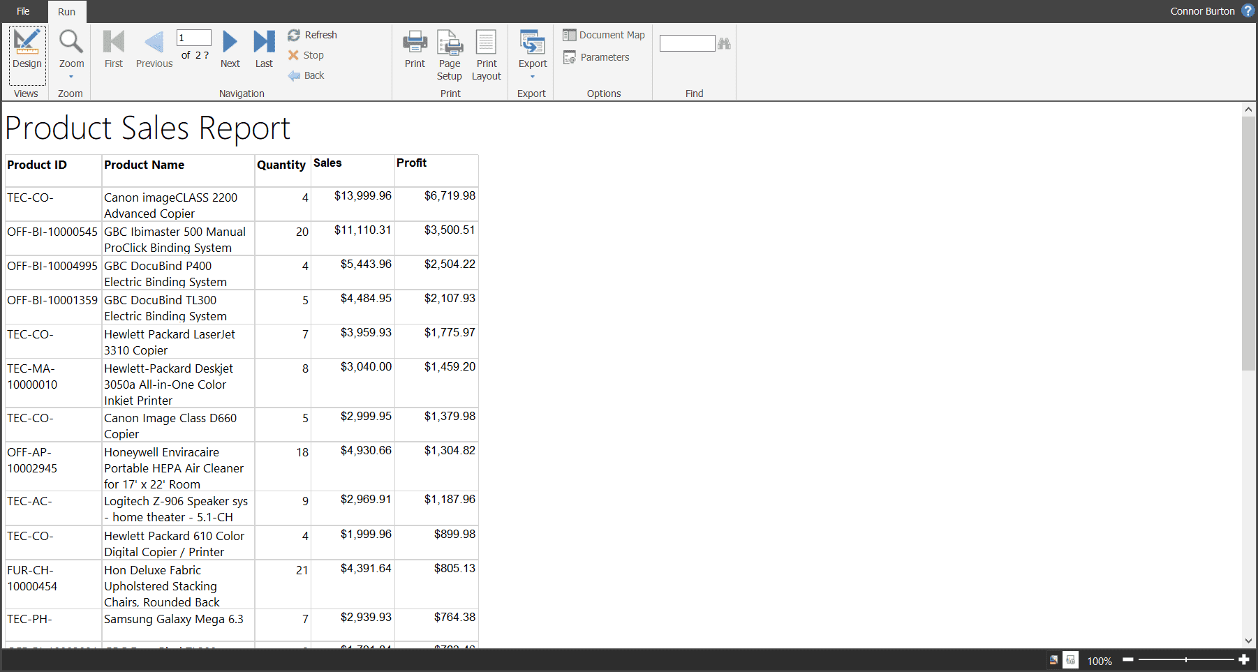
Repeat this process for the [Sales] and [Profit] boxes. After completing that process and adding a title to the report, it looks like this.
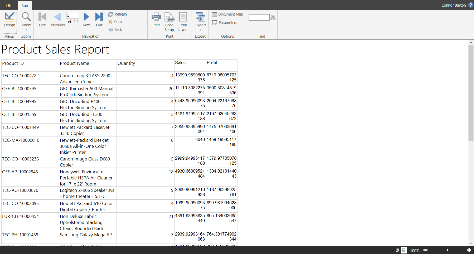
Click the run button in the top left corner of the page to see what the report looks like when populated with data.
Because of the ORDER BY SUM(Superstore. Profit) DESC statement that we added to the dataset query, the table is sorted from largest profit to smallest profit. If we remove that statement, the table will output the data in the order it is stored in the data source.
Step 5 - Formatting the Table/Report
The report runs, but we could change some formatting to make it look cleaner. To do this, click the Design button in the top left to return to Design mode.
First, there is a lot of white space in the Product ID and Quantity columns. Adjust the columns’ width by selecting the table and dragging the column border.
Next, Sales and Profit have a lot of decimal points and aren’t formatted as currency. We can format those two columns as a currency and show two decimal places. Right-click the text box, select Text Box Properties…, click Number, and select Currency.
Last, let’s bold the column headers so they stand out better. Click anywhere in the table, then click the small gray box to the left of the header row – this will select the entire header row. Then, in the Font box in the toolbar, change it to bold.
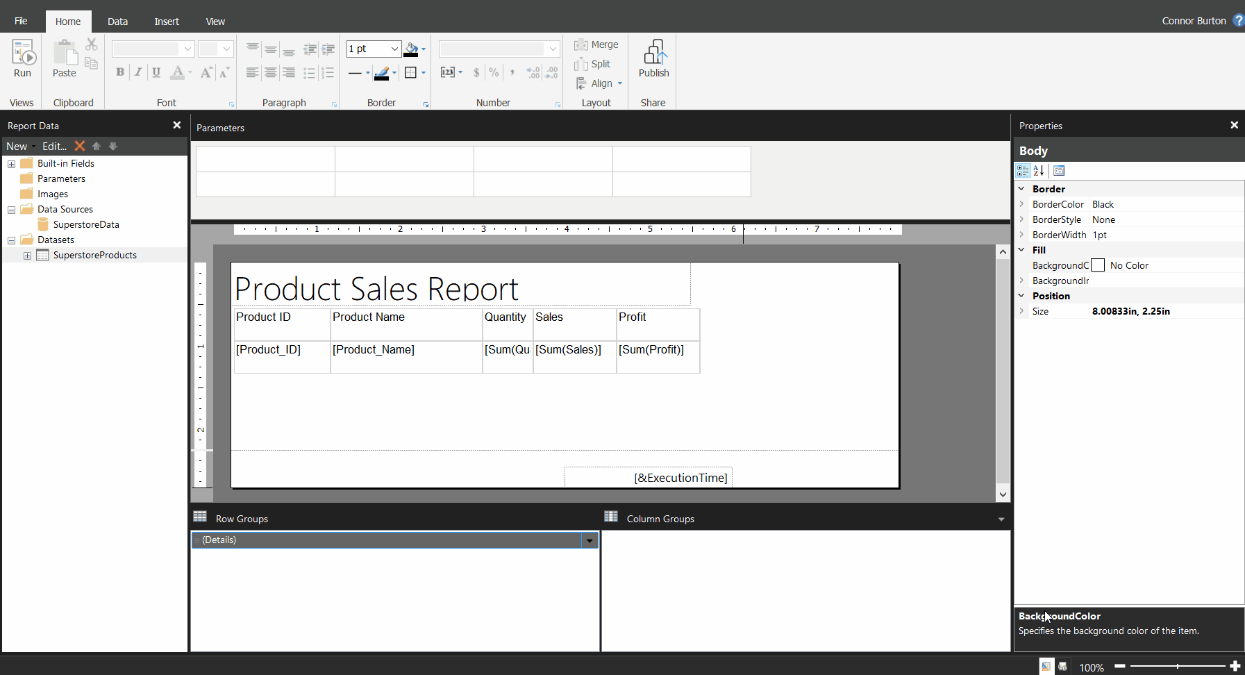
Any other formatting you may want to do can be accomplished using the toolbar in the Home tab or the Properties pane on the right side of the page.
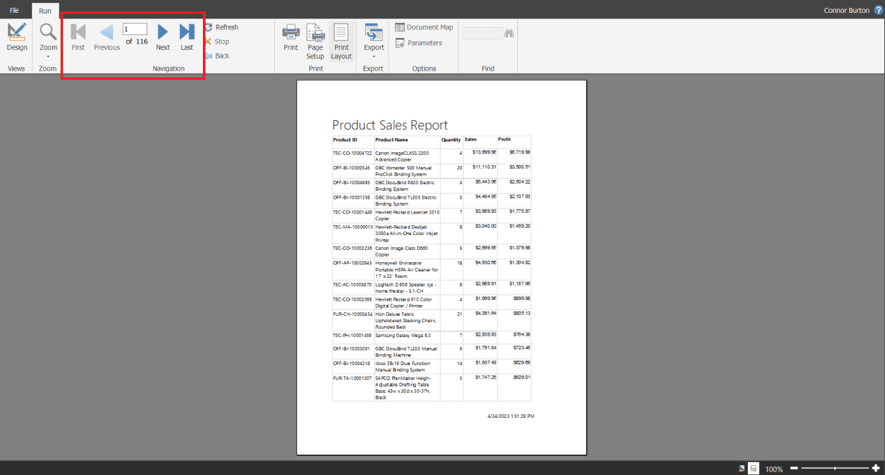
The report looks like when we run it now – much cleaner!
We can click the Print Layout button in the toolbar to see how it looks and how many pages it would have (116 in this example) if we print or export it. The image below shows the first page and how to navigate to other pages.
How to Publish a Paginated Report
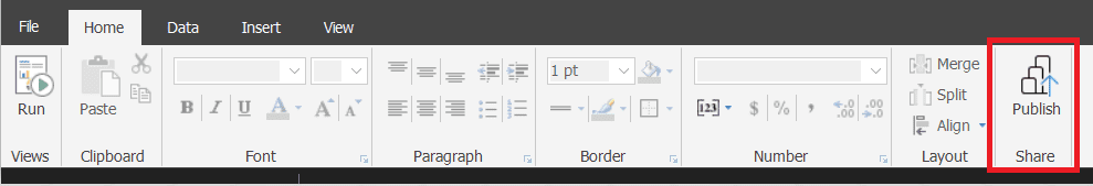
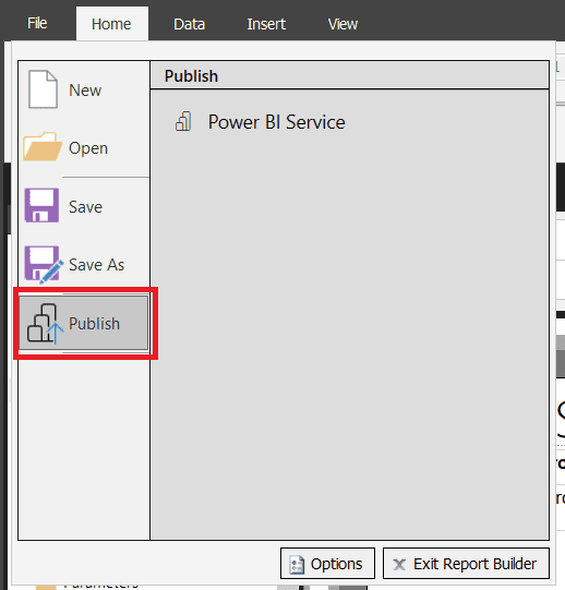
Publishing a paginated report from Power BI Report Builder is essentially the same process as publishing a report from Power BI Desktop. Either use the Publish button in the Home tab (first image below) or the Publish button located in the File tab (second image below).
A few requirements/considerations for sharing paginated reports:
You don’t need a license to publish a paginated report to My Workspace.
You need a Power BI Pro or Premium per User (PPU) license to publish a paginated report to other workspaces.
If your report uses an on-premises data source, you must install a Power BI gateway to access and share the report on the Power BI service. This enables you to connect the published report to the on-premises data source.
To view a published paginated report, you will need a PPU license if it is published to a PPU workspace. If the report is published to a premium capacity workspace, no license is required to view it.
Exporting a Paginated Report
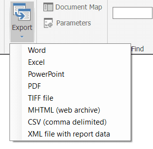
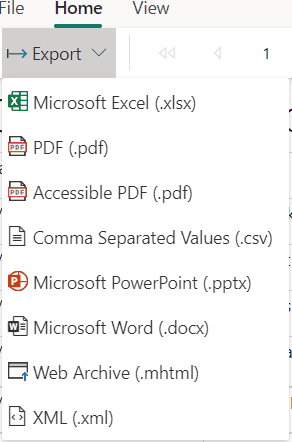
A paginated report can be exported from the Power BI Report Builder or the Power BI Service.
For both, run the report, then find the Export button in the toolbar, and select the file type that you want the report to be exported as. The first image below shows the Export option in Report Builder, while the second shows the Export option in Power BI service.
Closing
Paginated reports are designed to be exported by the end user. There is only one tool in the Power Platform landscape that allows you to create and edit paginated reports: Power BI Report Builder.
A paginated report doesn’t contain or store any data, just a report definition that tells the report what data to retrieve and how to display it to end users when the report is run. This is a very useful report style if your data exceeds one page and you want to display it in a tabular format.
Want to learn more about Power BI Paginated Reports?
FAQs
No. You can create reports with Power BI Report Builder and publish them to My Workspace without any Power BI license. However, you will need a Pro or Premium Per User license to publish to other workspaces.
Power BI paginated reports currently support the following data sources: Power BI Dataset, Dataverse, Azure SQL Database, Azure Analysis Services, Azure Synapse Analytics, SQL Server*, SQL Server Analysis Services*, Oracle*, Teradata*, ODBC*, Enter Data (manually enter your data).
*can be accessed via Power BI Gateway
Yes, as long as the file type is .rdl (report definition language). One standard software that was around before Power BI is SQL Server Reporting Services (SSRS), which also yields .rdl file types that could be opened and edited with Power BI Report Builder.


