

One feature I’ve always hoped for is a toggle button that is formatted for boolean (TRUE/FALSE) values. I think a toggle has always made sense for boolean values because they are either on (TRUE) or off (FALSE). With the use of parameter actions, and filter actions we can build a visualization that acts as a toggle button without having the look-and-feel of a traditional sheet on a dashboard.
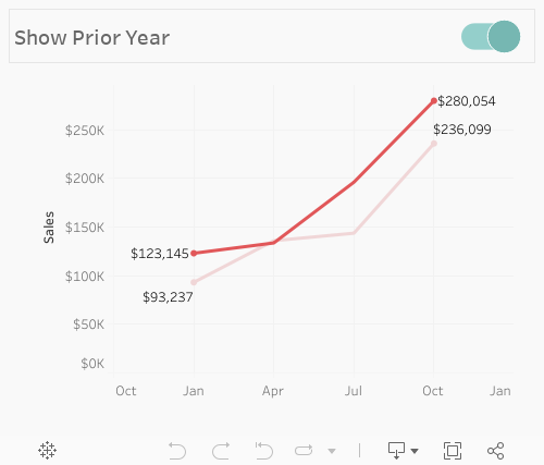
Consider the example below. We have a line chart that shows sales by quarter but we occasionally want to layer in prior year sales. We can do this with a toggle button.
Step #1: Build the toggle dataset and paste into Tableau
Copy-and-paste the following dataset into Tableau Desktop:
					Value
0
1
This dataset has just one column called Value and two rows with values of zero and one. There are other ways to do this, but I find having this simple dataset makes for faster data manipulation.
Be sure to extract this data before publishing.
Step #2: Create a boolean parameter.
Set the value to whatever you would like for now.

Step #3: Create a switch calculation with the boolean parameter.
Return a value of one when the parameter is TRUE and zero when the parameter is FALSE.
					// Switch calculation
IF [Boolean Param]
THEN 1
ELSE 0
END
Step #4: Create a calculation that will eventually switch the parameter from TRUE to FALSE (or vice versa).
We’ll build this calculation that will eventually change the parameter value with a parameter action. It won’t work right away until we create the parameter action.
					// Flip Boolean calculation
IF [Boolean Param]
THEN FALSE
ELSE TRUE
END
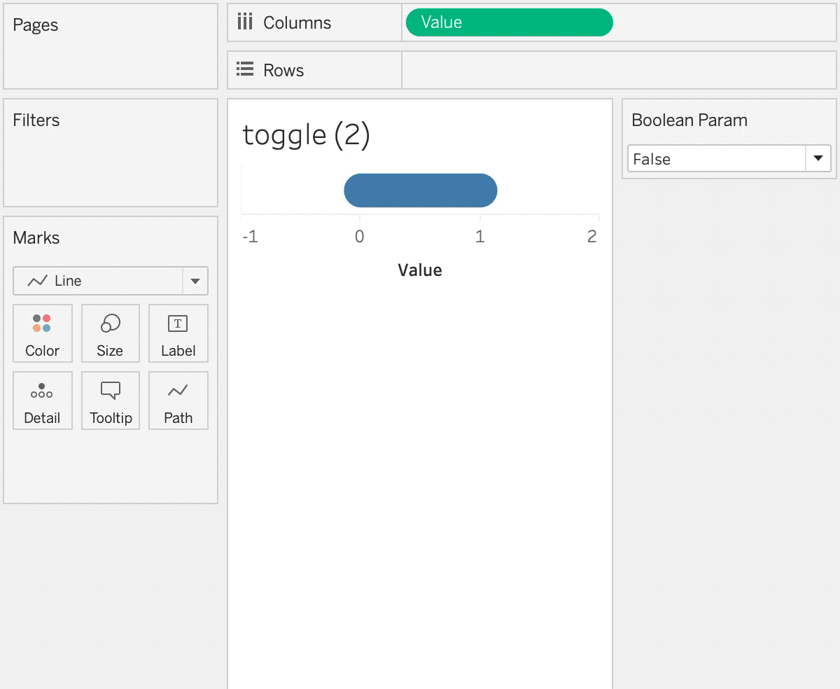
Step #5: Build the toggle visualization.
Use the data source we copied-and-pasted into Tableau Desktop. Click-and-drag the [Value] column onto rows–make sure it’s a continuous dimension. Set the mark type to line. Add the [Switch] calculation to rows and change the [Switch] mark type to circle. Add a white outline to the circle mark. Make the [Value] and [Switch] a synchronized dual axis chart. Add [Switch] to color as a discrete dimension. Set the FALSE value to a gray and the TRUE value to any color. Add [Flip Boolean] to detail on both marks cards.
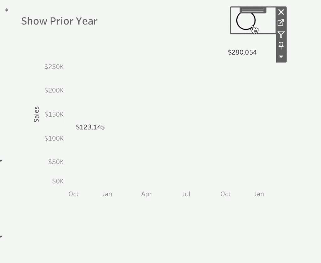
Step #6: Add the toggle to the dashboard. Add a parameter action to swap the values.
After you’ve created a visualization that utilizes your boolean parameter add this visualization and your toggle to a dashboard. On the dashboard a

Step #7: Add a filter action to automatically deselect the parameter selection.
Tableau will inherently keep the marks selected when you click on a visualization. This does not make for a pleasant user experience as you have to deselect then re-select.
It is possible to automatically deselect values.
Start by creating a calculation called [TRUE] that is equal to TRUE and a calculation called [FALSE] that is equal to FALSE. Add these values to detail on your toggle visualization.
Next go to the dashboard and add a filter action. On select of toggle go to the toggle sheet. Select specific values of [TRUE] to filter on [FALSE]. This will drive an action to reset the sheet without actually filtering anything.

Once you’ve added this filter action the toggle should swap parameters and reset the selection every time.
Once you’ve added this filter action the toggle should swap parameters and reset the selection every time.
And thats it! You’ve created a toggle button thats almost as good as an actual parameter on a dashboard! Just remember:<p?
- Use a toggle for a global change across the entire dashboard.
- Make it clear when the toggle is turned on or off.
- Apply the toggle to binary options not two unrelated options. Example: Night mode off/on instead of night mode vs. day mode.


