Welcome to the 4th of 5 posts on improving parameter design in Tableau. So far we have:
Discussed how parameter formatting hasn’t improved over time and gave one possible design solution and wrote a how-to on the topic.
Discussed the need for toggle buttons for boolean values and give an example.
Discussed the need for linked parameters–how parameters interact with each other and respond to each others values and build it with multiple sheets.
In this post, we discuss how we can create sheets that look like formatted sliders.
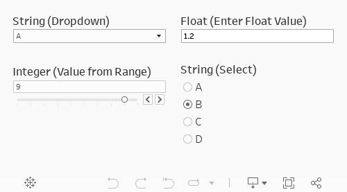
We’ve more-or-less always been stuck with this same parameter slider look-and-feel.
However, I want a different look! Once again, we can do this by using a separate sheet and formatting it to look like a parameter and applying parameter actions to that sheet.
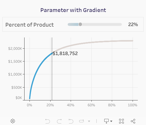
Let’s build this “parameter” with a gradient
Step #1: Create a dataset from 0 to 100 by 1s. Copy into Tableau
First create the dataset (I made it in Google Sheets). Create a single column called value [value] that is valued from 0 to 100 by 1s.
Copy-and-paste these values into Tableau
Step #2: Place [value] on columns as a continuous dimension.
Set the mark type to line.
Step #3: Create a parameter that can take values from 0 to 100. Add the parameter to columns.
Create the parameter.
Add the parameter to columns. Set the mark type to circle and create a synchronized dual axis.
Step #4: Create a gradient color calculation. Add it to color on the [value] marks card. Set the color.
Step #5: Set the colors.
Set the custom gradient colors. For the low value set the color to #F3F3F3 and the high value to #40A4D5. Set the low value to -200 and the high value to 100. Set the center to -10 and use the full color range.
This leaves us with the following sheet.
Step #6: Format the sheet.
Remove all lines and dividers.Hide the header.
Step #7: Create a new sheet. Create a calculation that converts the parameter to a percent. Add it to text.
Create a the following calculation. Set the default formatting to a percentage with no decimals.
// Parameter as percent
[switch]/100
Step #8: Build your visualizations that use the parameter. Create the dashboard.
Place the two sheets side-by-side in a horizontal container. This way you can have the text next to the slider.
Step #9: On the dashboard add a parameter action on the slider.
Select the slider sheet name (color in this example). Run the action on select. Set the target parameter to [switch] and select the value of [color] with no aggregation.
Step #10: Add a filter to automatically deselect the slider after a click.
This is one of my favorite techniques for automatically deselecting text. You can read about it in detail here.
First create two calculated fields. One called [TRUE] with the value of TRUE and the other calculation of [FALSE] with a value of FALSE. Add these calculations to detail the slider visualization.
Add a filter action. Select the color sheet on the dashboard. Run the action on select. Set the target dashboard to the color sheet–not the dashboard. Show all values when clearing the selection. Target filters will be [TRUE] for source and [FALSE] for target.
Final Result
Takeaways
This post focused on what the user interface could look like if you could format parameters. This post didn’t really extend parameters too far at this point, but the next post will take the learnings from this post and apply them in a new way that parameters cannot at this time.
More to explore
AI & ML
Why Traditional ERP Systems Fail to Track the Patient Journey in Life Sciences