

Welcome to the 9th post on improving parameter design in Tableau. So far we have discussed:
- how parameter formatting hasn’t improved over time and gave one possible design solution and wrote a how-to on the topic.
- the need for toggle buttons for boolean values and give an example.
- the need for linked parameters–how parameters interact with each other and respond to each others values and build it with multiple sheets.
- how to create a slider that you can format. This used external data but was linked via a parameter action.
- the need for vertical sliders and how to create them.
- how to create multiple-select parameters.
- the need for horizontal listed parameters and need for more design sophistication with rounded corners. We covered off both ideas in a single how-to post.
- how to create interactive legends using a parameter for multiple selection
For this blog post we look at the intersection of filters and parameters by creating a parameter that interacts with a range of values–much like a filter.
We’ve more-or-less always been stuck with this same parameter slider look-and-feel.
The need for this parameter isn’t extremely high because there is already a range filter available. However, if you do find yourself stuck and in need highly customized range filter then know it can be done in Tableau.
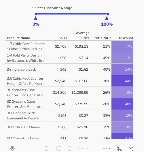
In this tutorial we will build the range parameter below. With this parameter you can select two different values (in any order) and also reset the range of the parameter.
The challenge of this use-case is that we need Tableau to do 3 different things on a sheet: select one value, select a second (and order them), and reset the view.
For this example we’ll have two data sources: a primary data source that we are creating a visualization from and a secondary data source that will drive our parameters.
Let’s hop into the how-to.
Step #1: Create your parameter data source.

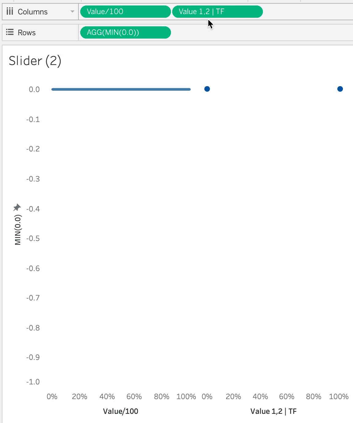
Step #2: Build the base of your range selector
Since we connected to a dataset that runs from 0 to 100 but we’ll be utilizing these values as a percentage we’ll want to convert the values to run between 0 and 1. We can do this by creating a new calculated field called [Value/100] where we just divided the values by 100:
// Value/100
[Value]/100
From there we can add the [Value/100] as a continuous dimension to columns. Let’s also create an ad-hoc calculation by double-clicking on Rows and typing MIN(0.0). This will create an axis on 0 that we we can control the axis. Set the MIN(0.0) axis to 0.05 and -1.0. Choose the line Mark type.

Step #3: Build the parameter that will control the range parameter.
Create a new string parameter called [Range Parameter]. Allow for any value and set the initial value to 0.00,1.00,.

Step #4: Parse the values from the parameter.
For this step we’ll create two calculations: [Value 1] and [Value 2], where [Value 1] will be equal to the first value in the string and [Value 2] will be equal to the second value in the string.
For [Value 1] the calculation is:
// Value 1
ROUND(FLOAT(SPLIT([Range Parameter], ",", 1)), 2)
Similarly, the calculation for [Value 2] is equal to
// Value 2
ROUND(FLOAT(SPLIT([Range Parameter], ",", 2)), 2)
The only difference between the two calculations a s single number which returns the value before (1) or after (2) the first comma.
Step #5: Set the colors.
Let’s create a calculation called [Value 1, 2] that matches the values from the [Range Parameter] to the calculation we have on columns in our current parameter control sheet from Step #2.
The calculation for [Value 1, 2] is:
// Value 1, 2
IF [Value/100] = [Value 1]
OR [Value/100] = [Value 2]
THEN [Value/100]
END
Be sure to format this value as a percentage with no decimals.
In the calculation, if [Value/100] is equal to [Value 1] or [Value 2] then we are returning [Value/100] value. Add this calculation to columns and create a synchronized dual axis with [Value/100]. Change the mark type to circle and add a white border around the circle.
By using the IF statement we can filter filter data without adding a filter directly on our visualization. If we did add a filter to the filters card then we wouldn’t show all of the [Value/100] values–which we want to show.
To add some additional formatting. we’re going to add [Value 1, 2] to labels. We’re going to customize that label by placing an arrow up (▲) on the first line and [Value 1, 2] on the second line. After we’re done customizing the label lets align the text along the center-bottom. This will make the arrows appear directly below the circles.

Step #6: Create the calculation to update the parameter.
For this example we want to have three on our faux parameter/filter.
- On our base setting where all values are selected we want our next click to select an initial value to filter by. Because we’ve selected a single value we will not yet be filtering by a range.
- After we have a single value selected we should be able to click on a second value and get the entire range of interest.
- If we have a complete range selected, tiger the next click should be too reset the filters. This means returning to the 0% to 100% setting.
These three options can be accomplished with the following calculation which we will call [New Range Values]:
// New Range Values
IF [Range Parameter] = "0.00,1.00,"
THEN LEFT(STR([Value/100]),4) + ","
ELSEIF (LEN([Range Parameter]) - LEN(REPLACE([Range Parameter], ",", ""))) = 2
THEN "0.00,1.00,"
ELSEIF (LEN([Range Parameter]) - LEN(REPLACE([Range Parameter], ",", ""))) = 1
AND FLOAT(SPLIT([Range Parameter], ",",1)) > [Value/100]
THEN LEFT(STR([Value/100]),4) + "," + [Range Parameter]
ELSE [Range Parameter] + LEFT(STR([Value/100]),4) + ","
END
After we’ve created this calculation let’s place it on detail of both marks cards. Change the aggregation of [New Range Values] to MIN().

Step #7: Add color to show the selected range
For the next step we want to have a visual indicator for what values are selected and what values are not selected. We can do that with color.
First edit the color of the circle marks card and select a color you’d like to use for when values are selected.
For the line marks card, we need to create a calculation that will indicate whether a value is within the range of the selected values or outside of the range. We can do that with the following boolean calculation we will call [Range | TF]:
// Range | TF
[Value/100] >= [Value 1]
AND
[Value/100] <= [Value 2]
We’ll need to select two colors for three different mark options: The same color for TRUE as the circle marks and a light gray for all the FALSE and NULL values (We’ll return NULL values when we’ve selected a single value since there will not yet be a value for [Value 2].
Step #8: Create calculations that will apply the range parameter to the main datasource.
Build your visualizations where the range filter will be applied. For this example, we’ve created a table that shows Sales, Average Price, Profit Ratio, and Discount Percentage by Product Name. These value are comprised of multiple orders where discounts vary from order-to-order.
First we calculate the weighted discount:
// Discount - WT
1 - (SUM([Sales])/SUM([Full Price]))
Next we can copy-and-paste over the exact same [Value 1] and [Value 2] calculations in the parameter dataset into our primary dataset. These calculations shouldn’t need any adjustments and should work without any issues since they are driven by the parameter and not a field inside our primary or secondary datasets.
We can then use [Discount – WT], [Value 1], and [Value 2] to create a boolean. This boolean will be used to dynamically filter our visualizations to the correct range within the parameter settings. Let’s call this calculation [Discount – WT | TF]:
Step #9: Build the dashboard and apply the parameter action.
Next we need to build our dashboard. We’ll bring the parameter sheet onto the dashboard then the table. If you haven’t don it yet, take a minute to format your parameter sheet by removing lines and borders from your parameter sheet.
Next let’s add the parameter action to the dashbaord. For the parameter action, when we click on the parameter sheet we want to update the [Range Parameter] with the [New Range Values] calculation. Be sure to select none for your aggregation type.

Step #10: Add a filter to automatically deselect the slider after a click.
This is one of my favorite techniques for automatically deselecting marks. You can read about it in detail here.
First create two calculated fields. One called [TRUE] with the value of TRUE and the other calculation of [FALSE] with a value of FALSE. Add these calculations to detail the parameter visualization.
Add a filter action. Select the parameter sheet on the dashboard. Run the action on select. Set the target dashboard to the parameter sheet–not the dashboard. Show all values when clearing the selection. Target filters will be [TRUE] for source and [FALSE] for target.

Final Result
These steps create the final product. These steps can certainly be altered to build different visualizations but the concepts for each step will be similar across the board.
Takeaways
This tutorial showed you how to create a sheet that has the functionality of a filter but utilizes a parameter. The use of range filters are vast in Tableau–however customizing their look-and-feel is not. With this solution we have the ability to update the design style. We can also swap axes and turn the horizontal range selector into a vertical range selector.
For our next installment we’ll look at applying this technique to gauges and funnels.


