

Tableau has been great about evolving its product. There things that would take my days to do with mapping just two years ago that can now be done in a few clicks. However there is one feature in Tableau that is like a crocodile (you know, a feature that hasn’t evolved since practically the beginning), and that’s the user interface of parameters.
The look-and-feel of parameters is incredibly harsh. If we take a look at the parameters there’s four general designs: input, dropdown, sliders, and selectors.
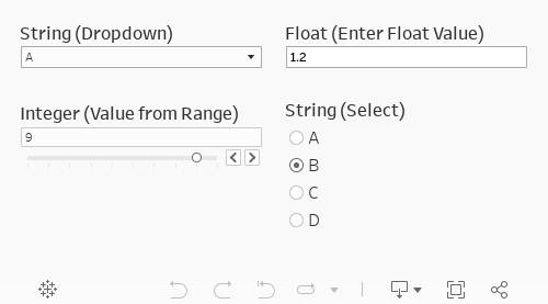
There is some customization that we can do with the look-and-feel. We can change the font size and color of the header text, the selector values, and text inside the dropdown, but we cannot change how we interact with these parameters. We also can’t change the size of the text inside the parameters displays! This means we are stuck with the size 9 text that is located inside a large white display box with gray outline.
There have been a couple of comments and blog posts in the past month or two. First, was a discussion I had with Zen Master Anya A’Hearn around the current nature of parameters (I had already been posting on Slack about it this year). Second was a few tweets put out by Lindsey Poulter.
Parameter actions make increasing/decreasing parameter values super easy... which means more ways to create custom filters! pic.twitter.com/Aj8BfjgLIt
— Lindsey Poulter (@datavizlinds) November 27, 2019
To me these were points I needed to discuss and drive home in a series of tutorials. This post will be one of several posts that will showcase the functionality of parameters and parameter actions. We will treat sheets as buttons, sliders, drop-downs, and displays.
For this post we’ll detail how to use parameter actions to change metrics. See the example below:
So how do we build this? Let’s dive into the tutorial!
Step #1: Create an integer parameter.
Choose a list of values. Enter as many values as there will be metrics. In the case of this example we are swapping four metrics: total sales, total profit, percent of margin, and total sales per order.

Step #2: Create the calculation with the parameter and the metrics.
Well use four metrics to match our four parameter values.
					// Step 2 Calculation
CASE [Select Metric]
WHEN 1 THEN SUM([Sales]) //Total Sales
WHEN 2 THEN SUM([Profit]) //Total Profit
WHEN 3 THEN SUM([Profit])/SUM([Sales]) //% Margin
WHEN 4 THEN SUM([Sales])/COUNTD([Order ID]) // $ per order
END

Step #3: Build your base visualization.
Be sure to include the calculation from Step #2 somewhere in the viz. Adding the parameter itself can be useful sometimes.

Step #4: Create the arrow right and arrow left sheets.
					// Left Calculation
"◄"
// Right Calculation
"►"

These are pretty straightforward. Create a calculation with an arrow left and another with an arrow right. Put each of these on separate sheets. Set the mark type as text. Format by removing all borders and lines. Turn off your tooltips!
Step #5: Create a calculation that will decrease values in the parameter.
Add the calculation to the arrow left sheet.
					// Subtract Value //
IF [Select Metric] = 1
THEN 4
ELSE [Select Metric] - 1
END

Step #6: Create a calculation that will increase values in the parameter.
Add the calculation to the arrow right sheet.
					// Subtract Value //
IF [Select Metric] = 1
THEN 4
ELSE [Select Metric] - 1
END

Step #7: Create a sheet that includes a calculation that labels the metrics to the parameters.
Set the mark type to text. Format by removing all borders and lines. Turn off your tooltips and add the calculation to color, too. Here is the metric I created for a name. It helps with color and labels in this case.
					// Metric Name //
CASE [Select Metric]
WHEN 1 THEN "Total Sales"
WHEN 2 THEN "Total Profit"
WHEN 3 THEN "Percent of Margin"
WHEN 4 THEN "Sales per Order"
END

Step #8: Build your dashboard.
Add the visualization and a horizontal container. Add the sheets with the arrows and parameter name in the horizontal container. Order appropriately. Remove padding from each sheet. Add borders and shading how you would like. I’m adding a border to the container and shading to the parameter name sheet.

Step #9: Add a parameter action to the arrow left sheet on the dashboard.
Apply the parameter on select to the arrow left sheet. Select the subtract parameter value. Choose aggregations as none.

Step #10: Add a parameter action to the arrow right sheet on the dashboard.
Apply the parameter on select to the arrow right sheet. Select the add parameter value. Choose aggregations as none.


Step #11: Turn off mark selection and highlight all values.
This takes a bit of work but makes things look-and-feel like an application. I’d recommend reading this post on how to execute this formatting. Without this step you’ll be clicking on sheets twice to activate a parameter action rather than once.
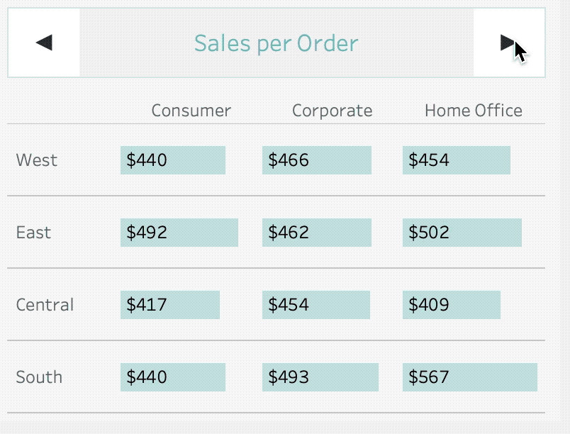
Without Step 11
Notice how the sheet highlights and two clicks are required–one to un-highlight and another to highlight.
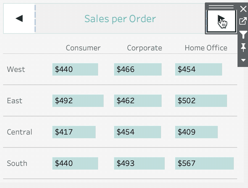
With Step 11
One click selects and deselects the sheet and removes highlighting.
When complete your visualization will look like this:
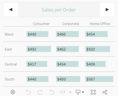
You can also view the report here in Tableau Public.
Takeaways
The current user interface for parameter is lacking, but we can certainly begin to spice up the look-and-feel of these parameters. Using parameter actions we can also explore the limitations of parameters interacting with each other–which we will explore in the next post.
Do you have more questions about Tableau? Talk to our expert consultants today and have all your questions answered!


