

This post was inspired by frequent client requests to have a menu of quick date presets like the one you see on left below. Why is the list so big? Well, the list grew out of the need to please various different end-user groups who look at data in different ways. These static, preset date periods are easy enough to create in isolation but challenging to pull off in a way that does not confuse the end-user and does not make the technical implementation a nightmare! What if there was a simple way to please everyone while also making the implementation much easier?? I am going to walk you through two use cases for dynamic date pickers using parameters.
Why Parameters?
A parameter is a workbook variable that can be controlled by the end-user and used in a calculation, filter, or reference line. It allows us to work across multiple data sources within the same workbook and allows us to compare multiple date periods with the same sheet with ease. Starting in Tableau 2020.1, we also have the ability to create dynamic parameters that can update (1) the ‘value when the workbook opens’ which will set the default value shown for the parameter when the workbook opens as well as (2) the list of possible values you will see in the parameter dropdown menu when the workbook opens.

Step 1: Decide What Kind of Flexibility your End-User Needs
The first decision you need to make is what level of flexibility your end-users will need to have in their selection choices. The main differences in the two images at right above are the level of granularity of the date part and the ability to select across years.
Option 1 is at the month/year level meaning the selections will show the entire month of data available for the range selected within the current year which in the case above would include all of January 2021 through all of August 2021.
Option 2 gives the user the ability to select down to the day level, so the date range can include just a few days to years worth of data if needed. Option 2 allows the flexibility of selecting a date range across years where Option 1 would not (unless you had a separate “year” selector for the Start and End dates). So if your end users will need options like “last 3 weeks” or “rolling 12 months” or they want to be able to select exact dates, then you will probably want to use some version of Option 2. Otherwise, Option 1 (as shown) would cover every possibility shown in the left image above except for “Past 12 months”. The two options discussed here will be referred to throughout the remainder of this post.
Step 2: Create Your Parameters
The next step is to create your parameters for the Start and End of the date range. The data type of the parameter you create depends on your requirements. In my case, I needed user-friendly date selections that could be dynamic from a field in my data source so I chose the date data type for my parameters (integers would be much easier to work with; I would choose this type if my parameters were NOT dynamic). Since the year here is fixed to the current year, I created a calculation that returns the “Months of Select Year” to generate my dynamic list of “Allowable values”. I also created two calculations that will provide aggregate values for the minimum and maximum months of the year, for which there exists data, to set as the default values for Start and End dates respectively. If you need to be able to select the year, you would simply create an additional parameter for this similar to that for the month selectors.
For Option 2 most end-users, in my experience, prefer the calendar view that comes from selecting “All” from the “Allowable values” parameter setting over a range. This option does prevent one from generating a dynamic list of options. However, calendar pickers just require a bit of trust and/or education on the part of the end-user to select appropriate date ranges. Parameter settings and associated calculations to generate dynamic values for each option are given below. The dynamic parameter values will update each time the workbook is opened if the data source has new data.

					Months of Select Year:  DATE(IF YEAR([Date])= YEAR([Start Month]) THEN DATETRUNC('month',[Date]) END)

Default Start Date: {MIN(IF YEAR([Date])= YEAR(TODAY()) THEN [Date] END)}

Default End Date:   {MAX(IF YEAR([Date])= YEAR(TODAY()) THEN [Date] END)}

					Default Start Date:  { min(IF YEAR([Date])= YEAR([Start Month]) THEN [Date] END)}

Default End Date: today()
Step 3: Create Calculated Fields
The final step here is to create calculated fields that will reference your parameter selections to ensure that you are only returning data that is within the defined Start and End date range selected. Additionally, we can use these parameters to perform comparisons to data from say the same period of the previous year to our selection or to dynamically set the date granularity for trending views based on the number of days in our range. Let’s take a look at these use cases for our parameters.
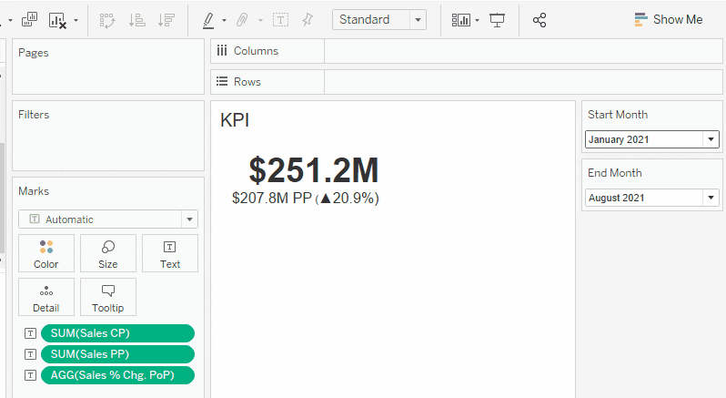
Use Case 1:
First, we will build a KPI view using the month level date pickers (Option 1) that shows us aggregated Sales for the Current Period (CP) selected as well as the aggregated Sales for the Previous Period (PP) which will be the same time period in the previous year. We can then show the % difference between these two periods to see how our Sales have changed over time. We can also include some custom formatting to include context shapes to show our direction of change.
Note, I did not use the datetrunc calculation here because at this level of granularity the month datepart would truncate to the first day of the month and thus excluding all other days of the selected end month. If your data is already aggregated to the month level then this would be fine. Here are my calculations and associate KPI view:
					Sales Current Period:  IF YEAR([Date])= YEAR([Start Month]) AND month([Date])>= month([Start Month]) AND month([Date])<= month([End Month])

THE N [Sales]

END

Sales Previous Period:  IF YEAR([Date])= YEAR([Start Month])-1 AND month([Date])>= month([Start Month]) AND month([Date])<= month([End Month])

THEN [Sales]

END

Sales % Chg PoP:  (SUM([Sales CP]) / SUM([Sales PP])) -1
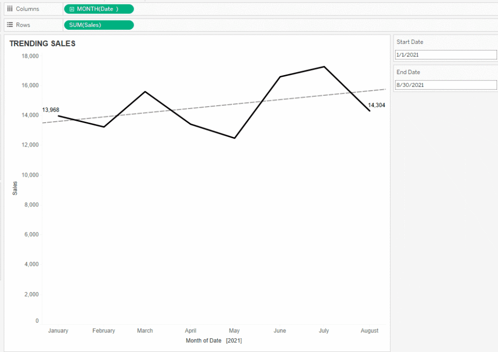
Use Case 2:
Second, let’s say we created the same KPI view above for a dashboard that has a day-level date picker (Option 2) and our end-user wants to see the trending sales for the current period selected to support this KPI. Our KPI calculation for the current sales from above would look very similar but even simpler yet as we can just compare the date field to the date parameters to ensure it is inside the range.
					Sales Current Period:  IF [Date] >= [Start Date] AND [Date]<= [End Date]

THEN [Sales]

END
Note: If you have no need to compare different date ranges with a view, then using just the IF part of the calculation above will create a Boolean expression that you can simply use on the filters shelf in your views. Then build your view as normal and all measures on the view will be filtered to the selected date range.
Now we need to build our view. As you can see in the screenshot below, the view is pretty simple to build and our parameter selections allow us to pick a wide variety of date ranges. However, as I change the Start Date parameter to be closer and closer to the End Date, the trending we want to see is not appropriately changing with our date range to reflect a finer level of granularity so our view loses value.
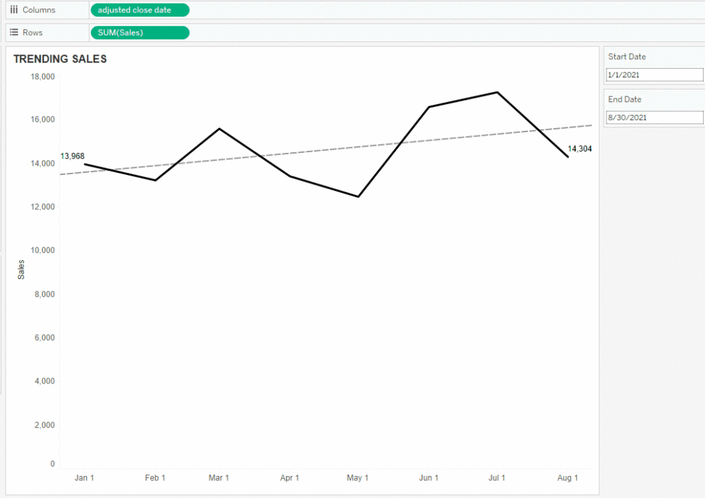
We can solve this using a handy technique I came across a while ago from Ryan Sleeper at Playfair Data (link here) where we automatically change the date part of our date field to the most appropriate level of granularity for the date range selected. I will let you read Ryan’s excellent walk-through that also includes the creation of parameters so it is easy to follow along from what we’ve created above! Basically, we first calculate the number of days in our selected range and then use business rules in a second calculation to decide how granular the view should be to still see a nice trend in our data.
The screenshot below shows how this method makes our view much better for the end-user while still giving them the flexibility to select whatever date range they want to see! If you pay attention to the dates I am selecting, you will notice the view starts out displaying at the month level from January to August. Then as I move Start Date to July 1, now 60 days of data, the view changes to the week level, and then finally as I go down to 30 days of data or just the month of August, our view changes to the day level.
Of course the above are just two simple use cases showing how to create flexible options for your end-users to view KPIs or trends over various date ranges (that are also quick and easy to implement!). In my opinion, understanding the needs of your end-user, the level of granularity of your data, and having the proper setup for your parameters is key. The options are endless for creating custom controls using date parameters WITHOUT having to decide on preset configurations. Finally, adding dashboard best practices such as displaying the time period at the top of the dashboard, using icons to explain any data definitions or abbreviations, and using color/legends to improve clarity will help ensure an awesome and clear end result.


