

One of the most frustrating parts of working in Tableau is when you have multiple sheets on a dashboard and you want to scrolling synchronized. This blog post is a tutorial on how you can use calculations and parameter actions to do just that!
Step 1: Build your sorting calculations
For the sort calculation we will need to do a ranking, but first we need to build the calculation that we’ll do the ranking on. This function needs to use two functions: TOTAL() and ZN(). These two will insert zeros where null values exist and we’ll also create a total for each row so that if/when the row contains other dimensions the values aggregate as we would expect.
For our example we are going to sort by total sales:
TOTAL(ZN(SUM([Sales])))
Because we are using total and it is a table calculation, be sure to set the table calculation. For our example were using [City, State].

Save this calculation. I’m saving it at [Sales | City, State | Total].
For the next part we’re going to place this calculation inside of the rank unique calculation. We’re going to use this for sorting and for another little trick down the line.
RANK_UNIQUE([Sales | City, State | Total], 'desc')
Step 2: Build a parameter
The next step is simple: create an integer parameter. The value wont matter because it’ll become a parameter action. For this example we’ll call it param1.
Step 3: Build a visibility calculation
We’re now to the fun part. We’re going to build the calculation that determines the values that should be shown based on the scroll bar we will create. Notice I’m utilizing the table calculation from Step 1 and the parameter from Step 2. The number 6 represents the number of values that are visible within the scrolling view. In this case we will see 13 values–the six values prior to the parameter selected and the six following. You could technically set these to be whatever you would like (and I ultimately recommend you parameterize this value, too).
					// Scroll View
IF [Sales | City, State | Rank Unique] >= ([param1] - 6)
AND [Sales | City, State | Rank Unique] <= ([param1] + 6)
THEN "Show"
ELSE "Hide"
END
Step 4: Add calculations to view
In our example we have a horizontal list of values with City-State on the rows shelf. Take the [Scroll View] calculation and place it directly to the left the dimension. After you bring it onto the view you’ll like see the hide value.

From there, right click on hide and select Hide.

Then right-click on the dimension on rows and un-check Show Header.

Step 5: Repeat (and pay attention)
Before you repeat the process for all other sheets make sure the dimension on rows is sorted identically. Also make sure your filter are also identical. Once you do that repeat the process on additional sheets.
As you do this you might decide you want additional dimensions on the marks card (or on columns) this will ultimately change your table calculations. No worries, though. With this table calculation we are using we can get around any complications with dimensions on your view. Take the following example where we’ve added segment to columns:

When we do this, we need to do some minor edits to our [Scroll View] calculation. Make sure our target dimension–the dimension we want to scroll on–is checked, while all other dimensions are left unchecked. Be sure you check both table calculations that are embedded in the calculation!


Once you’ve added the values, sorted, and filtered, you just need to hide the headers of the target dimension.

Repeat as needed for as many sheets as you are bringing onto the dashboard.
Step 6: Build the scroll bar
Now here is where the fun comes in. There are many ways to do this, but here is my way.
We’re going to build out a series of calculations that will allow us to build and then format the scroll bar. From there we’ll add a parameter action. Then we’ll test it out. But first, let’s build it:
1. Add your target dimension ([City, State]) to detail.
2. Place the [Sales | City, State | Rank Unique] calculation on rows. Make sure its a continuous dimension.
3. Set the mark type to circle.
Create the following calculation called [Hide Ticks] that will hide the top and bottom values. Note: the reason we’re hiding the top and bottom values is because we’re adding and subtracting from the center value that we calculated in the [Scroll View] calculation. In this case, if we scrolled to the first seven values or the last seven values we would show an equal number of rows relative to the rest of the dataset. Anyway, build this calculation:
					//Show-Hide Ticks
[Sales | City, State | Rank Unique] < 7
OR
[Sales | City, State | Rank Unique] > (WINDOW_MAX([Sales | City, State | Rank Unique]) - 7)
This creates a boolean (TRUE/FALSE) that we will use to hide the irrelevant values. Place this on rows. Also edit the table calculation and make sure that your target dimension is selected for all of your table calculations (remember you can edit more than one).

From there hide the [Show-Hide Ticks] header. Technically the scroll bar could work using just this formatting but this is awfully boring so let’s add some formatting.
Let’s create a calculation called [Tick Color]. This calculation will add color to the selected tick value and we’ll use it to size the tick, too.
					//Tick Color
[param1] = [Sales | City, State | Rank Unique]
This calculation is also a boolean that shows that the parameter value is equal to the rank (or not). Let’s add this to size and color. Feel free to then format the color and size.
When formatting the size be sure to sort the TRUE value below the FALSE value. This will make the TRUE value larger than the FALSE values and highlight the selected value. This selected value will always be the value in the middle of the viewable scroll range.
Finally, add two ad-hoc calculations to your marks card:
					[Sales | City, State | Rank Unique] - 6
[Sales | City, State | Rank Unique] + 6
We’ll use those to format our tooltip and help inform our users what values they’d ultimately be selecting.
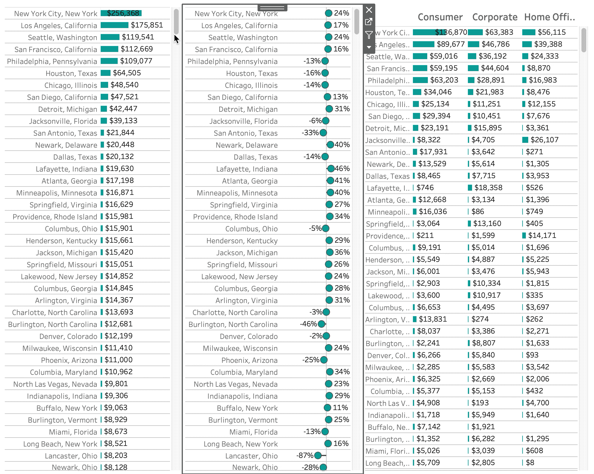
The final result is something like the following:

Step 7: Build the dashboard
Add a horizontal container to your dashboard. Add each of the sheets to the container. As you add the sheets remove all the left- and right- padding so that the charts look seamless. Depending on your chart types you may have to include upper- or lower-padding. Don’t forget to align each row pixel-perfectly.
After you’ve added your sheets to the container add the scroll bar to the right of the sheets. Size and pad the scroll bar as you desire.

Step 8: Add a parameter action
You are almost there! Let’s make this scroll actually work. We’ll do it by adding a parameter action on the dashboard. Go to Dashboard –> Actions. Then select “Add Action” and Change Parameter. Select the scroll sheet, parameter, and the rank unique calculation. Click OK.

Step 9: Synchronized scrolling
Thats it! Once you’ve added the action your scrolling should be synchronized. Thanks to two features, one old feature (Table Calculations, specifically TOTAL), and one new feature (parameter actions), we have synchronized scrolling across multiple dimensions.


