

If you’re reading this post I guess you made it through Part I of the Dashboard Design Essentials series! If you haven’t already read that post, make sure to check it out as we’ll be referencing back to some of the concepts discussed there.
In Part I of this series we talked about fundamental concepts of design (Contrast, Repetition, Alignment, Proximity). In this post, we are going to cover the basics of dashboard design. We will be applying the concepts we learned in Part I to help us build out great dashboard layouts and find out why some dashboard designs work and others don’t.
Dashboard Type
The first decision that you want to make when determining the design of your dashboard is whether you want to have an exploratory dashboard or an explanatory dashboard. Both have their benefits, but your design will ultimately be effected by which one you pick.
An exploratory dashboard is a dashboard that allows end users to explore the data you’re presenting them. You are handing them a dashboard with the intent of having them dive in deep and find the answers on their own. These dashboard tend to have more filters to allow for more custom slicing, and they tend to fit a more rigid layout as you aren’t quite sure what your end user will want to end up finding, all you know if that you want to enable them to find it.
An explanatory dashboard is a dashboard that comes with some predetermined points and stories that you want to explain to the end user. These dashboards most often have less filters and interaction as you will already have filtered down to the data needed to tell your story. These dashboards are common with presentations to executives for explaining things that have happened, rather than giving them data to find their own explanations.
Let’s look at two examples of the different dashboard types to see how their layouts and design might differ based on their purpose. Can you determine which one is explanatory and which one is exploratory?


Before I tell you which one is which, let’s walk through some of the key indicators of whether your dashboard is telling a story (explanatory) or letting you explore the data to find your story (exploratory).
- The dashboard on the left doesn’t appear to have any filters available (although you could potentially have filter actions which wouldn’t be visible), while there are two filters visible at the top right of the dashboard to the right
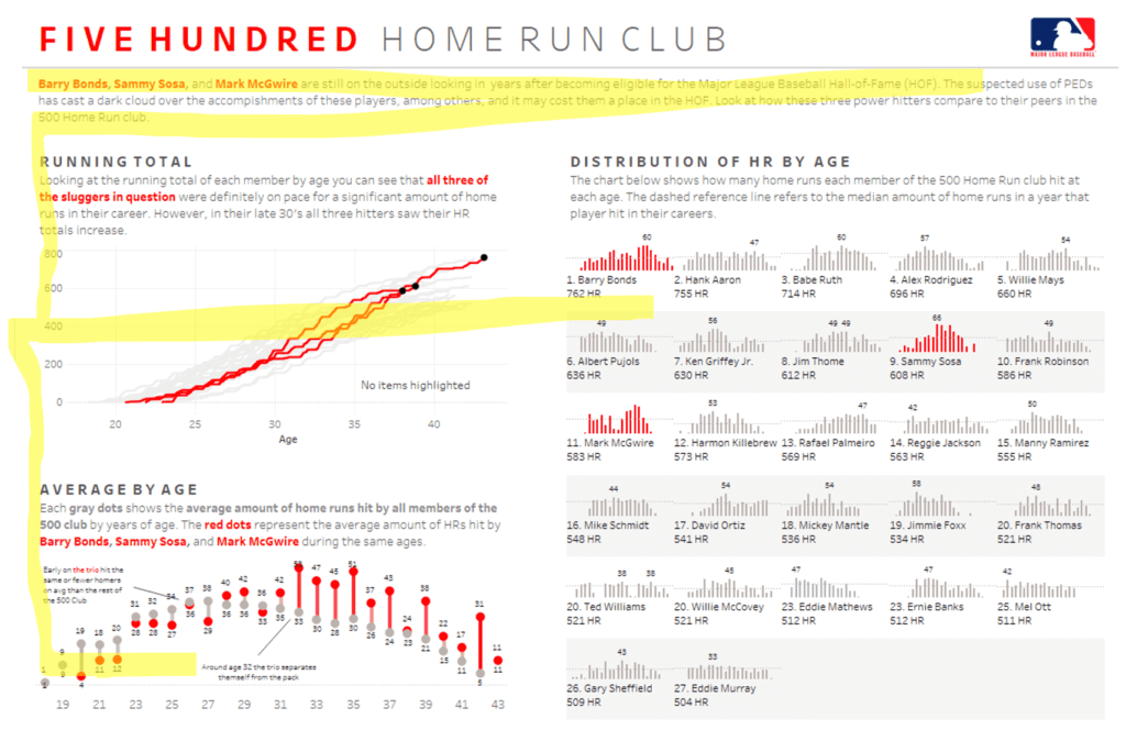
- The dashboard on the left seems to have very specific chart types that are seemingly comparing two categories, which limits the scope of conversation. In an exploratory dashboard you would want to be able to explore multiple categories of your data.
- The dashboard on the right has a lot of multiple category visuals like a heat map and a small multiple bar chart. This seems to indicate that there are a lot of variables at play and we as viewers are able to see all of them at once.
- The dashboard on the left has a lot of text. If you’re trying to explain things to users you might need some more text for sub-headers and call outs.
If you haven’t figured it out by now, the dashboard on the left is an example of an explanatory dashboard and the one on the right is an exploratory dashboard. The dashboard on the left is a dashboard explaining to views how the Rooney Rule has effected minority head coaching hiring in the NFL. The dashboard on the right allows users to explore all pitches pitched by MLB pitchers over the course of a whole season.
So before you start building your dashboard, make sure to understand the intent of your dashboard. Am I explaining, or am I allowing my user to explore?
Dashboard Size
The next step in determining the layout of your dashboard is determining what kind of physical space you’re wanting your dashboard to occupy. Do you want a standard 1000 x 800 pixel dashboard, or do you want a long story format so users can scroll? Do you want a horizontally scrolling dashboard that resembles more of a timeline? Or do you want a landing page and investigation layer approach where users have options to dig deeper into certain topics based upon a click? If you’re not sure, let me explain some of the pros and cons of each.
Standard Dashboard
The standard rectangular dashboard is the most common dashboard you’ll find at any work place. The dimensions can be variable depending upon size of viewer screens, but whether your dashboard is 1200 x 800 pixels or 2000 x 1000, the constant is that the viewer is not intended to do a lot of scrolling and the dashboard objects will all be visible in one rectangular area.
Long Form (Vertical)
The long form dashboard has really taken a hold of the Tableau community the past few years, but I have yet to see this format take hold in the business world. This format of dashboard is very useful when telling a long complicated story as it reads very much like a newspaper, long and skinny in a vertical fashion. Formatting things in a vertical fashion eliminates any other topic being horizontally aligned with another topic allowing users to focus more deeply on one topic. One the set backs is that this format is not very conducive to user who don’t want to scroll down to find their answers or ones who want to print it off and put it in a slide deck.
Long Form (Horizontal)
This is by far the least common dashboard layout. Ironically, one of the first dashboards I ever created on Tableau Public was a horizontally scrolling dashboard on the history of the Cincinnati Reds. I have never seen a dashboard in this format in the workplace, but I am mentioning it so that you know that is it an option.

Multiple Levels (Landing Page + Investigational Layers)
This is the second most common format of dashboard that I have seen. This format most commonly has a landing page where end viewers are directed to for initial viewing. On that landing page there are either prompts of multiple options to view different dashboards or topics that will then take you to another dashboard when you click on that topic/dashboard. These types of dashboards are common because it allows developers to include multiple layers and topics of data into one dashboard setting.
If you are building a dashboard for a project at work, you will most likely end up building an exploratory dashboard in a standard rectangular format. Although there are some exceptions, this is going to be the most common dashboard format. There is absolutely nothing wrong with choosing this format of dashboard. The reality is that these dashboards are the most easily understood by users, offer a good deal of flexibility, and embed nicely into website or slide decks.
But regardless of what’s common, make sure to pick a format that fits your use case. Now that you know of a few different layouts, hopefully you will be able to pick the right one for you.
Dashboard Layout
Lastly, we will be talking about common ways to lay out your dashboard. Keep in mind, there are infinite ways to structure your dashboard, but hopefully I will be able to give you some ideas that apply all of the concepts that we have covered thus far.
Dashboard Viewing
One of the biggest things to keep in mind while laying out your dashboard is how we as humans generally view dashboards. Most of the time we will view the top left first then work across the page horizontally before going back to the left side of the page, but a little lower than the first glance. After scrolling a little to the right in the middle of the dashboard your eyes then go back to the left side again but a little lower. Imagine the letter F. This is the shape that your eyes will make when looking at a dashboard. See the highlighted sections in the dashboard below.
As you can see in the pattern above, the bottom left of the dashboard will be the least viewed part of your dashboard. This means that we want to put the most important aspects of our dashboard in the top left and the least important items in the bottom left.
Common Dashboard Layouts
Next, let’s look at some common designs that take into account how humans view dashboards as well as the fundamental concepts of design. These dashboards are meant to be both easy to ingest and balanced/symmetrical in their design.
The first layout below is the most common dashboard design because of it’s simplicity, flexibility, and effectiveness. The 4 corner grid layout is simple because it’s easy to align the different sub-categories into easily identifiable groups within your dashboard. It is very flexible because the design allows you to swap different categories into different boxes without losing the symmetry of the design. It is effective because it allows users to view data in an easily digestible format while also being easily repeatable throughout your enterprise.


Generally, you want your dashboard to be symmetrical for a couple of reasons. One reason is that it looks better. A balanced dashboard in terms of design is easy for end users to navigate through and decipher your message. Another reason is because a symmetrical dashboard makes comparisons across the different sub-categories much easier allowing for greater insights.
Alternate Dashboard Layouts
The dashboards below are a couple of alternate layouts that are very balanced but do not have a distinct grid layout. These dashboards are common when displaying numerous KPIs at one time. Grouping your KPIs into the BAN (Big Ass Number) and then a deeper dive breakdown is very common in dashboard design. The practice of showing a high level metric and then drilling one level deeper to create a sub-metric is a topic that I will dive deeper into this during Part 3 of this series, so keep on reading if you’re interested.


I hope that this blog post has given you an insight into some of the basic concepts of dashboard design and layout. In Part 3 of the Dashboard Design Essentials series, I will be examining business dashboard KPI design and layouts in both Tableau and Power BI and showing how to format your dashboards for optimal end user experience.


