If you’re looking for strategic updates on key financial metrics like Actual revenue, Actual vs. Budget, Actuals vs. the previous year, etc., this is the Tableau finance dashboard for you!
Our Tableau finance analysis dashboard makes it easy for you to compare how your actual revenue performs against your forecasted budget.
Who is the Ideal User of This Dashboard?
This finance dashboard example is designed for a CFO or finance director who wants to monitor their revenue performance against a forecasted budget so that they can inform future strategy decisions.
What You Can Accomplish With This Dashboard
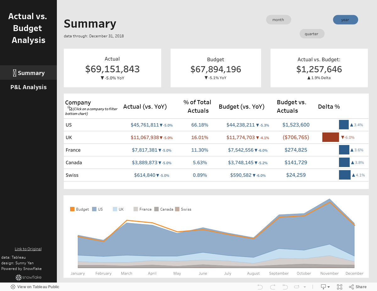
Summary View
Date Toggle: Use the buttons at the top right of the dashboard to view metrics for the current month, quarter, or full year. This also adjusts the values in the KPI cards and region table.
Region Toggle: Click on any region name to filter the bottom area/line chart to analyze that region’s performance of actuals vs. budget. Clicking on a region will also adjust the numbers in the KPI cards at the top of the dashboard.
Navigation Toggle: Click on the icons at the left of the dashboard to navigate to either the summary view or P&L Analysis view.
P&L Analysis
Region Toggle: Click on the filter icon to filter the chart to a specific region. When finished, click the ‘X’ to hide the filter container.
Tooltip Hover: Hover over any of the bars in the waterfall chart to see the full dollar amount of the bar without the millions unit.
Conclusion
We hope you found this dashboard valuable as you inform your finance strategy efforts through monitoring revenue numbers by region, comparing to budget and previous year.