

This post is the first in a series of posts aimed at providing resources to organizations and dashboard developers to help bring their dashboards to life regardless of what BI tool they use.
Basic Design Principles
Luckily, basic design principles do not discriminate between BI platforms. There are a few main design principles that are good to keep in mind regardless of what platform you’re using. Just remember, design your dashboards using CRAP.
“Huh?”
Ohhhh sorry, some context would be good here ya? I always try to design dashboards with the CRAP principles in mind. And I am not trying to be crass here, but CRAP is way more memorable than CARP or PRAC, so CRAP it is! The CRAP principles are:
- Contrast
- Repetition
- Alignment
- Proximity
Although these terms may be self explanatory, I want to show you specific use cases with dashboards that I’ve designed to drive home how important these concepts can be in portraying your dashboard’s overall message.
Contrast
Contrast in your dashboard may take many forms. Common forms of contrast may include colors, sizes, shapes, and location. Our first example will show how color can be used to draw viewer’s eyes to important aspects of a dashboard.
I. Color
Take a look at the screenshot below. What sticks out to you? What do you notice first?

They first thing my eyes looked at where the titles and the blue dots. Now let’s alter the colors a little bit and see what happens.

In this instance, my eyes quickly glanced by the bold title and then were attracted to the dark blue dots. My eyes then went back to the bold titles. Changing the colors of the dots every so slightly can heavily impact where your viewers eyes will go when looking at your dashboard.
II. Size
Let’s take a look at how we can use Size contrast to draw attention to our data. In this example I am going to be using NCAA football data. Take a look at the dot plot below showing the average amount of wins by a college football team plotted against their average recruit ranking and see what pops out to you.

If your answer was ‘nothing really’, then you pass. That’s because there is nothing differentiating any of the points from one another. Now let’s apply our first Contrast principal and see what this chart looks like colored by how many wins a team achieves per year on average per recruit ranking level (recruit ranked 1-5).

Now we’re starting to get somewhere. Our eyes are starting to be drawn to the top left and bottom right, or the outliers of this data analysis. Because we want to see teams that are really outperforming their expectations, we can use size to draw more attention to our positive outliers. See how this looks below.

See how the sizing helps eliminate more of the noise from our analysis and helps us focus on the most important aspects of the plot. Now as a bonus, let’s add some notations for emphasis and see the chart come together.

III. Shapes
Lastly, let’s see how Shapes can be used to help tell our story. Look at the table to the right. What stands out to you?
This was meant as trick question because our first two Contrast concepts take precedent over the shapes. The bold/black (Color) and larger (Size) total numbers pop out first. But after that, we see our shapes take hold.
This is actually right where we want this type of indicator to show through in a dashboard.

Since we don’t want the up/down arrows to be the first thing viewers see, the sizing and colors of these indicators need to be just big and colorful enough to catch your eye but not be overpowering in the overall layout.
Repetition
Using the concept of Repetition allows dashboard developers to portray consistent and steady themes that allows viewers to more closely follow the story you’re trying to tell. Let’s discuss two of the main ways that you can use repetition of location and color in this manner.
I. Location
When I say Repetition of location, I am predominantly meaning the consistent locations of certain chart elements throughout a dashboard. These chart elements can be anything from bar charts, texts, or underlines. Repeating chart types, objects, or colors in your dashboard allows viewers to feel more confident and comfortable while reading your dashboard since they’ll know where things are and can have certain expectations about appearance and representation.
A small multiple chart is a great example of how repetition can aid in understanding. See if you can identify some of the items that are being repeated throughout the chart.

Here are some of the repetitive items that I notice:
- Chart Type – obviously a small multiple chart will have the same chart type throughout, but you can still apply this concept to your dashboards. Using consistent chart types will keep viewers from having to interpret and learn new chart types multiple times on a dashboard
- Player Information – in this chart, the player information and HR totals are all located in the same spot with the same font and in the same order.
- Axis – every chart has the same x axis. If possible, make sure to have your axes matching if you have multiple timelines on one dashboard
- Row Banding – although more of a subtle feature, the constant row banding helps differentiate the rows allowing for viewers to better separate the charts from one another
- Data Labels – each bar chart shows the year where a player hit the most home runs. Make sure to keep data labels consistent in both their appearance and purpose
Another application of location repetition is the location of specific items on your dashboard such as filters and icons. If your company icon is normally in the top left, make sure it’s always on the top left. Also, decide early on where your dashboard filters are going. I have seen many preferences on this from horizontal below the title to a vertical pane on either the far right or left sides of a dashboard. Whatever you choose, make sure to keep it consistent.
II. Color
Let’s zoom out on that same dashboard we used for our location example and let’s see how repetition of color can make for a better design.
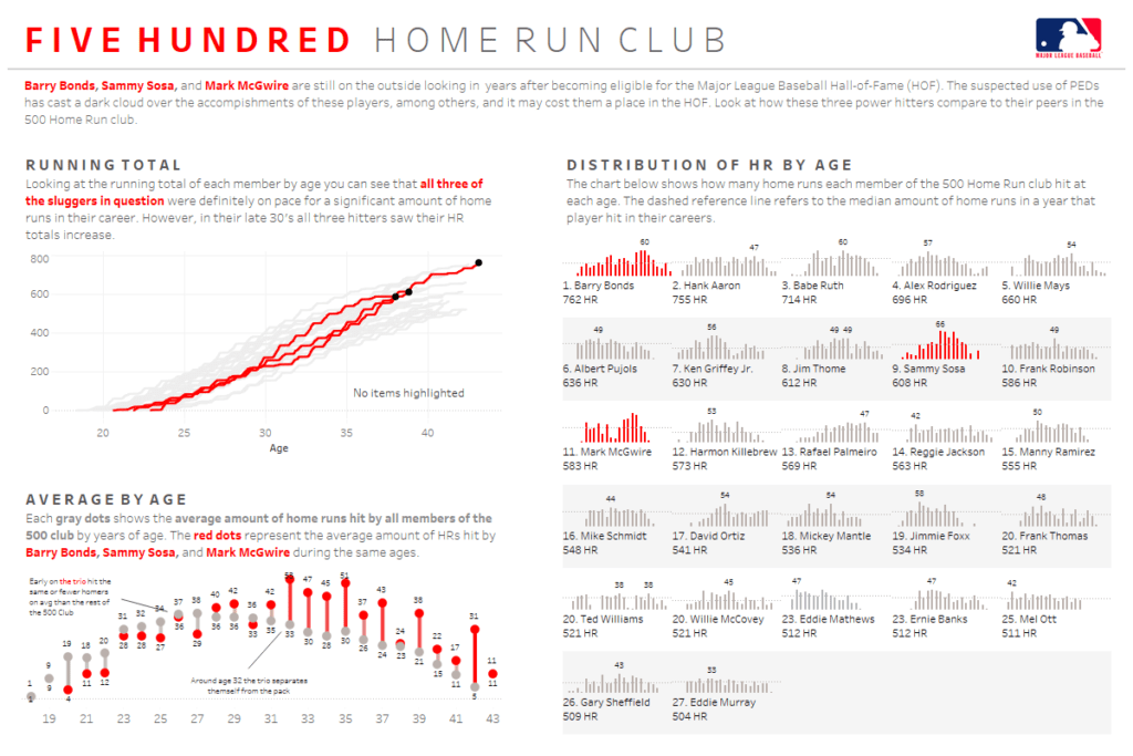
There are two elements of design I want to emphasize in the dashboard above in terms of color. First, keeping the color scheme simple is so important. As you can see, I’ve used two main colors, gray and red. Anything related to the three HR hitters being analyzed is highlighted in red. Anything else is gray or gray bold. I then tied the red color back into the title to tie the title and dashboard together.
Keeping the color scheme simple allowed me to tell the story partially using just the red highlights. Even without reading much of the text you are able to see what parts of the dashboard I want you to focus on.
Another important thing to mention for color repetition is that if you use a certain color to represent something in one chart, dashboard, or table make sure to use that same color throughout. It can cause a lot of confusion to have production plants colored in red in one dashboard then color them blue the next.
Alignment
Alignment helps create balance and organization within your dashboard. This concept might be the easiest one to understand, but it is undoubtedly the one I see not being followed most often. Alignment in a dashboard can take many forms including charts, text, and axes. Let’s talk about how to practically apply these topics to make a better looking dashboard.
First, you want to determine what your dashboard will be aligned to. Do do you want your dashboard left aligned, center aligned, or right aligned? Whatever you choose, you will want all aspects of your dashboard aligned in that direction. Personally, I always go with left aligned as readers will generally read your dashboard from top left to bottom right, but that will be a topic we discuss in Part II of this blog post.
Finally, your text will need to be aligned properly. This means for all of you that love center aligning titles, sub-headers, and text fields, if you’re left aligning your dashboard, left align your text! Having all of your text and charts in alignment will really help draw your dashboard together. Let’s check out an example that will tie all of these alignment concepts together.
See the dashboard below showing NCAA athletic department financials. See how many different elements of alignment you can identify in this dashboard.

This dashboard is aligned in several of the ways previous discussed:
- All text in the dashboard is left aligned including sub-headers, row labels, and the dashboard title.
- Top and bottom sections are vertically aligned to create three separate sections which are all left aligned within their sections
- All axes are aligned to show the same time period and the sparklines are all vertically aligned to allow for comparison
I know we’ve covered a lot of content so far. We’ve talked about how to use contrast to bring dashboards alive. We’ve discussed using repetition to help end users better follow your data’s story. And we’ve now talked about how alignment can help tie your dashboard together. This brings us to our final design topic, proximity.
Proximity
The concept of proximity means that the placement of objects in your dashboard matter. Objects placed at the top are going to be interpreted as more important. Objects placed close together are going to be interpreted as being related in some capacity. Make sure to keep this idea in mind while determining the final placement of objects on your dashboard.
Below is a dashboard showing data from the NFL combine since 1987. See if you can identify instances of proximity helping tell this dashboard’s story.

Here are just some of the ways proximity is displayed on this dashboard:
- The large summary metric (in red) is placed at the top left of each section
- The trend line and summary metric are next to one another indicating what metric the trend line is for
- There is space between each section allowing users to separate each of their metrics in their mind
- Within each sub group, the chart elements are not super close together allowing proper viewing of each dashboard object
It is important to talk about the concept of white space when discussing proximity. White space is essentially making space between different dashboard objects. This allows users to separate groups of information so that they can digest them in a more meaningful way. Make sure to include plenty of white space between groups, and even within related groups so that individual elements can be interpreted correctly.
I really hope this post was helpful in explaining the basics of design and will enable you to apply some of these concepts in your work place. Make sure to keep reading this series, Dashboard Design Essentials with our next installment discussing Dashboard Layout & Design.
Ready to add expertise to your data visualization projects? We are ready to help!


