We’ll start off by saying that gauges generally aren’t the best data visualization approach. This is because gauges involve two violations of best practices: 1) the gauge is effectively a curved bar – and as a general rule, curves aren’t easy to read or interpret; 2) we are treading into the territory of chart junk here: the number does the job of telling us what we need, the color on the gauge is an indicator (and it doesn’t need to be an arch) and the needle doesn’t really ‘do’ anything at all.
Before we dig in, I’ll acknowledge that we stand on the shoulders of giants and I’ll give a quick shout-out to Ken Flerlage and hisJanuary 2018 post on making a percentage gauge. I’ll also echo his comments made about this type of visualization:
All this being said, I’d simply caution you if you’re thinking about using gauges. I share this technique not because it’s the way you should do it, but because there could be a time where it makes sense, for whatever reason. But you should avoid using a chart like this simply because it looks cool. While visual appeal is often important, you can still create visualizations with both visual appeal and strong analytical precision at the same time.
Ken Flerlage, flerlagetwins.com, January 2018
So, if you’re still there, this post is provided for those niche needs (or niche clients) that merit or desire a gauge.
The Main Concept
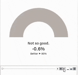
Gauge charts in Tableau are basically doughnut charts, which are basically overlapping pie charts. The middle section is a white circle – but in this case, we are adding in a needle to both the inner and outer pies.
The Set-Up
We’ll make a lot of formulas, but we’ll start off with a few parameters.
First – how large do you want the needle to be? I find that smaller is better, but again, your case may call for something different.
Second – what are the cut points needed on your gauge, and how many cut points do you need? For this example, we want our gauge to have three colors – red, yellow, and green – so that means having two cut points.
That should do it for our parameters, so let’s dig into the formulas.
The first one is easy – as we are making overlapping pie charts, and we want our gauge to span the upper 180 degrees of a circle, we just need to define our bottom half of the pie.
Note that for the formulas in this tutorial, I use images - you'll learn a lot better when you write your own formulas!
The next one is a bit of a doozy – we need to define the pointer that lives on the inner pie.
You'll see the field [Value] is used here - that is the field from my dataset that is the percentage that I want to show on the gauge.
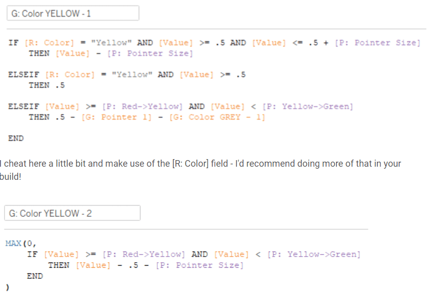
The second pointer is also quite the formula. This one is used for the outer section of the pie and adjusts based on the color of the pie.
At this point, I also like to include a little helper formula that tells me which color my value is, based on the parameter cut points:
Now for the main sections of the gauge chart. We’ll need two formulas for each color section on the gauge – one for the left side of our gauge (appended with the number 1 on the formula names), and one for the right (appended with a number 2 on the formula names).
You see here I reference a field called [G: Color GREY - 2] - don't worry, we're coming up on that.
So, those are the main colors. You’ll see in each case, we have a lot of IF statements. This is because we need to account for the value of the metric we are placing on the gauge and whether or not the needle should be shown (and if so, do we show the full need size or only a portion of it).
I’ve also seen gauges that don’t factor into the logic of the actual needle at all – the end result is then a gauge chart where the top half and the bottom half aren’t equal and then the gauge looks a little lop-sided. There are other approaches to correcting for this, like simply adding the value of the needle to the bottom half! In this case, I personally find the math pretty fun, so I’ve left in the needle size adjustment calculations in each of the formulas.
Earlier in the post, I mentioned a field called [G: Color GREY – 1]. This is the ‘yet unachieved’ portion of the gauge.
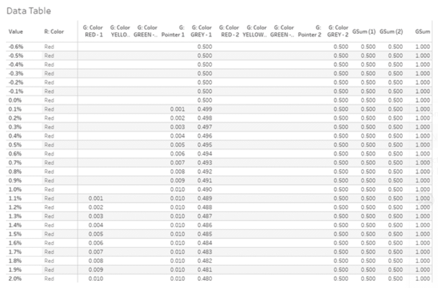
So, now that we have all of these formulas (and while they aren’t REGEX, geometry, or spatial values – they are a little complex), I like to do some validation to ensure I will get the results I want.
Here I sum the portions involved on the left side of the gauge.
Sum the portions on the right side of the gauge.
Sum all the portions in our gauge.
In a nutshell, [GSum (1)] and [GSum (2)] should always equal 0.5. Remember when we defined our bottom half to be equal to 1 in the very first formula? So if the top half is 0.5 + 0.5, that means that our top and bottom halves will be equal, and we will end up with a nice flat gauge.
Once I have those formulas ready to validate, I can put together a spot-check table, where I can ensure all my values check out:
Ok, things look good!
Because the data I am using for this example is simply a one-column spreadsheet of values ranging from -0.006 to 1.1, this kind of exercise is helpful. Your use case may not have all possible values and you may not need to go through a validation step.
Now that we have finished our setup, time to build.
The Build
The first thing to do is put some placeholder values of 0 on the rows and columns shelves.
Note the dual-axis!
All of our marks will be pies, so be sure to change that.
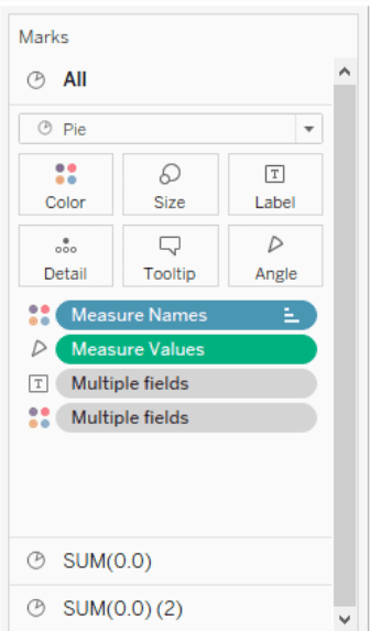
Note that Measure Names is on color and Measure Values is on Angle.
The outer pie is larger, so set the size accordingly to your needs. There isn’t anything special going on with the marks here either.
The inner pie chart will be a little bit smaller. Plus we need at least one extra field on there, a placeholder. Be sure to save this field and not just type it in on the marks card.
This image shows Pointer Label, Value, and Next Pointer Label on text, but in the end I decided not to do that. More details on that shortly.
Remember when we put Measure Values on the angle section of the card? Now we need to get the order right to sort these. This is because Tableau will start our pie chart in the middle of the upper half and work around the pie clockwise.
Now let’s assign some colors to those pie slices! Here I opt for a very basic Red-Yellow-Green palette with a dark grey for the needle/pointer and a light grey for the ‘yet unachieved’ grey portion. Be sure to color the bottom half to be the same color as your background on your viz!
The inner pie, however, gets a slightly different color treatment. All of the colors need to be the same as your viz background color, with the exception of the pointer – that should be the same color as your pointer from your outer pie.
At this point, the rest is really up to you in terms of formatting and adjusting and tweaking things. I don’t like to place labels directly on the pie chart and instead prefer to make a floating label that will show exactly the information needed.