

This is the first of two blog posts on the simple and innovative ways Alteryx and Tableau can be used for spatial analysis. This post will get into two very spatial (pun intended) types of analysis: intersection and proximity.
The most fundamental relationships in spatial analysis are proximity – or distance between spatial objects – and intersection – or layering. If you think about it, proximity is one of the core filters that we use when searching for anything; What restaurants are nearby? Where is the nearest ATM? Even when searching for a business or name, Google prioritizes the things which are closest to us compared to those which are farther away. As self-service tools improve in spatial functionality – particularly Alteryx and Tableau – we can easily answer a wide range of spatial questions.
To showcase the power of these tools we’ve put together a demo using brewery locations. The state of Virginia was kind enough to post the locations of all licensed breweries in the state on their open data portal. The data can be accessed in both CSV and shapefile formats. We will use both for each of the methods described below.
Spatial Joins
We can now join data based on their shared geographies in shapefiles with the release of Tableau 2018.2. The brewery data for our example contains geographic coordinates and addresses, but doesn’t list its county. With the spatial join feature, we can now perform a simple intersection analysis between a county boundary shapefile and our brewery locations.
To create the spatial join, load both shapefiles into the data pane. Choose the Geometry field from each shapefile as the field to join on. Set the shapefiles to join on “intersect” and set the join type to full outer join. This setup will return all records from each data set where the brewery locations intersect the county polygons.

Perform a spatial join
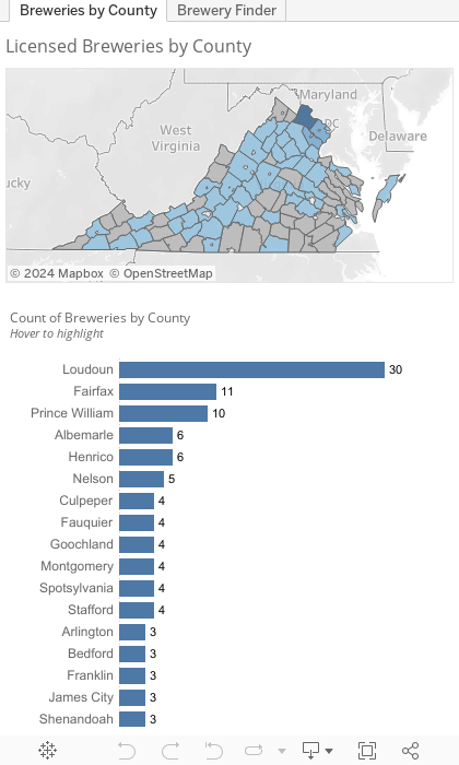
With this relationship set, we’ve added additional context to complete aggregation that wasn’t possible with the original brewery data. The dashboard below shows the possibilities, where we can see that Loudoun County in the DC area has 30 breweries. We can also see the grey counties which don’t have any breweries.
You can also view the report here in Tableau Public.
Proximity Using Coordinate Math
Now that we’ve used the spatial join method to find the county with the most breweries, let’s find where there is the greatest congregation – or density – of breweries. Let’s say we want to plan out a pub crawl in Leesburg and don’t want to walk too far. If we start at Bike TrAle Brewing Company, let’s see how many breweries are located within one mile. This sets up another important type of spatial analysis: proximity, or “What’s close to me?”
There’s a good Tableau Knowledge Base article that describes how to find the distance between two points on a map. The article details two methods for measuring the distance between locations; the radial tool and another method using a self join and a calculated field.
Since Tableau 10.0, users have been able to measure distance from a point using the radial tool. This method is find for measuring individual points, but doesn’t work if we want to perform any type of analysis. The second method described in the article uses custom SQL to join the dataset to itself. The query creates a cross join that filters out a single point from joining to itself. This method is appropriate for small datasets, but will very quickly run into performance issues with larger sets. We’ll use the second method, but update it to use the latest and greatest features in Tableau.
While sets have existed in Tableau for a while, the release of set actions in Tableau 2018.3 allows us to dynamically change which features are included in the set. The Knowledge Base article describes using custom SQL and joining the data to itself, which is fine, but set actions allow us to skip this step. The following steps can be followed to replicate their method with dynamic sets.
The Steps
For this example, we’ll use the licensed breweries data from the first example. We’ll load the file using the data pane and use the default field names – just be sure to set the X field as your longitude and the Y field as your latitude.

Next, create a set named “Selected Brewery” from the ObjectID field.

Following that, create a set action called “Select a Brewery” which adds items from the map to the set when a user clicks the item. Choose the option to keep the set values when the selection is cleared.

Continue by creating two calculated fields, Selected X and Selected Y, which use the Fixed Level of Detail calculation to get the average of the coordinates for breweries which are included in the set. This step eliminates the need for the self join and custom SQL mentioned in the KB article. This populates the coordinates from the location in the set to all other records in the data set. Remember: this method assumes a single point is being used, but it could be extended to get the average location of a group of points or other objects.


Next, create a calculated field called “Distance” which uses the formula from the KB article. We have modified the formula from the article to work using the calculated fields created in the previous step. In short, the Distance field pulls the X value, which is generated by the Fixed level of detail calculation, which is only populated for points which are included in the “Selected” set. It then calculates the distance from itself to the X (or Y) coordinate of the point in the set.

We’ll sidestep the debate on whether this formula is an appropriate way to measure the distance between two points (hint: it’s not). We used the radial tool method outlined in the KB article to spot check the method and it appeared to be accurate.
Create a parameter named “How far is too far?” and set the radii for your analysis.


Create a boolean calculated field which will return True when the Distance field is less than or equal to the radius parameter.

Create a set named “Within Radius” from the Less than Too Far field which sets True as the In group of the set.

Finally, create a field named Distance Groups which evaluates membership in each of the sets in order to color the dots on the map.

Wrapping It Up
With those steps complete, we can now find the number of breweries that are within any distance of the items in our set. Explore the dashboard below to see how it all works together. There are some additional formatting steps that we have skipped over that you can find in the workbook.
Using this method we can see there are six breweries within one mile of Bike TrAle Brewing Company.
Using these two methods we’ve extended our data by performing a spatial join and found the distance between two points, some of the most fundamental and common spatial analyses. We didn’t have to use any external packages, tools, or languages – it was done entirely in Tableau. Check back for part two of this post where we’ll incorporate Alteryx to get more precise with our analysis.
Do you have more questions about Tableau? Talk to our expert consultants today and have all your questions answered!
This post was originally written by Shaun Davis.


