

This dashboard is built to give digital advertising managers an understanding of exactly how their digital ads are performing and how cost-effective they are.

Quickly and easily track financial performance over time and gain insight into your organization’s financial stability with this Tableau dashboard.

This interactive and shareable dashboard allows executives to drill down and monitor key drivers of KPI metrics.

Use this helpful sales vs. target dashboard to identify the top and bottom performers versus a target metric in Tableau.

This dashboard helps accounting professionals uncover outstanding invoices and email the appropriate owning contact.

Leverage this Tableau Shipment Dashboard example to better track key shipping performance indicators at a glance.

This Tableau dashboard gives call center leaders insight into the service performance of their call center, its capacity & demand requirements over time, and more!

This dashboard is meant to help marketing leaders examine the health and performance of their email marketing campaigns.

This Tableau Inventory dashboard gives users a current snapshot into an organization’s inventory on hand across warehouses and product categories.

This PMO Tableau dashboard example helps project management leaders monitor the progress, status, and budget of their open projects.

Get an overview of spend volume by vendor and by category with this helpful procurement spend analytics Tableau dashboard.

Compare how your actual revenue performs against your forecasted budget with the help of this Tableau Dashboard example.

Monitor the operational burden on your agents and keep a pulse on the performance of your Call Center with this dashboard.

Gather information needed about how the KPIs are performing across centers with the help of this Tableau dashboard example.

Receive critical insights into your organization’s supply chain stock coverage with the help of this Power BI dashboard.

This contact center executive Tableau dashboard example is ideal for Executives who want a high-level summary of a contact center’s various channels.

Leverage this Power BI dashboard to get better insights into which web pages, referral sites, and countries are contributing the most to your web traffic.

This sample Plugs Electronics Dashboard provides high and low level views into an example retail company’s trending sales.

Explore KPI performance at a high and granular level through the use of highlighting and user interaction in this dashboard.

Track the engagement and effectiveness of Twitter digital ad campaigns with the help of this Tableau dashboard example.

Gauge customer loyalty and satisfaction with this net promoter score Tableau dashboard built for business leaders.

Gain valuable feedback insights on important business topics with the help of this Likert Scale Survey Dashboard in Power BI.

Uncover trends and investment opportunities in the S&P 500 Index with this insightful Sigma Computing Dashboard. Investigate today!

As the status of COVID-19 changes every day, this dashboard example was created to track its trends by county and can be embedded on any website.

This Tableau Dashboard example allows local and state government departments to gain insight into the submitted open Citizen Service Requests.

This dashboard example demonstrates how Sigma can process incredibly large datasets and provide flexibility in analyzing the data to address a diverse range of inquiries.

Leverage this handy Expense Report Dashboard from Sigma Computing to better determine how expenses are being spent across your business.
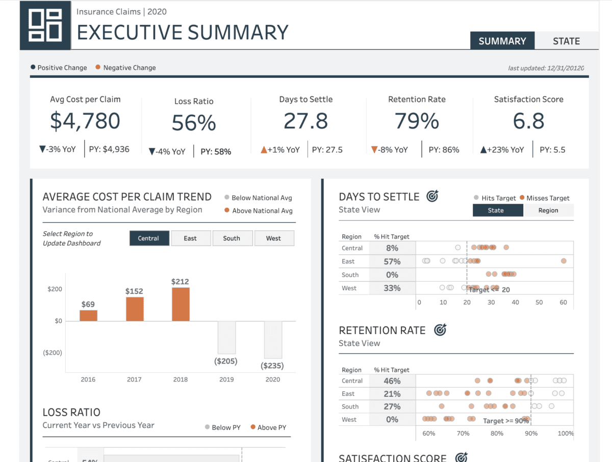
This dashboard provides users with an end-of-year summary of five key insurance KPIs.

This dashboard helps promote sales and saves time by providing an automated but customizable way to assign targeted marketing campaigns to customers.

Instantly gauge success, compare properties, and pinpoint areas for improvement with our dynamic dashboard, crafted by a team of industry-leading Tableau experts.

Uncover a high-level summary of service performance gaps and trends, specifically to identify opportunities to improve service with this dashboard.

Leverage this Tableau dashboard to get a view of your organization’s sales and margin performance across products and customers.

Use this Store Analysis Power BI Dashboard example to track progress, identify gaps, and make informed decisions to better align with sales.

This ServiceNow Tableau Dashboard helps monitor IT service performance, track key metrics, identify trends & issues, and ensure efficient service delivery.

This dashboard analyzes customer data for trends in churning and opportunities to sell other offerings to help encourage customer retention.

The Fraud, Waste, and Abuse (FWA) Tableau Dashboard provides organizations with an overview of application trends, metrics, details, and potentially fraudulent activity.

The Sales Analysis Power BI Dashboard provides an in-depth analysis of stores’ sales performance.

Gain valuable insights into sales performance versus quota with this Tableau dashboard example!

Discover interactivity in our Superstore Tableau dashboard example. Explore dynamic visualizations and data insights with Tableau’s power.
Discover a detailed Tableau dashboard for delivery analysis optimized for mobile viewing.

Leverage this Sigma Computing dashboard to uncover must-have analytics and insight for any call center.

Get an overview of spend volume by vendor and by category with this helpful procurement spend analytics Tableau dashboard.

Use this Sigma Dashboard to prepare for any upcoming travel disruptions proactively.


