

Trend lines represent a significant asset for businesses because they not only signal the presence of certain patterns but also allow predicting the future performance and supporting data-driven decisions. In Sigma Computing, the use of trend lines in your visualizations will not only enhance your data storytelling but also provide more profound insights into trends across periods.
If you are looking to analyze sales performance, user growth, or operational metrics, then learning how to use trend lines in Sigma would not only help you spot important trends but also enable you to make better business decisions. In the course of this blog post, we will cover:
-
What trend lines are and when to use them.
-
Step-by-step instructions for adding trend lines in Sigma Computing.
-
Various categories of trend lines (linear, exponential, etc.) and their optimal application.
You will be able to apply trend lines to your Sigma dashboards with confidence and extract valuable insights from your data by the end of this article. So let’s get started!
What are Trend Lines and Why Do They Matter?
To help analyze and comprehend data over a given period, data visualization tools (particularly business intelligence (BI) tools) include a feature called trend lines. Trend lines help users detect trends and provide the ability to predict potential outcomes based on the data provided, which offers a basis to make rational, informed decisions. They condense and summarize considerable portions of data. By doing so, they convey the overarching data and simplify the intricate details.
Why trend lines matter
Recognizing Trends and Behavior
With the help of trend lines, users can establish whether the data is increasing, decreasing, or is constant. This rapidly provides a user with the general concept relative to the performance/growth or behavior over a period.Predict What’s Next
By extending historical data trend lines, businesses can predict possible outcomes. For instance, a business can analyze its previous sales to predict sales for the future and use that to develop a sales-related strategy (considering the predicted sales for the future, the business can plan how to balance inventory).Improved Data Visualization
Trend lines enhance the story that is told by a set of numbers by simplifying the data. This improves a team’s ability to analyze, interpret, and collaborate on a report or presentation.
Types for Trend Lines in Sigma
Trendlines are statistical tools for extrapolating future trends from existing data sets. The underlying distribution of the data determines which regression model – Linear, Logarithmic, Polynomial, Power, Exponential, or Quadratic – is best. The reliability of a trendline is quantified by its R-squared value, or coefficient of determination. Greater predictive accuracy is indicated by a high degree of fit between the trendline and the observed data, as indicated by an R-squared value close to 1.0.
1. Linear
A linear trend line fits a straight line to data showing a linear relationship. It reflects a constant rate of change, indicating a steady increase or decrease in the data points over time.
Y = a + b * X
2. Logarithmic
A logarithmic trend line is a curved line that fits data where the rate of change is rapid at first and then levels off over time. This type of trend line can handle both negative and positive data values.
Y = a + b * log(X)
3. Polynomial
A polynomial trend line is a curved line fitted to data with fluctuations. The order of the polynomial corresponds to the number of bends, or “hills” and “valleys,” in the data’s pattern. Sigma’s polynomial trend lines default to an order of 3 but can go from 3 to 7. This order determines the number of coefficients in the polynomial function, affecting the curve’s complexity. A higher order allows for more bends, helping the trend line fit more intricate data patterns.
Specifically:
An Order 2 (quadratic) polynomial can model one bend.
An Order 3 (cubic) polynomial can model up to two bends.
An Order 4 (quartic) polynomial can model up to three bends.
Y = a + b * X + … + k * X^3
4. Power
A power trend line is a curved line that fits data where the dependent variable changes at a rate proportional to its current value raised to a power. This model only works with datasets that have only positive values since it is undefined for zero or negative numbers.
Y = a * X^b
5. Exponential
An exponential trend line fits data that changes at a constant multiplicative rate, which means values rise or fall more rapidly over time. This trend line is only suitable for datasets that only contain positive values, as the exponential function does not work with zero or negative numbers.
Y = a * e^(b * X)
6. Quadratic
A quadratic trend line is a second-order polynomial. Like higher-order polynomials, it models non-linear data and smooths out volatility; however, its parabolic shape (with one ‘hill’ or ‘valley’) is best for capturing simpler U-shaped or inverted U-shaped trends.
Y = a + b * X + c * X^2
How to Add and Customize Trend Lines in Sigma
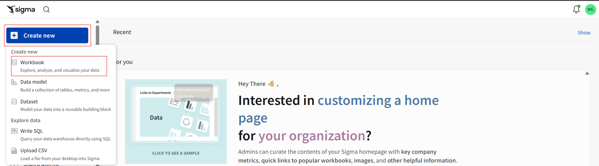
Step 1: Navigate to your Sigma environment and log in with your credentials. You will typically land on the homepage.
Click the blue + Create New button in the global navigation bar at the top of the screen.
In the dropdown menu that appears, select Workbook.
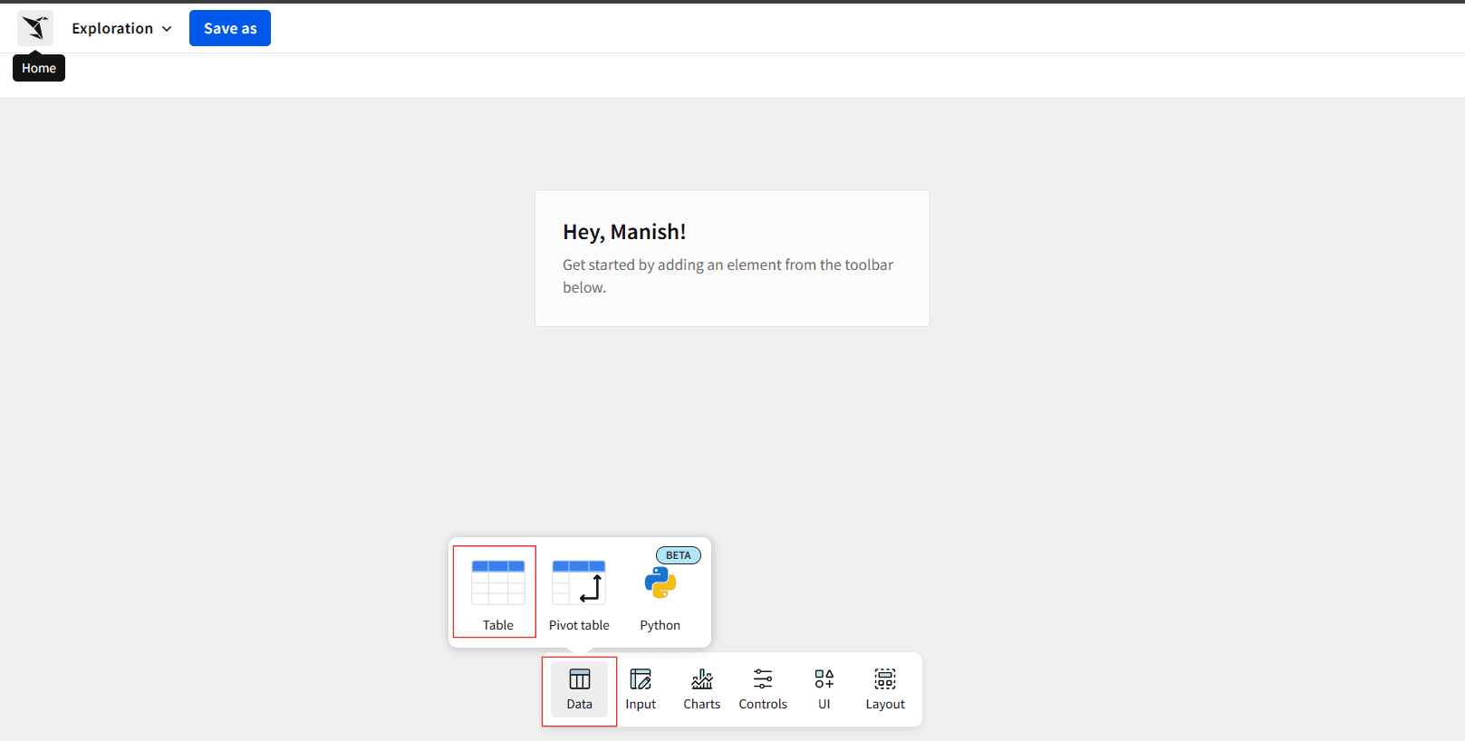
Step 2: From the Data Pane option, choose Table, then a window will pop up. This is where you select the dataset to start your analysis.
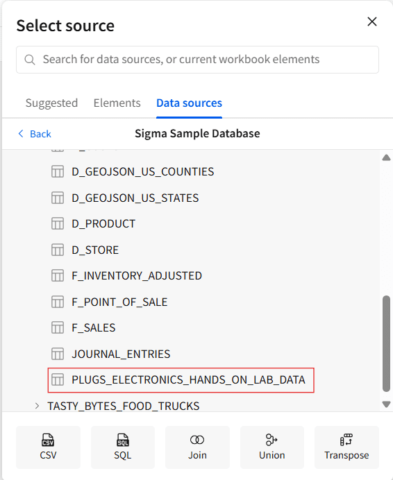
Step 3: Navigate through the available data sources. You can choose from:
Tables in your connected databases (like Snowflake, BigQuery, etc.).
Existing Datasets that have already been created in Sigma.
Here, in our case, we are using Sigma Sample Database/Retail/PLUGS_ELECTRONICS/PLUGS_ELECTRONICS_HANDS_ON_LAB_DATA and click Open.
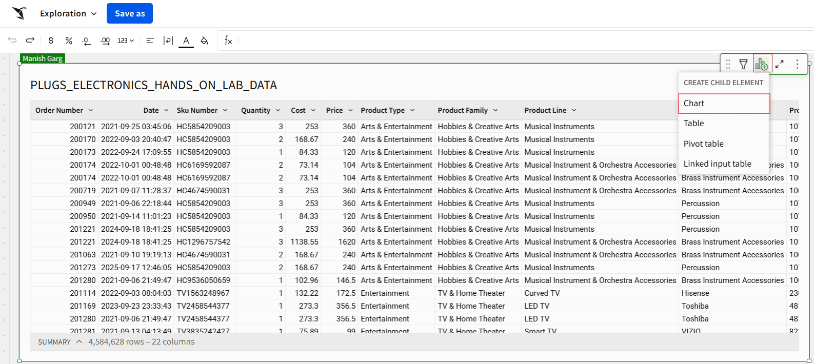
Step 4: Now that we’re connected to our dataset, click on the Create Child Element icon below and select the Chart option to begin creating a scatter plot visualization.
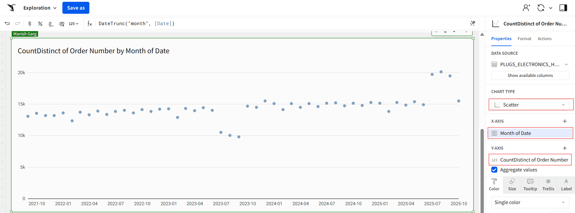
Step 5: Once you move to the Chart section, select Scatter Plot as the chart type. Set the X-axis to show the Month of Order Date and the Y-axis to show the distinct count of orders. This setup helps visualize how order volume trends over time.
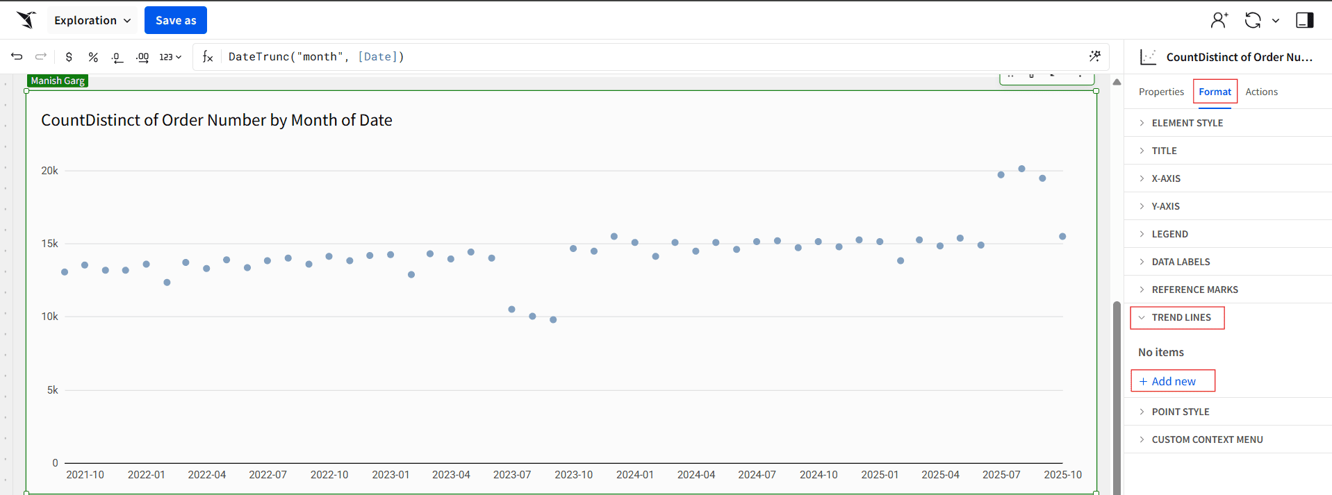
Step 6: In the editor panel, click Format, expand the Trend Lines section, and then click + Add New.
Step 7: Expand the Trend Line section, choose a Y-axis column under Select Column, pick a model type (Linear, Logarithmic, Exponential, Power, Polynomial, or Quadratic), optionally adjust the line’s style, size, and color, add a label and position it, and enable Show Value to display the R² fit metric.
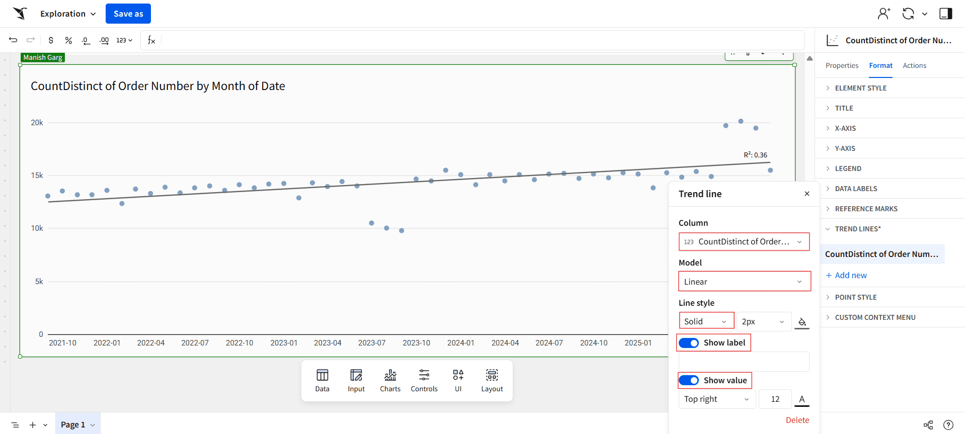
The resulting R² value of 0.36 indicates a moderate correlation between the variables, suggesting that while there is some trend in the data, a significant portion of the variation remains unexplained by the model.
Note: Trend lines are supported only when both axes have columns plotted and when the scales are compatible — Linear, Time, Log, Pow, or Sqrt.
A warning message will appear in the Format panel’s Trend Lines section if your chart uses an incompatible scale. Review the scale types of your axes and change them to a supported option to resolve this.
Best Practice for Trend Lines
Here are some best practices to keep in mind when creating trend lines:
Choose the Right Model
Select a trend line model that best fits your data pattern:Linear for consistent rises or falls.
Exponential for growth acceleration or deceleration.
Logarithmic for quick initial changes that level off over time.
Polynomial or Power when data varies or curves.
If the data doesn’t support it, don’t try to fit a complicated model.
Don’t Overuse Trend Lines
Too many trend lines on one chart can confuse readers. Stick to one or two key metrics that convey the main insight.Use Clear Formatting
Select a trend line model that best fits your data pattern:Use contrasting colors for trend lines so they stand out.
Label your trend line (and optionally display the R² value).
Make sure that the charts have the same style (solid, dashed, or dotted).
Closing
And that’s it! You now know how to add and change trend lines in Sigma Computing. You know how to choose the right model type (Linear, Logarithmic, Exponential, Power, or Polynomial) and how to use the R² (R-squared) value to see how well your line fits the data.
Keep in mind that a higher R² means your trend line explains more of the data’s variation. However, even lower values can show you interesting patterns and connections. So go ahead and try out different models, see how well they fit, and let your data tell its own story!

Ready to make your data stories more insightful?
Put this into practice in your next Sigma workbook, then share your chart, and we’ll help you pick the right trend line and explain the R² with confidence.
FAQs
What are the key limitations of the R² (R-squared) value?
While R² is a useful measure of how well your data fits a model, it has several important limitations to keep in mind:
R² cannot detect bias.
It doesn’t indicate whether your coefficient estimates or predictions are biased — you’ll need to review the residual plots to assess that.R² doesn’t guarantee model adequacy.
A low R² can still come from a good model, while a high R² might come from a model that doesn’t actually fit your data well.R² is a biased estimate.
The R² value reported in your output is an estimate based on your sample, not the true population R² — meaning it can be slightly inflated.
What is a trend line used for?
While traders often use them to identify entry and exit points, forecast movements, and detect reversals, analysts use trend lines to understand whether data is rising or falling consistently and to model meaningful relationships within a dataset.


