

In this post, I’ll be walking through how to create table headers in Tableau that allows your users to customize the sorting of the values.
Why Should You Add This to Your Tables?
Stakeholders often ask for tables when they want to see a lot of information related to a value consolidated into one place. However, sifting through this information can be tedious and difficult and this only increases as the table gets larger.
Tableau does provide some native sorting options but this can be hard to find for users who do not have a lot of Tableau knowledge. Another bonus of this method is it allows the developer to customize the headers. The benefit of this is it provides the opportunity to present clearer labels for your metrics than how it may come in the data.
How to Make Custom Sorting Headers
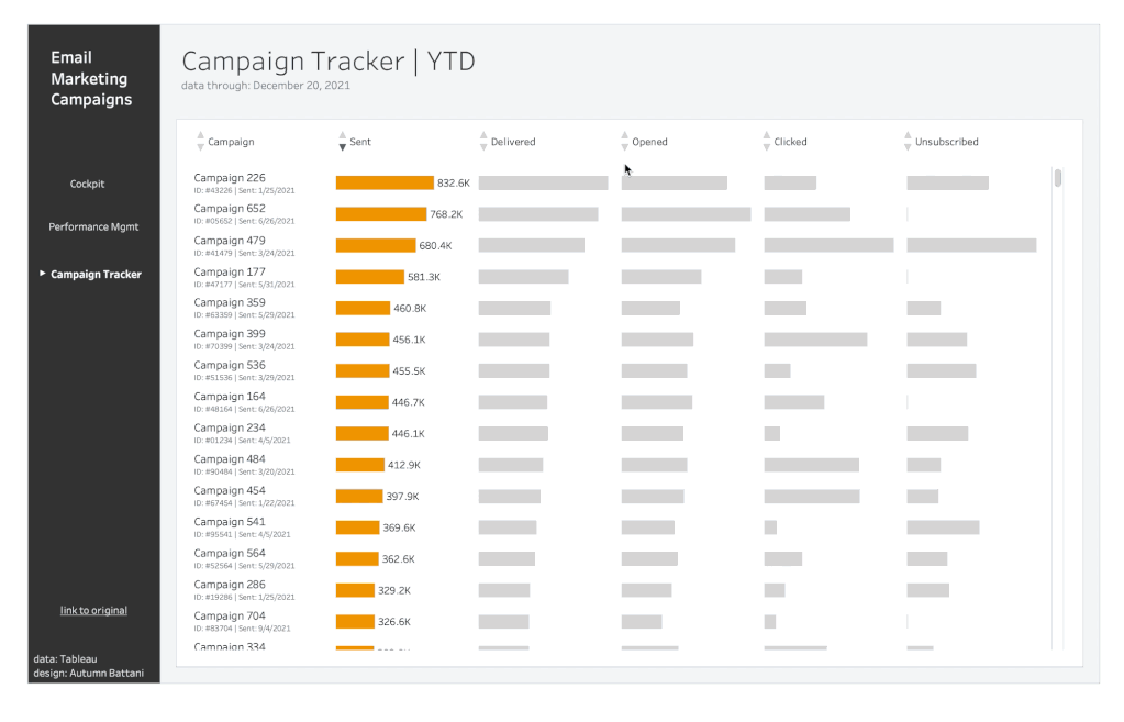
To get started, first set up the table you’re looking to sort!
Step 1: Add a new data source

This data source will be used to provide structure to the headers. You can make your own using the displayed values.
Step 2: On a new sheet, add the ‘Field’ pill to your Rows shelf
The default way this will come in is aggregated so change it to a dimension.
Step 3: Change the mark type to shape and add your ‘Shape’ field

The shapes are labeled with the shape type they need to be to make it easier. Set ‘Up’ to an up arrow, ‘Down’ to a down arrow, and ‘Transparent’ to a transparent shape.
Step 4: Make your columns
Make an inline calc on your columns shelf with MIN(1.0). You’ll want to repeat this step for every column in your table. If you have 7 columns in your table, you’ll have 7 MIN(1.0) pills on your columns shelf.
Change the name of the calcs. You can do this by double clicking on the pill. Inside you’ll type in front of the calculation //Column Header. You will need to press Shift + Enter to close this out.
Edit the axis on all of your columns. For this, I usually like to use a fixed axis from 0.8 to 2.2. This will move the shapes over to the left to allow more room for the labels.
Step 5: Create the labels

You can either do inline calcs for this or calculated fields. You’ll do one for each column. The calculation will read IF [Shape] = “Transparent” THEN “Column Header” END. Place these pills on the text mark for each column respectively.
Step 6: Create your parameters
Sort Field: This parameter will be a string parameter and will be used to dictate which column is being sorted. You can make it a list parameter but it’s not necessary with how the view will be set up. You can set it to all but I recommend putting one of your column headers in the current value field.
Sort Order: This parameter will be an integer parameter and will be used to dictate the order the column is being sorted in. You can make it a range from -1 to 1 with a step of 1 but you can also set it to all.
Step 7: Add Measure Names to detail on the ‘All’ mark
Step 8: Add the color (optional)
This step will help the user identify how the table is being sorted. This isn’t necessary but it is recommended. I’m going to tell you my little secret on this one. This will save you from going through the same motions of setting the color on each column.
Make an inline calc with 1=1 and put it on color for the ‘All’ mark. Now select the color you would like the arrow to be when it’s the current sort.
Edit that same calc with 1=0. Now select the color you’d like the arrow to be when it’s not the current sort. I usually pick a dark and light gray for these respectively.
Go through each separate mark and edit the calc to read [Sort Field] = “Column Header” AND [Sort Order] = [Field]. What this will do is change just that arrow to the color from Step 7a when that’s the way the table is sorted and to the color from Step 7b for the rest. Doing it this way (with part a and b) keeps you from needing to change the color each time; the colors are already set.
Step 9: Write a Case Statement
This is easy! You will need to do this on your original data source – NOT the sort data source. The case will be your sort field parameter. Then you will have an argument for each column where the WHEN statement is the column header and the THEN statement is the measure associated with that header. At the end of your case statement you will multiply it by your sort order parameter. This controls whether or not the sort is ascending or descending.

Step 10: Add your new calculation to the sort on the primary field in your table

To do this, right click on the pill and go to ‘Sort…’. Choose to sort by ‘Field’ and select the calculation you just made. Now add the sheets to your dashboard.
Step 11: Add both your table and the table headers sheet to your dashboard
I recommend putting them in the same vertical container. You may need to adjust the padding to get the alignment right.
Step 12: Add parameter actions to your dashboard

Your first parameter action will be to change your sort field. You’ll want to choose the selections above. To run on select, to change your Sort Field parameter based on Measure Names (Hint: this is where step 4 comes into play), with no aggregation.
Your second parameter action will change the order. Similar selections as above for ‘Run action on’, ‘Clearing the selection will’, and ‘Aggregation’ but change the parameter to ‘Sort Order’ and the field to ‘Field’.
And that’s it! You just made custom sorting headers.
Closing
With these 12 steps, you’re providing your users with greater flexibility to manipulate the view to their curiosities and gain additional insights. Pair this with other table best practices like pagination to help increase the utility and efficiency table and take it to the next level.
Interested in learning more about the data visualization tools in Tableau? Reach out to phData’s team of Tableau experts today to have all your questions answered!
FAQ
This happens with all selections in Tableau but it can appear more obvious with a sheet that prompts click. Visit this blog by Luke Stanke to learn how to automatically deselect the marks after clicking.


