This dashboard showcases how phData builds multi-level data products. We start with KPIs and their trends then provide interactive dashboards to help consumers understand the drivers of those metrics.
Who This Dashboard is For?
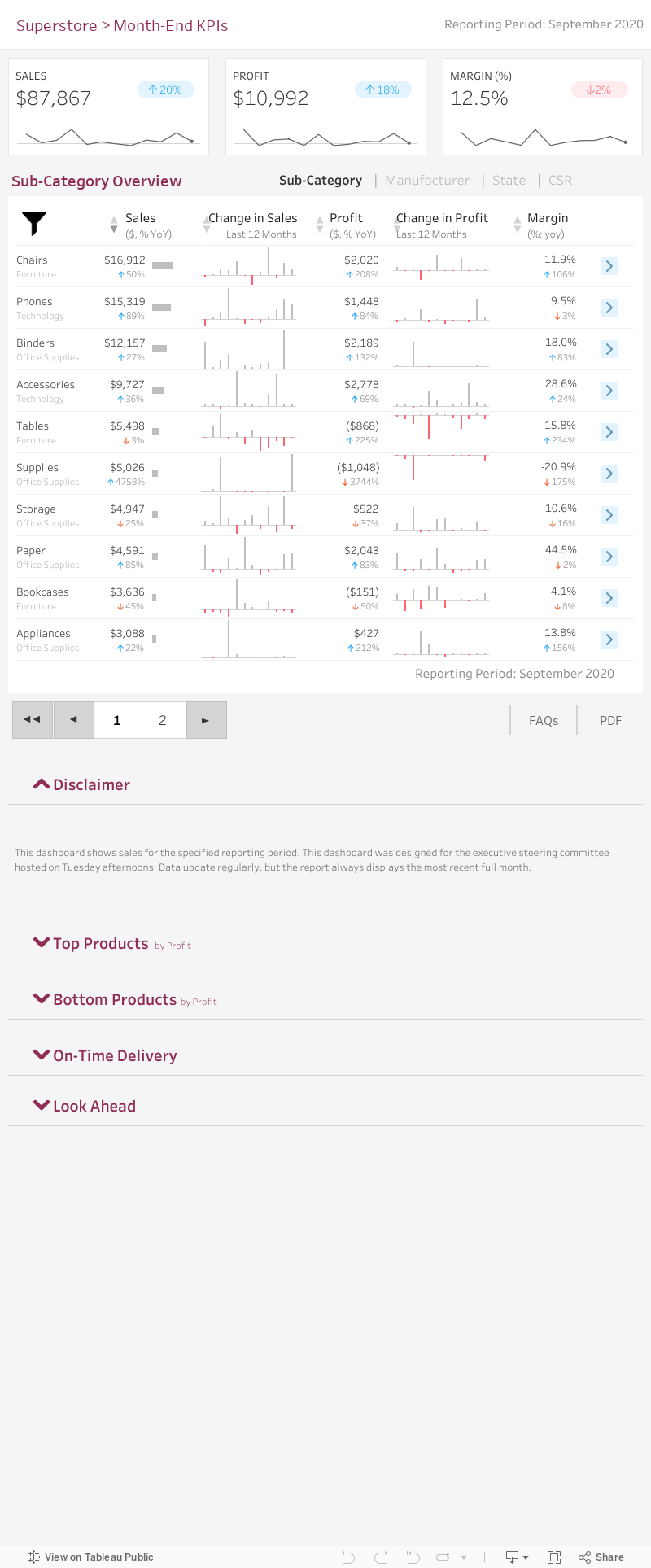
This dashboard is designed for executives to monitor the progress of several key metrics. Executives monitor trends (and changes in those trends) and need to quickly understand the drivers that are impacting business performance. This dashboard allows leaders to drill into detail across four different business segments with a click of a button.
Additionally, leaders need design-forward dashboards so the information can be shared at any time with any audience.
What You Can Accomplish With Dashboard
This dashboard contains two key features:
A dynamic dashboard that looks like a table but allows a user to filter by any of the selected measures. The table also includes pagination.
The ability to drill into a particular member of a dimension. For example, a consumer can quickly drill into the Chairs subcategory. This will then take the consumer to a secondary dashboard designed for a seamless experience.
Conclusion
We hope you found this dashboard helpful in understanding the user design and user experience that phData brings to our engagements. If you have any questions, need help, or are interested in having a team of Tableau experts design dashboards for you, feel free to reach out!