The Template
Here’s the TL;DR version:
- Making a funnel chart takes time.
- Making a beautiful chart takes even more time.
- Here’s a template for you to automate everything.
- And here’s the original data.
How to Use It
So you want to make a sales funnel but don’t have the time to re-create it on your own. No problem. I’ve been working on a template that should make it easy. (Shout-out to Ken Flerlege for his Sankey Diagram Templates).
Step #1: Edit and Replace The Data Source.
Download the workbook. Then edit and replace the existing data source called Replace this.

Connect to your own data source your data source should have the following fields:
- A unique ID in the data for each sales opportunity.
- A Value representing the value of the sales opportunity.
- A Stage indicating the step of the sales process.
- A Date the opportunity was last moved or updated (since each sales opportunity could have multiple rows, we want the most recent value).
And create an inner join. Use the Join column from the Data Model and inner join using a join calculation. Type 1 in the join calculation. This will create a full outer join of the entire data.

Once you’ve completed this step go to your visualization–which will be broken.
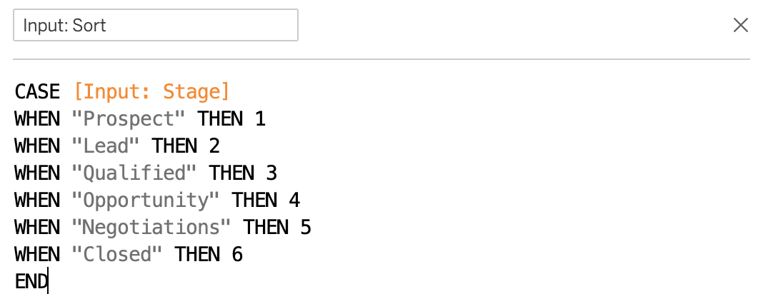
Step #2: Update The Calculated Fields.
Once you’ve completed this step you need to update five calculated fields. Each of the calculations begin with Input. Search the calculations for Input.

Update [Input: Stage] with the field you will use to specify the step. Update [Input: Id]: with the unique ID. Update [Input: Amount] with the field that will represent the value. Update [Input: Date] with your date field. If you do not have a date field create a placeholder date field: DATE("2020-07-07"). Finally, update [Input: Sort] with the order of your steps/stages.
Step #3: Customize The Color And Spacing.
Update color–as per the usual protocol. If you want to update the spacing of the stages, use the [padding] parameter.
Step #4: Enjoy.
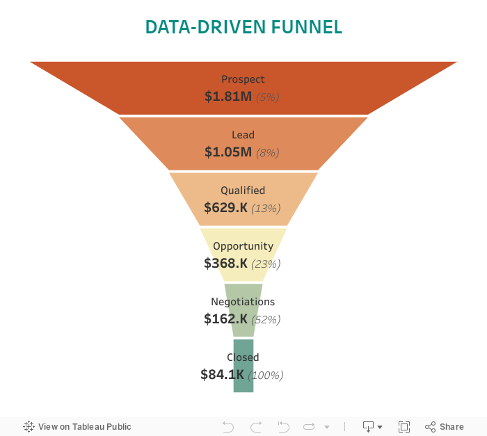
Interpreting The Visualization
This visualization uses data to build a funnel. The funnel will always be widest at the top. The top width of each quadrilateral represents the proportion entering that stage. The bottom width of the funnel represents the proportion exiting the stage.
The values at the current stage are always accounted for in earlier stages (thanks to table calculations). Additionally, a percentage is shown–which represents the amount of that stage to reach the bottom of the funnel.
This funnel is dynamic. So if your pipeline has harsh changes from stage to stage then the visual will show that change.
Note: the visualization proportionally appropriate so the part-to-whole representation will always be accurate (unless you have negative values).