

The goal of this post is to show you how to make expandable tables in Tableau. There are other steps you will want to use like adding pagination to your tables but for now, we’ll focus on building expanding tables with zone visibility.
This technique of expanding space between rows in a table is excellent when you want to provide a lot of row-level information, but are lacking the space you’d usually reserve for a larger table. Having an initial table with crucial details that you then drill down into provides the best of both worlds–having detailed information while reserving the table for critical top-level KPIs.
What Are Expandable Tables in Tableau?
An expandable table takes a standard table and adds visual components between the rows–but only when a particular row is selected. An expandable table features three main components:
- Two sheets that dynamically expand or contract based on the row that is selected.
- A dynamic zone that is visible between the two tables when a row is selected and is not visible when a row is not selected.
- Arrows in the table that point to the expanded table when it is selected or not selected.
Now that we have a background, let’s get started on how to build expandable tables. For this example, you can leverage this Table for embedding.
Part 1: Build the Base Table
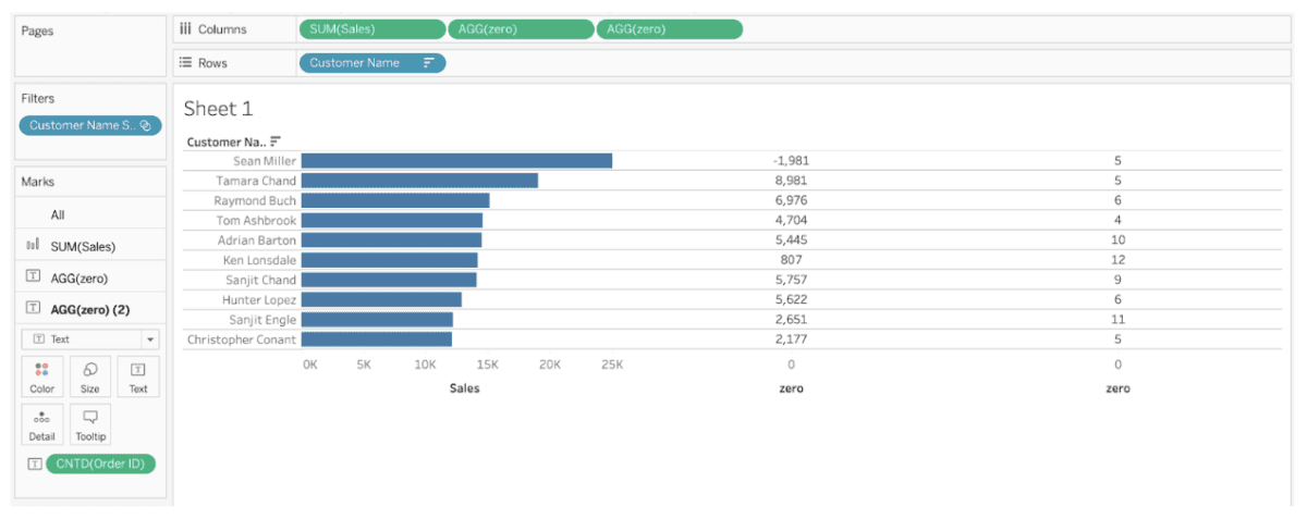
For the sake of simplicity, we will focus on the top 10 customers by sales using the Sample – Superstore data. If you are not familiar with Sample – Superstore, it is an example of retail data provided by Tableau. It includes sales by customers for an office supplies company for four years.
- Connect to Sample – Superstore.
- Add [Customer Name] to Rows.
- Add the SUM of [Sales] to Columns. Set the mark type to bars.
- Create a new calculation called [zero] in the field type MIN (0.0)
- Add [zero] to Columns. Set the mark type to text. Add SUM of [Profit] to text.
- Add [zero] again to Columns. Set the mark type to text. Add COUNT DISTINCT of [Order ID] to text.
- Using the [Customer Name] field create a set. In the set keep the top 10 customers by SUM of [Sales]. Add the new field [Customer Name Set] to filters.
- Sort the table descending by SUM of Sales
- Format the table by removing all vertical dividers and gridlines. Add row dividers.
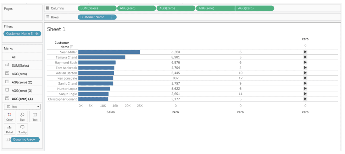
Part 2: Add the Drill Indicators
For this step, we’re going to add visual indicators to determine if the table is expanded or not.
- Add [zero] to Columns to the right of all values. Set the mark type to square. Size the square to be a little larger than it already is. Set the color to medium gray.
- Add [zero] to Columns, again. Set the mark type to text. Make a synchronized dual axis with the field in the step above.
- Create a Boolean (true or false) parameter. Call it [True or False]. Set the value to TRUE. We’ll use this later, but we’ll need it for the calculation now.
- Create a new parameter that uses values from the [Customer Name] field. Call it [Customer Name Parameter].
- Create a new calculated field called [Dynamic Arrow]. Type the following:
IF [Customer Name] = [Customer Name Parameter]
AND [True or False] = True
THEN “▼”
ELSE “►”
END
6. Add [Dynamic Arrow] to the marks card from Step 2.
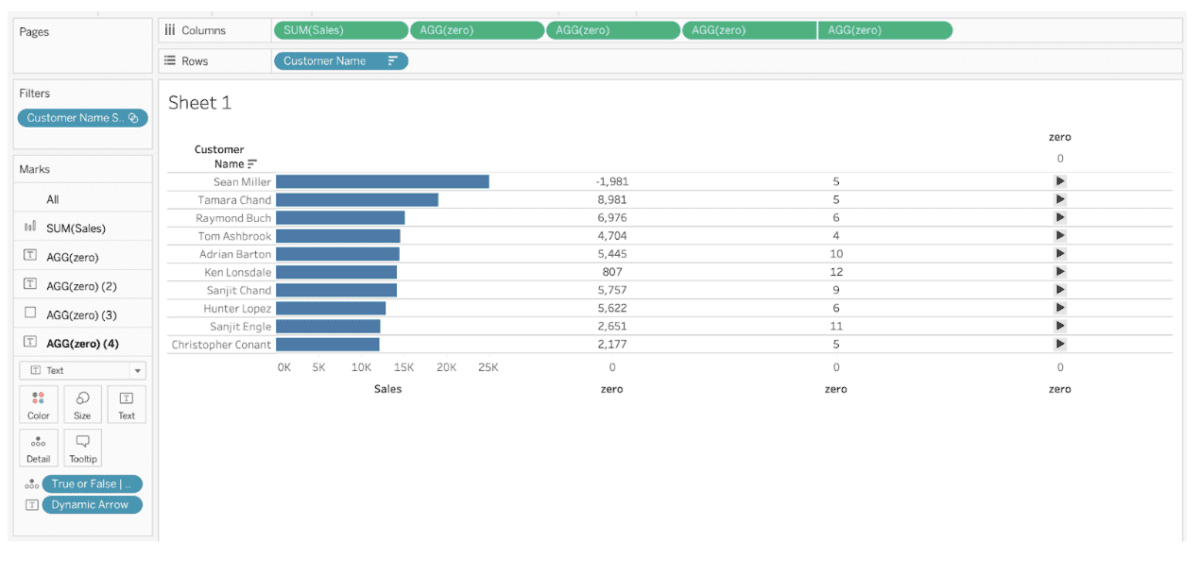
Part 3: Preparing Interactivity for the Table
Next, we’ll get the interactivity ready, but we won’t finalize it in this step.
- Create a new calculated field called [True or False | Update]. Type the following:
IF [Customer Name] = [Customer Name Parameter]
THEN Not [True or False]
ELSE True
END
This will eventually be used to update a parameter later on during the tutorial.
2. Add [True or False | Update] detail of the marks card.
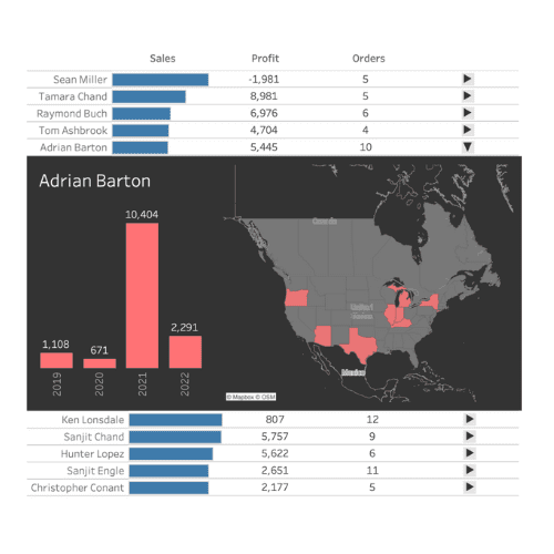
Your solution should now look like this:
Part 4: Preparing Sheets for Interactivity
We’ll start building the calculations that will allow us to show or hide the correct values in our tables dynamically.
- Create a float parameter called [Row Number]. Let’s set it to 4 (an arbitrary number in the meantime).
- Create a new field called [Row]. Type: INDEX()
- Add [Row] to Detail of the All marks card.
- Create another calculation called [Dynamic Row Number]:
IF NOT [True or False]
THEN 10
ELSE [Row Number]
END
5. Create another calculation called [Row | Above]:
[Row] > [Dynamic Row Number]
6. Create another calculation called [Row | At Below]:
[Row] <= [Dynamic Row Number]
7. Create another calculation called [Row | At]:
[Row] = [Row Number]
Part 5: Build the Visualizations for the Table Expansion
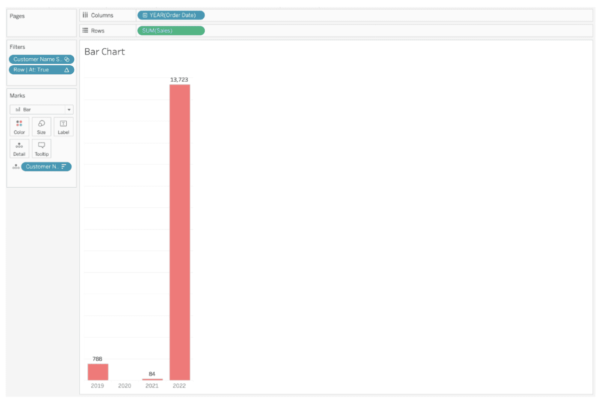
First, let’s make the bar chart:
- Create a new sheet called Bar Chart.
- On the Bar Chart sheet, add YEAR of [Order Date] to Columns.
- Also, add SUM of [Sales] on Rows.
- Change the mark type to bar. Change the bar color to bright red.
- Add [Customer Name] to Detail.
- Right-click on [Customer Name] on the marks card and sort descending by SUM of [Sales].
- Add [Customer Name Set] to the filter shelf.
- Add [Row | At] to filters. Edit the Table Calculation; Check Customer Name and uncheck Year of Order Date. Set the filter to True. Right now this value should correspond to the 4th highest sales.
- Right-click on the Order Date field label and hide the label.
- Hide the sales axis. Show the labels on the marks.
- Edit the title at the top. Delete <Sheet Name> and Insert <Customer Name>.
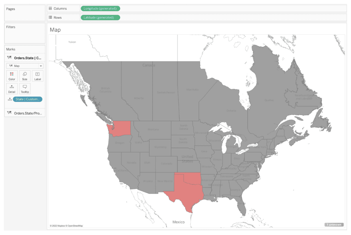
Next, let’s make a map.
- Create a new sheet called Map
- To the Map sheet, make a map with the [Country/Region] and [State/Province] fields. Change the mark type to Map and make the color of the states gray.
- Create a new calculation called [State | Customer Name] where the calculation is:
IF [Customer Name] = [Customer Name Parameter]
THEN [State/Province]
END
4. To the new [State | Customer Name] calculation, change the default properties so the new field also carries geographic properties to State/Province.
5. Add a new layer to the map with [State | Customer Name]. Set the mark type to Map. Set the color to bright red.
6. Go to Map >> Background Layers and uncheck Base and Land Cover. Check Coastline.
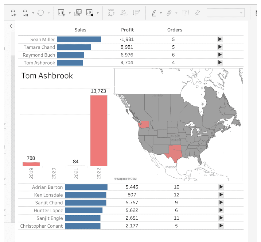
Part 6: Finalize the Tables
So the trick is that we’re using two tables at any given time. We’ve made one table that we’re going to finish with some formatting and then duplicate it and add filters to each visualization.
- Go to Sheet 1. Hide the axes. Also, hide the Customer Name field label for rows.
- Create a calculation called [True] and type: True.
- Create a calculation called [False] and type: False.
- Add [True] and [False] to detail.
- Add [Row] to detail. Edit the table calculation and check all values. (Note: if you add this AFTER you duplicate your rows, make sure the table calculation is the same between the two–it matters!)
- Duplicate Sheet 1.
- Rename Sheet 1 to Table Top.
- Rename Sheet 1 (2) to Table Bottom.
- Add [Rows | At Below] to filters on the Table Top sheet. Edit the table calculation and make sure all values are checked. Filter to all True values.
- Add [Rows | Above] to filters on the Table Bottom sheet. Edit the table calculation and make sure all values are checked. Filter to all True values.
Okay, our sheets are ready. It’s time to build a dashboard.
Part 7: Start the Dashboard
- Create a new dashboard.
- Set the width to 600 and the height to 800.
- Add a vertical container.
- Add the Table Top sheet to the container.
- Hide the title and set the outer padding to 0px.
- Add a horizontal container above Table Top.
- Set the height of the container to 30px.
- In the horizontal container, add three text boxes (sometimes you need to adjust the height of your container to add the text boxes).
- In the leftmost text box type “Sales” in bold. Center align the text.
- In the middle textbox type “Profit” in bold. Center align the text.
- In the rightmost text box type “Orders” in bold. Center align the text.
- In the horizontal container set the left padding to 100px and the right padding to 120px.
- Add another horizontal container below the Table Top sheet.
- Set the height of the new container to 300px.
- Add the Bar Chart sheet into the container.
- To the right of the Bar Chart sheet add the Map sheet in the same container.
- Hide the title of the Map sheet.
- Add the Table Bottom sheet below the horizontal container with the Bar Chart and Map sheets.
- Hide the Table Bottom title and set the padding to zero.
Part 8: Add Interactivity
For this dashboard, we need to add several actions.
- Go to Dashboard >> Actions.
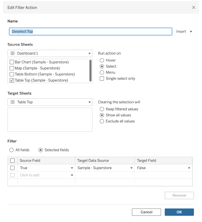
- Add a filter action. Call the action Deselect Top. For the source select Table Top from the dashboard. Set the target from the dropdown to the Table Top sheet. Run the action on select and clearing the selection will show all filters. Select the source sheet to be [True] and the target field to [False]
- Add a parameter action. Call the action Update Customer Name. Select the dashboard as the source and choose Table Top and Table Bottom. Run the action on select. Choose [Custom Name Parameter] as the target parameter and the source field is the [Customer Name] field. Clearing the selection should keep the current value.
- Add another parameter action. Call the action Update Rows. Select the dashboard as the source and choose Table Top and Table Bottom. Run the action on select. Choose [Row Number] as the target parameter and the source field is the [Row] field. Clearing the selection should keep the current value.
- Add a parameter action. Call the action Update True or False. Select the dashboard as the source and choose Table Top and Table Bottom. Run the action on select. Choose [True or False] as the target parameter and the source field is the [True or False | Update] field. Clearing the selection should keep the current value.
Part 9: Add Zone Visibility
We’re almost done!
- Select the horizontal container with the Map and Bar Chart. On the Layout Pane, select Control visibility using value. Select the [True or False] parameter.
Part 10: Format
Add any formatting or styling you would like. I’m adding a black background and darker lines in the Bar Chart and Map. I’m also setting the background color to be Transparent.
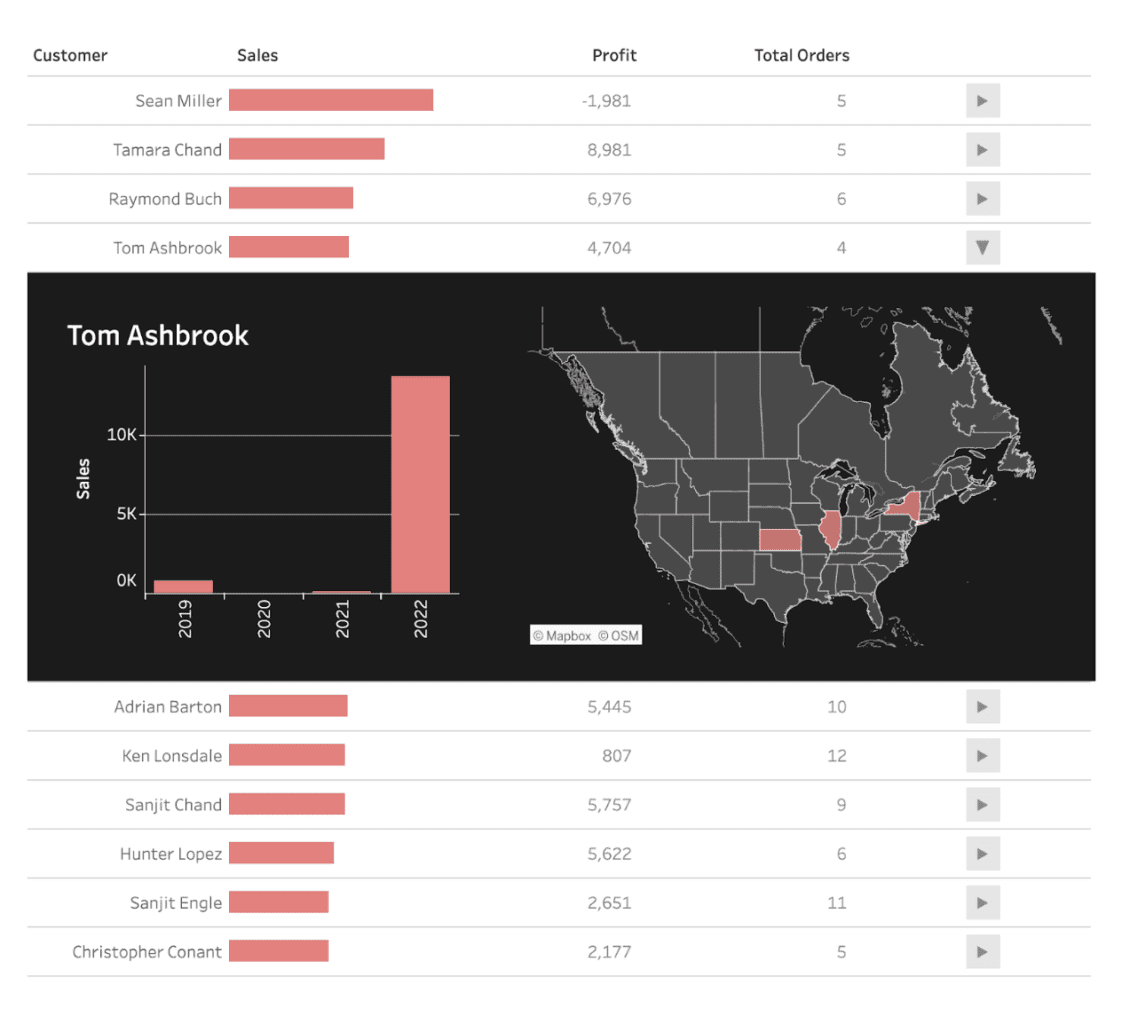
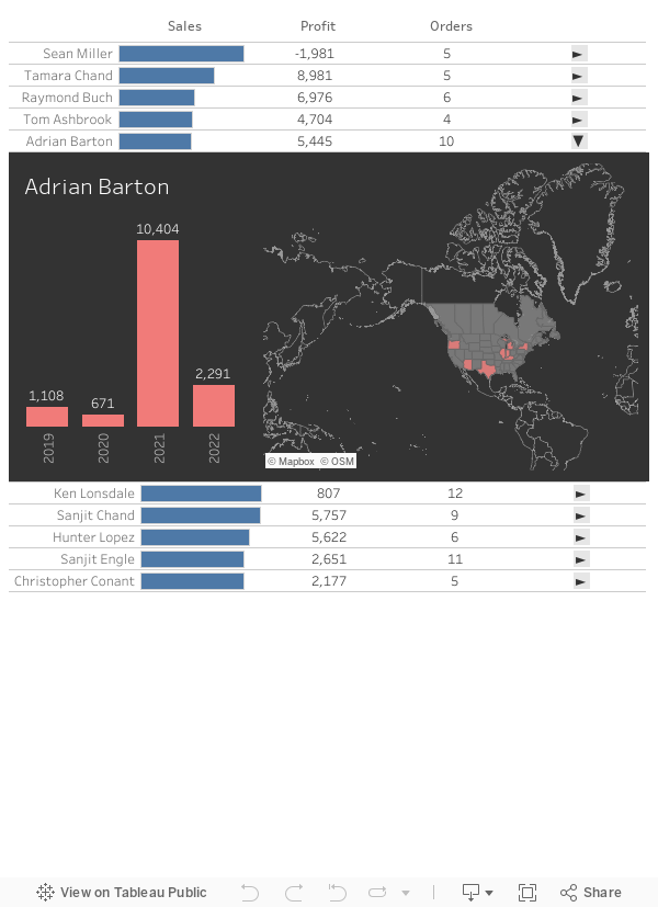
Final Result
Need Help?
Interested in learning more about expandable tables? Reach out to phData’s team of Tableau Visionaries, analysts, and developers today to have all of your questions answered!