

There are a lot of resources available to read about the shining stars of Tableau, the showstoppers. This is not that blog. This is the blog for the underdogs, the little things that people often overlook that go a long way in improving your process. At phData, we got together 10 of our Tableau developers to talk about the most underrated features of Tableau. From handy calcs to formatting, see the things we suggest adding to your arsenal that you might not know about yet or utilize often.
Usability
Alicia – Data Source Pivoting
The ability to pivot in the data source page has saved me lots of time over the years. I send out surveys to get feedback on our trainings. The survey responses get auto-populated to a Google sheet. Then I connect to that Google sheet in Tableau. So far, so good.
But survey responses are not added to the sheet in the right structure for me to analyze them. Each question gets a separate column. And I actually need all of the questions in one column and all of the responses in a second column.
Another way to think about it is that the initial data structure is wide, and more easily readable by people. But it needs to be tall, and more easily read by Tableau.
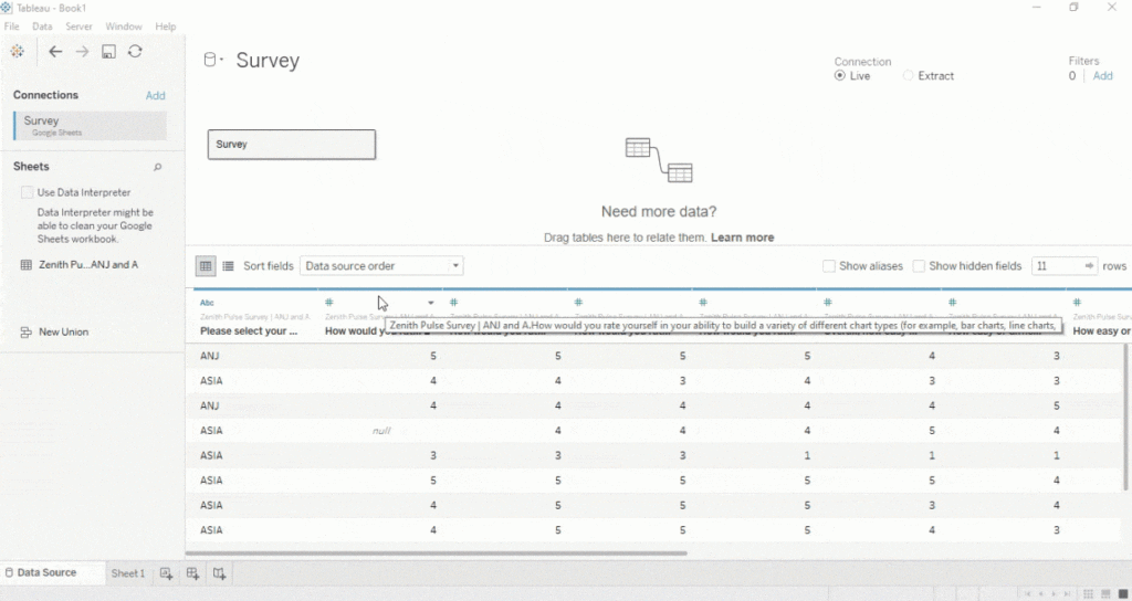
The solution? I need to pivot some of those columns. I select the first column, hold down shift, then select the last column, and then select Pivot in the menu. (Note: If the columns are not right next to each other then I can hold down control instead of shift to select specific columns.)
After I rename the fields I’m ready to start building some charts!
If this pivot feature didn’t exist then I would need to reshape the data in some other tool first. I have used Tableau Prep, Alteryx, or EasyMorph to get the job done with more complex surveys. But for quick surveys like this I’m grateful that I can take care of everything in one tool.
Pivoting survey responses is just one way this feature can be used. I’ve also used the pivot feature when reshaping data from a spreadsheet that had a separate column for each year or month.
Over the years I’ve worked with a lot of different examples where the original analysis was done in Excel and then needed to be converted to Tableau. In many cases one of the first easy steps to complete is to reshape / pivot the data right in the data source page.
Autumn – Captions
Ever open a workbook created by someone else and have a hard time orienting yourself to what’s going on in the view? Ever open up an old workbook of yours to find out you’ve completely forgotten what’s going on? One way to attack this is by looking through every filter and calculated field but that’s both time consuming and confusing. A better way is to use captions. It isn’t apparent that it’s an option but if you right-click on a worksheet they can be added. Tableau automatically generates a caption based on what is in the view but I prefer to customize them. It’s a great way to define things such as what’s being filtered out (and why) and how certain fields were calculated to give yourself and future users a more nuanced context of how the sheet works.
Nick – Secondary Click
One piece of functionality that I like with Tableau is right (secondary) click and drag your pills to the shelf. You’ll get many more options to choose from when you’re building your viz, and save a few clicks every couple of seconds in the process. Simple – yet useful!
John – Flexibility
For me, one of most underrated aspects of using Tableau is the flexibility developers have when formatting their visualizations and dashboards. Having used other tools at previous employers, the first time I used Tableau I was blown away by the customization options that were available. You really are only limited by your cleverness and creativity, aspects which I am sure all visual storytellers can agree are critical to building successful workbooks.
Calculations
Luke – Ad-hoc Calculations
I was originally going to tackle parameter actions–which I think is the most revolutionary feature of any business intelligence tool, but unpacking that was going to be… laborious. Instead, I want to focus on a fairly simple feature: ad hoc calculations. With ad hoc calculations you have the ability to create a calculation directly on columns, rows, the marks card, or the measure values card. You can create an ad hoc calculation by double clicking then when a value appears, typing the calculation. You can type existing measures or dimensions, or you can create a completely different calculation. I find this easy to quickly prototype any solution.
Alex – ZN() Function
Handling NULL values is a common occurrence in Tableau. Let’s say we want to replace our [2014 Sales] field with $0 if the field is NULL.
We could write the following calculation:
					IF ISNULL([2014 Sales])
THEN 0
ELSE [2014 Sales]
END
Pretty common thing to do. However, you might not know that there is shorthand for this exact calculation:
ZN([2014 Sales])
We have just saved some time. We went from writing 49 characters in a calculated field to writing only 16.
The ZN() function replaces NULL values with 0. Super handy shorthand trick. There are a ton of functions in Tableau that are actually just shorthand for longer calculations. It is always worth exploring as it will save you time down the road.
Joe – Index ()
One of the most underrated features in my opinion is the ability to use INDEX() as a rank. INDEX() will assign each row in the returned data a value, and from there, you can use a table calculation to sort by a specific dimension. Say you have a list of stores that are sorted via sales, but you want to rank them by profit. You can use INDEX(), edit the table calculation and have the values sort descending based on sum([profit]). You can use INDEX() for Top N, hiding values and having ranks persist when RANK() won’t cut it.
Formatting
Spencer – Data Labels
The Marks to Label options that are available might not be the most underrated feature, but it’s certainly the most under-appreciated. Tableau offers developers a multitude of options for how to label data points that are not offered by other BI platforms. I would kill to have this kind of data labeling available in Power BI as their options are unbelievably limited in this area. A data label in the right place and in the right context can make the difference between an end-user understanding the dashboard’s message and total confusion. Shout out to the data labeling capabilities in Tableau!

Katrina – Default Workbook Formatting
Default workbook formatting options are a great way to standardize formatting from one spot. I typically don’t use grid lines on sheets, so setting them to be off saves lots of clicks!
Elizabeth – Formatting with Containers
When I first started using Tableau, I never used containers and could never get the formatting quite right, especially when different devices viewed the dashboard. I personally love fixed containers and using the inner and outer padding to create space in between visuals. They do a great job of keeping consistent formatting when viewing the dashboard on a range of screen sizes.
We hoped this helped you amp up your day-to-day practice! Have a feature in mind that you think is underrated? Let us know!
Do you have more questions about Tableau? Talk to our expert consultants today and have all your questions answered!


