

As someone just beginning their Power BI journey, I have been inundated with tips, tricks, and essentials from Power BI experts. There’s a lot to learn, and a lot to consider when using Power BI. If you’re Power BI beginner like me, you might find it difficult to sift through all the new information. Here are 5 Power BI basics I’ve learned so far that you should learn too.
I would be remiss if I didn’t give a shout-out to Data Coach, which has been an immense help in my Power BI education, and has inspired this post.
Most & Least Useful Charts
So you’re staring at a blank report, and it’s time to pick a chart. Which one should you go for? The first thing to assess of course is the data you’re using and the story you want to portray, but that’s not all you should consider. Not all charts are made equal, some are much more useful than others. Data Coach offers up two main principles when choosing a chart type: choose a common chart type, and choose one that conveys the same message at a smaller resolution.


Simple is successful. It’s not about making the most complex graph to prove you know your way around the data, it’s about conveying what you want to convey in a way that’s easily digestible for the viewer.
Classic Charts – Here are some basic charts and visuals that you will find yourself repeatedly using in your reports:
- Line charts
- Scatter charts
- Bar charts
- Matrices
- Cards
- Tables
- Multi Row Cards
Charts to Avoid – On the other hand, there are some charts and visuals that don’t pass these principles, and are best to avoid.
- Pie charts
- Stacked bar charts
- Area charts
- Funnel charts
In many cases, it’s difficult to make comparisons between data using these chart types, which is the main reason they don’t match up to the charts above. There are times when these charts can work out quite well, but until you become more comfortable with all the options, it’s a good idea to avoid them.
Quick Insights
New datasets are like finding a present under the tree on Christmas morning, half the fun is the unwrapping. When handling a new dataset, exploring the data often comes first. Quick Insights is a great feature for this introductory look into the data. It searches through different subsets of data, applying algorithms and generating an easy to consume set of analyses automatically within seconds. Users can search through these analyses for hidden patterns, trends, and outliers. Although some of the insights may not be useful, you may find a couple of diamonds in the rough.
To use Quick Insights on Power BI Service, find the dataset in your workspace and click the vertical ellipsis that appears when hovering over the dataset. From here, select Get quick insights from the menu and you will be prompted to view the insights shortly.

After finding an insight you’d like to use, click the pin icon in the corner and select the dashboard you would like it pinned to.
Power BI Q&A
Power BI has a Q&A feature that’s perfect for putting words to work, allowing users to answer their data questions with natural language and forgo overthinking the semantics. After typing the information you’d like to visualize, the tool selects the best visualization based on your query, although you can be more specific in those queries if you’d like. They give you a couple starter options to get you started. These visuals are interactive and update when you modify the query, so you can keep modifying until you’re happy with the result. Finally, you can pin the visual onto the report or dashboard using the button in the top right corner of the tile.
There are a couple ways to access this feature:
Power BI Service and Desktop –Double click on any empty space within reports or dashboards.
Power BI Service –Press the Ask a Question button from the menu bar in Power BI Service.

Power BI Desktop – Press the Ask a Question button in the Insert tab on Power BI Desktop.

It’s simple. It’s easy. It’s useful.
Bookmarks
When reading, do you ever come across a phrase or a sentence that speaks to you? Something you want to go back to in the future without having to skim through to it? Maybe you’ll highlight it, maybe you’ll dog-ear the page, or maybe you’ll bookmark it. Well, Power BI can do the same.
When designing reports, you can use bookmarks to capture and preserve content, whether it’s filtered a certain way, simply the default view, one visual, or the entire page. Bookmarks allow you to return to your hand-picked views or states of your report, allowing you to switch between functional views.
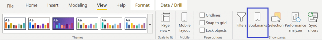
You can access and create bookmarks by toggling on the Bookmarks Pane in the View tab in Power BI Service as shown below.

OR access Bookmarks by pressing the Bookmarks option in the View tab in PowerBI Desktop.
Once your visual or page is set up the way you want it to appear in the bookmark, you can select the Add button on the Bookmarks Panel. A new bookmark will appear, and by clicking on the ellipses next to it you can edit it to your preference (one visual or full page, grouped or ungrouped, etc) and easily rename, update, or delete the bookmark. This new bookmark will automatically save the current page, filters, slicers, and the overall state of the visual(s). Whenever you return to the report, you can go back to the specific view by pressing the bookmark in the Bookmark Panel, and can jump between different bookmarks with ease.
EXTRA USE CASE – By creating and arranging a list of bookmarks, you can also use them to travel through your report and zero in on a series of insights in a story-like fashion. First create all the bookmarks you’d like to feature, drag and drop the bookmarks in the order you’d like them to appear. Once you have your ordered collection all set up, press the View button in the Bookmark Panel to transform your bookmarks into a slideshow presentation.

Power BI Themes
I’m not going to lie, I love making reports and dashboards as aesthetically pleasing as possible, but I don’t want to spend endless time picking out every single color or creating a uniform format. This is where Power BI themes come in, with Power BI themes, you can apply design changes to your entire report or dashboard in seconds.
To change your report theme in Power BI Desktop, select the View tab in the menu and press the drop down button in the Themes section, from here you have multiple options:

Choose an existing theme–click one of the multiple popular theme options, and watch your report or dashboard transform.
Import a theme–by clicking Theme gallery, you can find many different theme options on the Microsoft Power BI Community site. After deciding on a theme, you can download it to your computer and upload it by clicking the Browse for Themes button.
Create and customize your own theme–if none of the themes really speak to you or you need to use specific colors, you can click Customize current theme, where you can customize the colors, text, and visuals to your liking.
BONUS
Did you think I would stop at 5 basics? I just had to include this extra tidbit as a bonus. 6 words.
Power BI Community Data Stories Gallery.
I didn’t realize how badly I wanted or needed some Power BI inspiration until I stumbled across this page. The Power BI Community Data Stories Gallery contains plenty of creative reports that you can browse through to find new report features and ideas. It is 100% worth it to check out, even briefly. Just looking at all the unique reports made me excited to try out different styles.
Have more Power BI questions? Our team of Power BI experts are here to help!


