

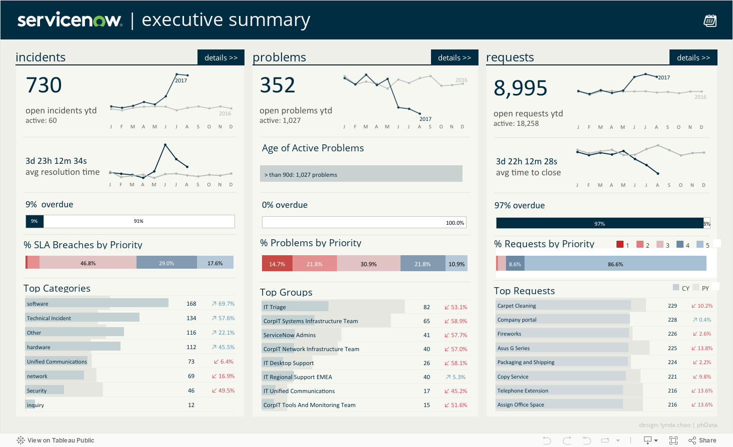
This ServiceNow Tableau Dashboard provides business users with an executive overview of their ticket incidents, problems, and requests. Users can quickly view ticket trends, overdue items, tickets by priority type, and top categories, groups, and requests.
This dashboard also includes three additional tracker dashboards, where users can navigate from the main dashboard to dive deeper into more detailed metrics for incidents, problems, and requests.
This collection of ServiceNow dashboards is designed for a broad user base within an organization, including IT managers, executives, service desk agents, IT analysts, IT operations teams, customers, administrators, business stakeholders, HR professionals, and customer service representatives.
These dashboards enable users to monitor IT service performance, track key metrics, identify trends and issues, and ensure efficient service delivery. Ultimately, these dashboards help IT service teams understand which ticket types are the highest of priority, where most of the tickets originate from, and drive business decisions around where and how they can improve ServiceNow performance.
Additionally, they can also be adapted for other similar ticket tracking and request systems, such as ServiceDesk.
The executive dashboard refers to the main page that summarizes measures and metrics that are relevant to the business unit or responsibility area of a manager. This tab provides a high-level overview of the three primary ServiceNow: incidents, problems, and requests.
Users can also view the overall monthly trends of incidents, problems, and requests, the average resolution time to close tickets, the percentage of tickets overdue and by priority, and the top categories, groups, and types of requests made.
This dashboard provides a more robust overview of incidents, including KPIs for the total number of incidents, active incidents, overdue incidents, reopened incidents, high-priority incidents, and the average age.
This dashboard provides a more detailed overview of problems, including KPSs for the number of problems, active problems, related incidents, not worked on problems, and known errors. It also provides a list of active problems, and users can drill into related incidents.
This dashboard provides a more detailed overview of requests; KPIs include the total number of requests, active requests, item requests, critical requests, and avg time to close.
We hope you found this Tableau dashboard useful in your pursuit to track ticketing trends and performance in your organization!
If you have any questions, need help, or are interested in having a team of Tableau experts design dashboards for you, feel free to reach out!

Data Coach is our premium analytics training program with one-on-one coaching from renowned experts.


