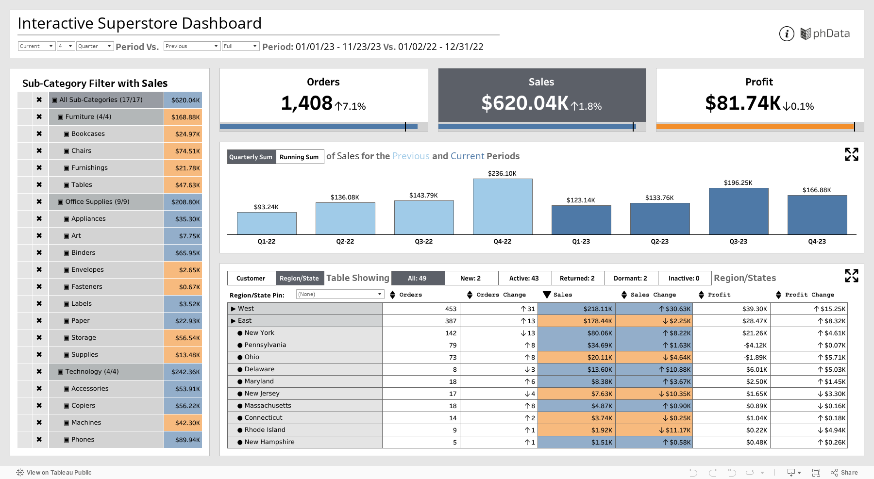
Date Selection Options for selecting the Current/Last Full 1/2/3/4 Week/Month/Quarter Period and compare it with the Previous/Last Year Same To Date/Full Period. This will affect the entire dashboard. Throughout the dashboard, Blue is used when the change between the current and previous is positive and Orange when this change is negative.
All three KPIs are selectable, and once selected, they will turn into a dark gray. This shade of gray is used to indicate selections throughout the dashboard. This will also change the bar and line charts to display that particular metric, color the selected KPI section of the table, automatically sort the information in the table by that particular metric, change the metric in the hierarchy filter, etc.
The chart section of the dashboard will show a Weekly/Monthly/Quarterly Sum Bar Chart or a Daily Running Sum Line Chart. This section will, by default, show the trend for the entire data, but when something is pinned in either the customer or region/state table, it will show the trend for that particular customer or region/state. It can also dynamically zoom into this section so that it occupies more of the dashboard space for clearer insights, especially with the line chart.
The table section shows a paginated table for customers or a drill-down table for region/state. There is also a slicer for quickly whittling down the list based on the custom engagement segments. There is also a provision to sort the table based on the metrics in the table. Clicking on the metric will pin that particular customer or region/state on the top, allowing for effective comparison. This also changes the chart section to show the data for that particular customer or region/state. Lastly, there is a search box for directly pinning a particular value. There is a provision to zoom this section too dynamically. This will double the number of customers displayed on a single page.