

During an internal data visualization learning session, I presented on a couple of fun ways that I use containers in my Tableau dashboards. Although many of the folks on the call were aware of my trickery, I was told that this would make a good blog post. I’m not sure if they actually thought it would make a good blog post or if they were telling me that because that’s normally my catch line (“hey, that’s cool – write a blog about it!”) – but either way, here we go!
Container Basics
Before we dive deep into containers, let’s first touch base on why we might want to use containers in our dashboards. First off, I find containers to be a very orderly way to deal with worksheets on your dashboard. They help organize and standardize the size and layout of your dashboard’s worksheets. Secondly, when viewing dashboards through different sized screens and devices, floating images can often be distorted or misrepresented. Using containers allows developers to fix locations of dashboard elements regardless of how you are viewing it. Now…let’s get into it!
Containers are dashboard objects that allow developers to organize and shape the worksheets that are put on to a dashboard. Containers can either be Horizontal or Vertical. This means that you can either stack worksheets on top of one another like layers on a hamburger or you can place them side to side . You are also able to put different type of container within each other, but we’ll get to a use case of this a little later.
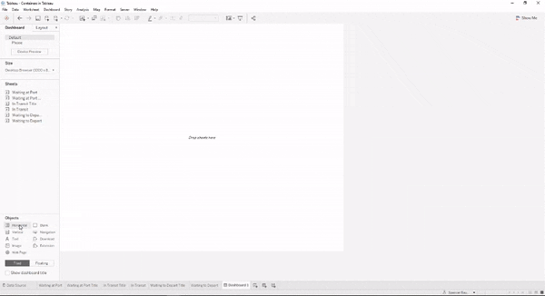
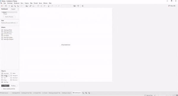
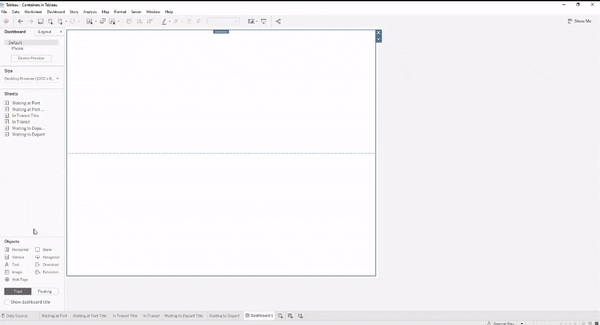
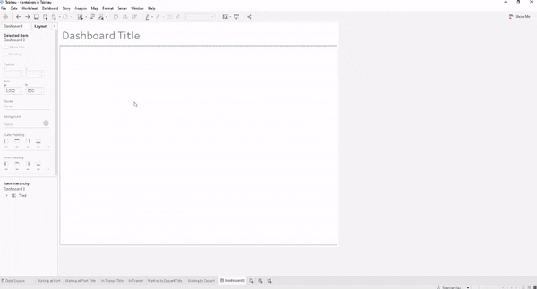
Let’s start with the basics: putting a worksheet into a container. In the example below I am going to drop two blank objects into a horizontal container. The key indicators that the blank object is being put inside the container are the thick blue line around the parent container and the gray area being populated. When both objects have been placed, double click on the tab for one of the objects to select the parent container. You can see a dashed line between where the two objects within the container are.
In the example below, you can see the same example as above but with a vertical container.
Once you have put your objects within the desired containers you are able to control not only the sizes and characteristics of the individual objects, but the sizes and characteristics of the containers as well. In the horizontal container example, you can either size each object to a specific width or you can click on the parent container’s down arrow and select “Distribute Contents Evenly”. You can also add background color to each object separately or to the container as a whole.
In the gif below, I am going to add a horizontal container in the middle of my two objects that are in the existing vertical container. I am then going to set the size of this horizontal container and then distribute its contents evenly.
Now that you have an understanding of how containers function, let’s hop into some fun examples of how to use them effectively in your dashboards!
Use Case #1: Title Underlines
Ever go into a dashboard and find that the underline under the dashboard title is a floating blank object with some background applied to it? So have I. I’ve also see those underlines end up halfway down a page depending on which device I’m viewing it on. In this use case I’m going to show you how to use containers to create that underline.
- Bring in a vertical container
- Drop in a blank object
- Bring in a horizontal container to top of vertical container
- Drag text box into the horizontal container – type desired text
- Double click Text box to select parent container – drop down down and select Edit Height
We’ve not input the desired text into our horizontal container that is in the body of a vertical container. Now, we are going to use the background colors of both the text box and the horizontal container to create an underline
- Click once on text box – change background to white
- Double click on text box – change background to light grey. A border around your text box should appear
- Click back to text box – down click on Outer Padding – select 0 for all. Your border should disappear
- Unselect All sides equal – add 2 pixels of padding to the bottom – bottom line should appear. Adjust for desired thickness of under line
- Adjust the title inwards by using the Inner Padding feature – approximately 8-10 pixels will suffice
- Right click text box – select Format text object – change vertical alignment to bottom so the text stays next to the under line
The short explanation of this is that by having just the text box in the horizontal container, we can adjust the colors and padding of both objects to reveal an underline to the text box.
Use Case #2: Dashboard Sections
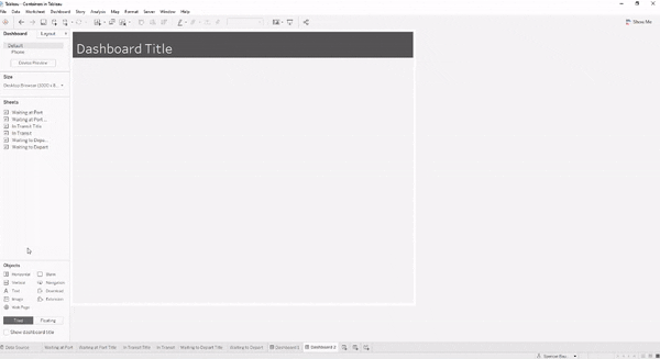
When building out a dashboard, I like to start by carving out sections for future worksheets to be placed in. Using horizontal containers with multiple vertical containers within them, I can create a template that allows for easy dashboard construction, especially with the help of sheet swapping.
- Within an existing vertical container, drop in a horizontal container
- Size new horizontal container to desired height (300px in example)
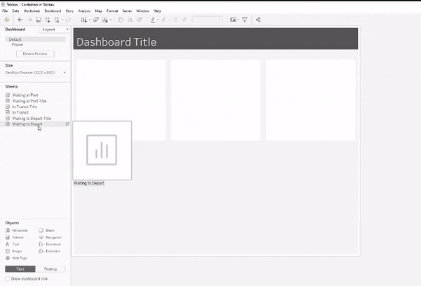
- Add a blank object first – then add in three vertical containers – delete the blank object
- Click on down arrow – Distribute evenly
- Color each vertical container white
- Adjust Outer Padding to 10
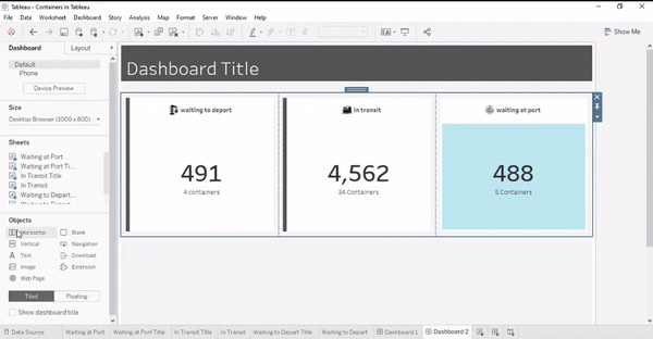
Once you had created the worksheets to add in here you can add them to the vertical containers. Add in a text box or other worksheet for a title/header to the section. See how the worksheets fit seamlessly into the existing containers below.
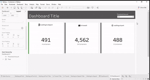
Use Case #3: Side Bars
This example is similar to the underlines, but done with padding on the left or right borders. I am also going to show you a little twist with adding a worksheet that changes colors according to corresponding metrics.
- Add in horizontal container to the vertical containers in your existing horizontal container
- Drag one of the vertical containers into the new horizontal container
- Adjust the padding so that the existing vertical containers padding is 0
- Color the background of the parent horizontal container that you just dragged the vertical container into as a dark gray
- Adjust the inner left padding of the parent horizontal container to be 8
Using this method, we are essentially replacing which container we color with our outline/underline colors. With the existing vertical container containing multiples objects, I find it easier to add the horizontal container to act as the parent container that we can color to add the color effects.
Now that we have a way to add a bar to our containers, let me show you how to create a bar that changes based upon the change in metric.
- Create boolean calculation that returns T|F depending on whether the selected value has reached the desired threshold
- Create worksheet that is a bar chart that takes up the entire space – you can play with the axis and SUM(1) calculations in the columns and rows to do this
- Color the bar chart with your T|F calculation created in Step 1
- Drop new horizontal container into the existing parent horizontal container – add in the other containers that will go along with this changing color bar
- Edit width of color bar to 8 px
- Adjust outer padding of the parent container to 10
Using this technique you can create indicators of your metrics that also help with the design and alignment of your dashboard.
In Conclusion
I use containers in nearly every dashboard I build since they are extremely helpful in keeping my dashboard organized and aligned. Users using different viewing mediums also don’t have to worry about the layout of the dashboard changing. Hopefully these tricks were helpful and have helped you understand a few different use cases for containers.
Enjoy – and try to keep your excitement contained!


