

If you are in the Tableau space, you have probably come across dashboards with insightful tables featuring different color formatting for each column and/or even some columns with charts. Although tables like these do support the native sorting that Tableau provides, the controls are often hard to find (especially if the axis header is hidden to make the table look clean), and sometimes, clicking on them might not sort the way you want Tableau to sort.
It is often necessary to create custom sorting using parameters to make the sorting experience more user-friendly (or, in some cases, even to have a usable sorting option). Tableau Visionary Autumn Battani has an amazing blog on this topic, too.
In this blog, you will learn an alternate take on the same topic. The technique you will learn here is not only simpler to implement (especially if the table’s columns are of different widths) but is also more performant.
Dataset
You can use the Orders table of the latest (2020-2023) Superstore dataset to follow along. No data source tinkering is needed for this.
Step 1: Create a Table
To create the highlight table from the one in the introduction, wherein each of the three measures was colored separately, start by creating the following calculations.
					//Customer
[Customer Name] + " (" + [Customer ID] + ")"
Technically, the Customer ID (a field hidden by default) is the unique identifier for each customer in the data, but adding the Customer Name will provide more context.
You can create the other four columns using simple Fixed Level of Detail (LOD) calculations. Note that it is unnecessary to use LODs, but doing so will simplify some calculations.
					//Customer Last Order
{ FIXED [Customer ID]: MAX([Order Date])}
					//Customer Orders
{ FIXED [Customer ID]: COUNTD([Order ID])}
					//Customer Sales
{ FIXED [Customer ID]: SUM([Sales])}
					//Customer Profit
{ FIXED [Customer ID]: SUM([Profit])}
With these calculations created, you can build the table. Start by adding Customers to the Rows shelf. Then, add the Customer Last Order next to it. Whenever adding date fields, it is an excellent practice to right-click drag the fields as this opens the drop field menu.
You must select the Customer Last Order (Discrete) option in this case. Another tip is to double-click the option you wish to choose (this works in many other menus, too; try it out!) instead of navigating to the bottom of the screen to hit OK.

Next, double-click on the Columns shelf to open a blank pill, write 1, and press enter. Convert this pill to a dimension. Edit the axis to go from 0 to 1 and hide its header. Set the mark type to Bar, add the Customer Orders to both Label and Color, and set the Size to the maximum value. You will get this.

Now, Ctrl+drag the placeholder (the 1 pill) in the Columns shelf towards the right of itself to duplicate. Do this two times.

Add the Customer Sales and Customer Profit in the Color and Label of 1 (2) card and 1 (3) card, respectively. Edit the axis of both these placeholders so that they go from 0 to 1, and then untick the Show Header. You will have something like this.

When using placeholders, it is an excellent practice to alias them to make them easier to distinguish. To do this, double-click on the first 1 pill, navigate to the left of the 1, and type //Customer Orders (like shown below) in the pill.

Hit Shift+Enter and then Enter. You will have the following.

Repeat the same for the other two placeholders and format the sheet to your liking. This is what it would look like after some formatting adjustments.

Step 2: Build the Header Row
First, using the Order Date field, create the following calculation.
					//Header Label
CASE DATEPART('day',[Order Date])%5
WHEN 0 THEN "Customer"
WHEN 1 THEN "Last Order"
WHEN 2 THEN "Orders"
WHEN 3 THEN "Sales"
WHEN 4 THEN "Profit"
END
This is similar to internal data densification, but you do not need a minimum number of rows per aggregation level for it to work. Thus, any dimension with at least 5 (since there are 5 columns in the table) values that will not go lower than 5 due to data refresh/row-level security can be used in the Case statement.
Next, create the following.
					//Header Size
CASE DATEPART('day',[Order Date])%5
WHEN 0 THEN 330
WHEN 1 THEN 150
WHEN 2 THEN 100
WHEN 3 THEN 100
WHEN 4 THEN 100
END
Now, on a new sheet, add the Header Size in the Columns shelf and the Header Label on the Label.
You will get this.

Manually sort this so that it matches the table, change the aggregation to MAX, edit the axis to go from 0 to 800 (sum of the individual values from Header Size + 20), untick Show Header, change the Color to white, set the Size to the maximum value, set the Fit to Entire View, and remove all Borders (from Format as well as Color). This is what you will get.

This stacked bar chart acts as the header row. Using the Header Size calculation, you can adjust how wide you want each header to align with the table underneath.
Step 3: Set up the Actions
The sorting mechanism in this case will be similar to the native sorting: click on any header to sort descending and click on the same header again to sort ascending. This can be accomplished using two parameters that are set up as follows.
The first, called “Sort Metric,” is fairly simple. It will just add the clicked Header Label in the parameter.

Next, add a Worksheet Change Parameter action that looks like this:

Create a second parameter that will be used to determine the direction:

Unlike the previous parameter, the values that go into this will be determined based on the sorting mechanism.
To accomplish this, create the following calculation.
					//Sort Direction Value
IF [Sort Direction] = -1 THEN 1
ELSEIF [Header Label] = [Sort Metric] THEN -1
END
Convert this to a dimension and add it in Detail. It should be below the Header Label in the Marks card.

Next, set up the Worksheet Change Parameter action for this parameter as follows:

Please note that you have to add the Sort Direction Value as the Source Field for this parameter action.
Show the two parameters and watch how the values change when you click on the Headers!
Create the following calculation to inform the user about the sort metric and direction.
					//Sort Symbol
IIF([Sort Metric]=[Header Label],IIF([Sort Direction]=1,"▼","▲"),"")
This calculation will add a downward-pointing triangle or upward-pointing triangle based on the sort direction for the selected Header Label.
Add this in the Label shown below.

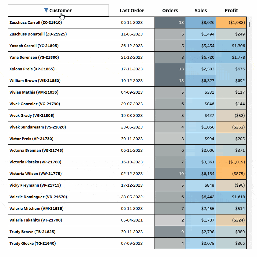
This is what you will get when Profit is clicked once.

Play around with it and watch how the symbol changes.
The UI elements are done, but Tableau does not know what to do when these headers are clicked. All the values from the five columns need some numerical representation to build the logic.
The Customer field, being alphanumeric, has to be sorted using the ASCII method. To do it, you have to create the following calculation.
					//Customer ASCII
INT(STR(ASCII(UPPER(MID([Customer],1))))+
STR(ASCII(UPPER(MID([Customer],2))))+
STR(ASCII(UPPER(MID([Customer],3))))+
STR(ASCII(UPPER(MID([Customer],4))))+
STR(ASCII(UPPER(MID([Customer],5)))))
This will return the ASCII number for the capitalized first five letters concatenated into a large ten-digit number.
In a new sheet, drag Customer and Customer ASCII in the Rows shelf. This is what you will get.

The only drawback of this method is that since we are considering only five letters, Customer field values like Chris, Christopher, Christina, etc. will have the same Customer ASCII.

You can always go deeper into the string with as many letters as you want, but remember that string functions are resource-intensive. So, avoid crossing the point of diminishing returns for your use case. Generally, for most use cases, 5 is enough.
Next, create the following calculation. Convert this to a dimension.
					//Sort Field
CASE [Sort Metric]
WHEN "Customer" THEN [Customer ASCII]
WHEN "Last Order" THEN DATEDIFF('day',TODAY(),[Customer Last Order])
WHEN "Orders" THEN [Customer Orders]
WHEN "Sales" THEN [Customer Sales]
WHEN "Profit" THEN [Customer Profit]
END * [Sort Direction]
Note that DATEDIFF is used to convert the Customer Last Order date to numbers.
Step 4: Put it All Together
Create a new Dashboard (of size 840 x 840) and add a vertical container (with outer padding as 20). Then add Sheet 2 (the one with the header row) and drag Sheet 1 below it. Hide the Titles for both sheets and set the height of Sheet 2 to 40 pixels. Adjust Sheet 1 to Fit Width.
Next, adjust the table’s columns to line it up with the headers, and you will get something like this.

Based on the data you add, you might need to resize your table and header size to match it. It is easier to adjust the table, but adjusting the stacked bar chart will be difficult. A pro tip is to edit the calculated field from the Analysis pane and choose Apply till it lines up perfectly.


This will save a lot of back and forth.
Another pro tip is to always make sure that the stacked bar chart axis is the exact same width as the table in pixels. In this case, the table was 800 pixels wide, and with a scroll bar width of 20 (the default scroll bar in Tableau is 20 pixels wide), the labels had 780 pixels. This sounds tedious, but it saves a lot of time and will be easier to edit later on.
Next, go to Sheet 1, click on the Customer pill in the Rows shelf, and then click Sort. For the Sort By option, select Field. Make the Sort Order Descending. Change the Field Name to Sort Field, and change the Aggregation type to Maximum.

This will tie the parameter values to the actual table sorting.
All that is left now is to change the actions so that they are running from the dashboard and not the sheet. This can be done by changing the Source Sheets to Dashboard 1 and unticking Sheet 1 for both parameters.

With this, clicking on the headers will sort it based on the implemented sorting mechanism.

There you go! Your table now has a custom sorting option.
Conclusion
Hopefully, you enjoyed learning this hacky yet practical and scalable technique to sort your tables. Technically, you can use this to sort any table (not just ones created using placeholders) if you find the native sorting experience in Tableau sub-optimal.
While it is not as intuitive from a UI perspective as the alternative by Autumn, since the header row does not need multiple ad-hoc calculations or multiple sheets (when the columns are of different widths), it is more performant and easier to implement.
Depending on your requirements/limitations, you can choose either of the two techniques to spruce up your headers and give your users a unique sorting experience.
If you want more information on Custom Sorting in Tableau, contact our team of experts!


