

Buttons are ubiquitous and self-explanatory to use, and yet it feels like our options for creating and implementing them in Tableau can be quite limited. Not anymore! This guide will walk you through the steps needed to create beautiful and functional buttons in Tableau for a variety of needs.
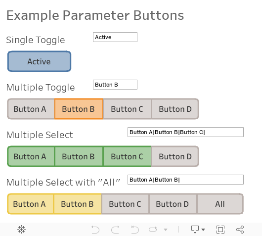
In this guide you will learn how to make the following kinds of buttons:
About This Tableau Guide
This guide is intended for use with Tableau 2020.4 and higher, but if not you can still use most of these techniques with 2019.2 or higher. If you don’t have map layers available, you can use other mark types like bars or shapes to get the job done, albeit with a little less dynamic control of the button design.
Here are the features of Tableau that these buttons leverage to look and work great.
- Parameter Actions – These are the heart of our buttons’ interactivity. The advantage of using parameters to store button states is that we can build them in their own separate data source so they aren’t slowed down by large data sources, and any other data source can grab the contents of the parameter for filtering or driving the shape and behavior of those other worksheets.
- Map Layers – These are are great tool for building UI elements like buttons because we can specify which layers should and shouldn’t be interactable. It’s best to only allow interactable elements to react to the user’s mouse with a hover or click, and map layers give us that control. If you don’t have a version that supports map layers, don’t fret. You can use other mark types like bars or shapes to achieve similar results using the same calculations for driving parameter actions.
- Relationships – These simplify data modeling and allow us to handle many-to-many joins with ease. It’s still possible without relationships, but you’ll need to filter out values from unwanted dimensions in any other worksheets using that data source, lest you get duplicated rows downstream. With relationships, you can simply ignore those fields when you don’t need them, and Tableau will work it’s behind-the-scenes LOD magic to ignore unneeded joins when they are unused. Smart!
We will use a single, small data source to create these buttons. This will ensure that they are as quick and responsive as possible, which is important when connecting them to bigger and more complex data sources. Since the buttons will drive parameter values, those parameters can be picked up by calculations in any other data source and used to filter or shape the way data is displayed in other worksheets.
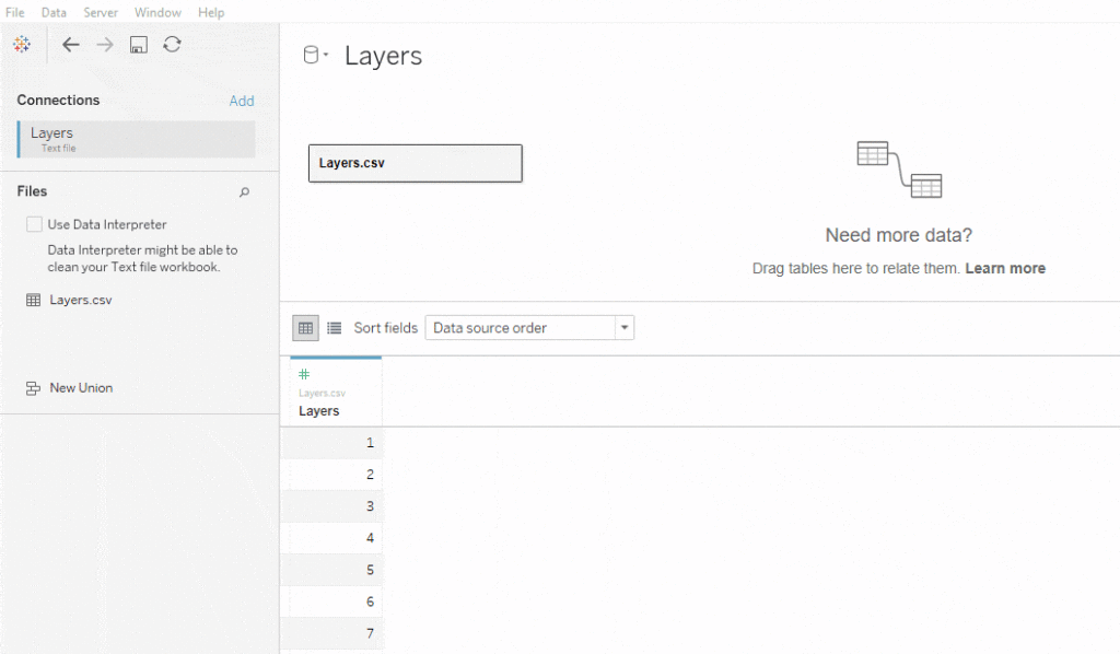
Preparing the Data Source

Drag your CSV file into a new, blank data source. Then, drag the same CSV file from your “Files” pane on the left into the data source to create a relationship join. We’ll want to specify the cardinality of the join (many-to-many) by double clicking the line. We’re going to create what’s called a “cross join” or “cartesian join” where all rows in one table join to all rows in the other. To do this, create a calculation with a value of 1 on both sides of the join.
We’ll also rename the fields to “Layer A” and “Layer B” to tell them apart as we proceed. I like to change this data source to group fields in folders, which helps to organize the fields related to different sets of button controls within your dashboard. Also, assign [Layer A] and [Layer B] as discrete dimensions rather than continuous measures by right clicking them and selecting those options from the context menu. This will prevent problems later on.
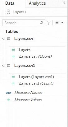
The data source is ready, and we’ll now create calculations to define the shape and structure of the buttons. Layer A will draw the shape of the button, and Layer B will define the number of buttons shown and their labels in later examples.

Single Toggle Button
We’ll start with a single toggle button that will switch between on and off. Since we’re using map layers to draw the button, create two calculated fields for drawing the path of the button, one for the X axis and the other for the Y axis. This could be a simple box, but I want to round the corners of the button for a different look that screams, “I’m a button, click me!” We’ll use those X and Y calculations to create a third calculated field using MAKEPOINT() to combine those paths into the overall button outline on our map. Finally, we’ll create another MAKEPOINT() with fixed values for the center of the button to anchor the label.
Note: It’s possible to just hard-code these values into our CSV file with new columns, but I decided to use calculations here so I’d have more flexibility in changing the shape later if I wanted to without editing the data source. You’ll see later that there are more variations we’ll use.
// Button Path Y
CASE [Layer A]
WHEN 1 THEN  1
WHEN 2 THEN  0.25
WHEN 3 THEN  0
WHEN 4 THEN  0
WHEN 5 THEN  0.25
WHEN 6 THEN  1
WHEN 7 THEN  7
WHEN 8 THEN  7.75
WHEN 9 THEN  8
WHEN 10 THEN 8
WHEN 11 THEN 7.75
WHEN 12 THEN 7
WHEN 13 THEN 1
ELSE NULL
END
// Button Path X
CASE [Layer A]
WHEN 1 THEN  0
WHEN 2 THEN  0.25
WHEN 3 THEN  1
WHEN 4 THEN  14
WHEN 5 THEN  14.75
WHEN 6 THEN  15
WHEN 7 THEN  15
WHEN 8 THEN  14.75
WHEN 9 THEN  14
WHEN 10 THEN 1
WHEN 11 THEN 0.25
WHEN 12 THEN 0
WHEN 13 THEN 0
ELSE NULL
END
// Button Path Map - Single Toggle
MAKEPOINT([Button Path Y],[Button Path X])
// Button Map Center
MAKEPOINT(4,7.5)
Create a Parameter named [Single Toggle Value] with an initial string value of “Active” which will hold the button state.

Create the following calculations to define how the button looks and operates.
// Button Label - Single Toggle
[Parameters].[Single Toggle Value]
// Button Action - Single Toggle
CASE [Parameters].[Single Toggle Value] WHEN 'Active' THEN 'Inactive' ELSE 'Active' END
// Button Active - Single Toggle
[Single Toggle Value] = 'Active'
There are a couple more simple calculations we’ll need so that we can make the button deselect itself after the user clicks it. Original credit for this technique goes to Yuri Fal, and you can find more details on it in Luke’s blog post on the subject.
// TRUE
TRUE
// FALSE
FALSE
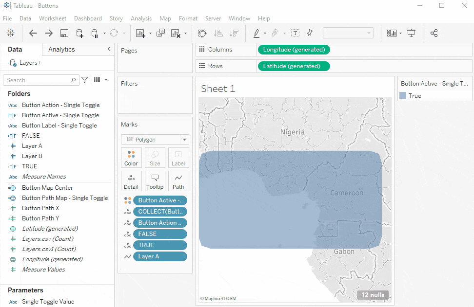
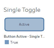
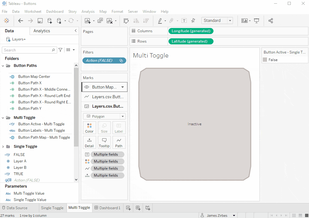
Now after all that preparation, we’re finally ready to build our first button! It will have three map layers: Background, Border, and Label
For the first background layer, drag [Button Path Map – Single Toggle] to the Detail card or your marks, and Tableau will automatically identify it as a map element, and add generated latitude and longitude measures to your rows and columns respectively.
Change the mark type from Automatic to Polygon, and then drag [Layer A] on to the Path button of the marks card. Make sure that [Layer A] is set to a discrete (blue), rather than a continuous (green) to else it will just aggregate the field as a sum and display a single dot.
Drag [Button Active – Single Toggle] to the color button on the marks card then set the opacity to 50% under the color mark button.
Drag [Button Action – Single Toggle] calculation to detail, along with the [TRUE] and [FALSE] calculations.
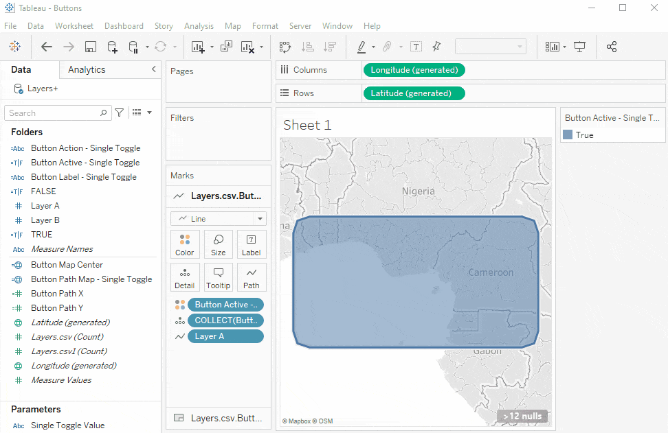
Now for the border. Drag [Button Path Map – Single Toggle] from the measures list over to the worksheet area, and you will see a new element pop up. Drag it over the icon next to “Add a Marks Layer.” Now you’ll see a new mark card section for this new layer. Change the mark type from Automatic to Line, then drag [Layer A] over to the Path button on the marks card, just like before. Drag the Button Active calculation to color here as well. Now we have a blue rectangle with a border and rounded corners. We don’t want the user to click on the points around the outline, so we’ll disable selection from the small arrow menu in the header of the marks card section for this layer.
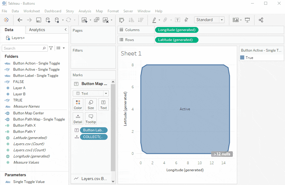
Next, on to the label. Our third layer will be created using the [Button Map Center] field, by dragging it on to the “Add a Marks Layer” icon. Change the mark type for the new layer from Automatic to Text, and drag [Button Label – Single Toggle] to the Text button on the marks card. Disable selection on this layer as well, through option on the small triangle menu button in the header of the marks card.
We can disable the actual map shown underneath the button now that we’ve created our three map layers. From the map menu, go to “Background Maps”, and select “None” to remove the map background. I’ve found that you cannot create another map layer by dragging a MAKEPOINT() field out on to the sheet while the map is disabled, so do this step once all your layers are created. You can always turn it back on temporarily later on if you want to add more.
Time for some cleanup. I don’t want tooltips for any of my buttons, so I’ll disable tooltips for all three layers by clicking the tooltips button, and deselecting “Show tooltips” from the popup window. Disabling it on one layer should disable it for all other layers as well.
Next, right-click the background, click the sheet tab, and from the lines section, disable grid lines, zero lines, axis rulers and axis ticks. Right click on each of the latitude and longitude measures on the columns and rows shelves and uncheck “Show Headers.” Let’s also name the sheet “Single Toggle” so we can find it easily.
Now to put it in a dashboard, and get it working. Create a new dashboard, and drag the Single Toggle sheet into a container of your choice, and size it down to a good shape. You can disable the null values indicator in the bottom right corner from the top menu under Analysis -> Special Values -> Hide.
We’ll need 3 total dashboard actions to make it function. Create the first dashboard action from the top menu under Dashboard -> Actions… -> Add Action -> Change Parameter. Name it “Single Toggle Action” and select Single Toggle Value as the Target Parameter, and your Button Action calculation as the source field.

Next, we’ll add the two actions which will work together to deselect the button once the user clicks it. Click Add Action -> Highlight, and name it “Single Toggle Deselect”. For this to work as expected, always select the dashboard name in the Source Sheet dropdown at the top of the window under source sheets, and select only the related worksheet in the list of sheets under that section. Under Target Sheets, select the worksheet Single Toggle from the dropdown selection directly, rather than the dashboard. Under Target Highlighting, click selected fields, and select only TRUE from the list of fields.

Create one last dashboard action. Click Add Action -> Filter, and name it “Single Toggle Deselect” as well. Make the dashboard and sheet selections just as last time (Source = dashboard level, Target = sheet level), and set it to run action on select, rather than on menu. In the bottom target filters section, click “Selected Fields” and then “Add Filter…” below. Set the Source field to TRUE and the Target field to FALSE.

Click OK, and you should have all three actions shown, looking something like this.

Click OK to close the Actions window, and click your new button to your heart’s content!
You can open the color legend for that worksheet to adjust the colors for Active and Inactive to fit your needs. For me, the default for inactive was orange so I changed it to grey for a more expected result. You can adjust any of the other formatting options in the button to your liking as well, such as the label font and size, the opacity of the background, and how you choose to assign the button’s color.
Now you can use the related parameter in a calculation in any other data source in your workbook, and you’ll have a great looking and intuitive button for the user to control it.
Multi-Button Toggle
We’re just getting started. Let’s make multiple buttons in a set
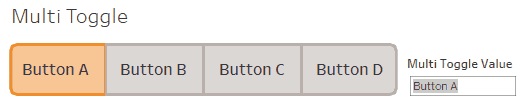
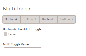
Right-click the Single Toggle sheet and click Duplicate to make a copy. Rename it “Multi Toggle” and then create a new parameter called “Multi Toggle Value” which will also be a string.
To get multiple buttons, we’ll bring in our [Layer B] field as a data scaffold to represent each button, and we’ll get the button labels from that new dimension rather than from the parameter value itself.
Let’s move the calculations related to our Single Toggle Button out of the way by putting them into their own folder. Leave the Button Path and Button Map calculations alone, since they’ll be used by this and other button sets.
Here are the new calculations to create, which connect the buttons together within the group and round only the outer corners.
// Button Path X (Round Left End)
CASE [Layer A]
WHEN 1 THEN  0.5
WHEN 2 THEN  0.75
WHEN 3 THEN  1.5
WHEN 4 THEN  15
WHEN 5 THEN  15
WHEN 6 THEN  15
WHEN 7 THEN  15
WHEN 8 THEN  15
WHEN 9 THEN  15
WHEN 10 THEN 1.5
WHEN 11 THEN 0.75
WHEN 12 THEN 0.5
WHEN 13 THEN 0.5
ELSE NULL
END
// Button Path X (Round Right End)
CASE [Layer A]
WHEN 1 THEN  0
WHEN 2 THEN  0
WHEN 3 THEN  0
WHEN 4 THEN  13.5
WHEN 5 THEN  14.25
WHEN 6 THEN  14.5
WHEN 7 THEN  14.5
WHEN 8 THEN  14.25
WHEN 9 THEN  13.5
WHEN 10 THEN 0
WHEN 11 THEN 0
WHEN 12 THEN 0
WHEN 13 THEN 0
ELSE NULL
END
// Button Path X (Middle Connected)
CASE [Layer A]
WHEN 1 THEN  0
WHEN 2 THEN  0
WHEN 3 THEN  0
WHEN 4 THEN  15
WHEN 5 THEN  15
WHEN 6 THEN  15
WHEN 7 THEN  15
WHEN 8 THEN  15
WHEN 9 THEN  15
WHEN 10 THEN 0
WHEN 11 THEN 0
WHEN 12 THEN 0
WHEN 13 THEN 0
ELSE NULL
END
Create a new Button Name dimension field for our Multi Toggle Set. Add this to a new folder named Multi Toggle, to keep things organized.
// Button Labels - Multi Toggle
CASE [Layer B]
WHEN 1 THEN 'Button A'
WHEN 2 THEN 'Button B'
WHEN 3 THEN 'Button C'
WHEN 4 THEN 'Button D'
ELSE NULL END
Our path for this button set which will differ from the single toggle. I’ve used LOD expressions along the [Layer B] dimension to find the first and last buttons in our row, and give them the appropriate styles. This way, the appropriate style will be used regardless of the number of buttons in the group if you change or add buttons in the future.
// Button Path Map - Multi Toggle
MAKEPOINT([Button Path Y],
    CASE [Layer B]
        WHEN {MIN([Layer B])} THEN [Button Path X - Round Left End]
        WHEN {MAX(IIF(ISNULL([Button Labels - Multi Toggle]),NULL,[Layer B]))}
            THEN [Button Path X - Round Right End]
    ELSE [Button Path X - Middle Connected]
    END
)
Add a calculation to show if a button is selected or not:
// Button Active - Multi Toggle
[Multi Toggle Value] = [Button Labels - Multi Toggle]
Now let’s build it. Add [Layer B] to the columns shelf to enforce the order of the buttons by the Layer B value. Then drag [Button Labels – Multi Toggle] to its right. Right click each and uncheck “Show Header.”
Filter out null values from [Button Labels – Multi Toggle] by dragging a copy (hold control for Windows, command for Mac) to the filters card, and set it to exclude nulls.

Next, replace the MAKEPOINT() fields for the polygon and line layers with the new field. Click into each layer section (make sure only that layer is selected in the marks card) and drag [Button Path Map – Multi Toggle] over the existing field shown as COLLECT(Button Path Map – Single Toggle) to replace it. Then replace the existing label field on the text layer with the new Button Labels field. We want the buttons to cozy up together, so unhide the longitude axis, and set it to a fixed range of 0 to 15 to remove the space between buttons. If the axis scale is set to reverse, deselect that option. Since we have columns now, you’ll also want to remove the row and column dividers in your sheet format to clean the layout further.
Replace the existing color fields on the polygon and line layers with the new [Button Active – Multi Toggle] field, and remove the old Button Action – Single Toggle Fields. Replace the action field so the buttons function as expected – drag the new [Button Action – Multi Toggle] over the old [Button Action – Single Toggle] on the polygon layer as well.
Now the buttons should be looking good – go to your dashboard tab, and pull in the Multi Toggle Sheet wherever you’d like it. You’ll need to set up your dashboard actions again, just as we did for the Single Toggle button. The process is the same, but this time for the parameter action use the [Button Labels – Multi Toggle] field pointed to the [Multi Toggle Value] Parameter. They should look about like this when complete.

Your new buttons are ready to go! Try them out, and use the color legend to adjust the colors to your liking.
Now that we have the basics working, I’ll talk about some variations for different button behaviors.
Multiple Selection Buttons
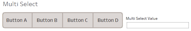
Here, we incorporate additional techniques like using parameters to hold multiple values at once using delimiters. I’ve used Luke’s technique from this blog post to drive the parameter action here, and we’ll build on it in the next section. I like to use vertical pipes for delimiters, since they’re uncommon to find “in the wild” as anything but a delimiter.
Here are the calculations needed, and the result when used in place of the calculations from the Multi Toggle build. You’ll need to add the [Button Action – Multi Select] field to the polygon layer marks at the detail level, and map that to the parameter action against the new parameter [Multi Select Value].
// Button Labels - Multi Select
CASE [Layer B]
WHEN 1 THEN 'Button A'
WHEN 2 THEN 'Button B'
WHEN 3 THEN 'Button C'
WHEN 4 THEN 'Button D'
ELSE NULL END
// Button Path Map - Multi Select
MAKEPOINT([Button Path Y],
    CASE [Layer B]
        WHEN {MIN([Layer B])} THEN [Button Path X - Round Left End]
        WHEN {MAX(IIF(ISNULL([Button Labels - Multi Select]),NULL,[Layer B]))}
            THEN [Button Path X - Round Right End]
    ELSE [Button Path X - Middle Connected]
    END
)
// Button Active - Multi Select
CONTAINS([Multi Select Value],[Button Labels - Multi Select]+'|')
// Button Action - Multi Select
IF CONTAINS([Multi Select Value],[Button Labels - Multi Select]+'|')
THEN REPLACE([Multi Select Value],[Button Labels - Multi Select]+'|','')
ELSE [Multi Select Value]+[Button Labels - Multi Select]+'|'
END
To evaluate the parameter against a field in a different data source, just use a calculation similar to the Active calculation above.
// Multi Select Button Eval
CONTAINS([Multi Select Value],[Your Dimension]+'|')
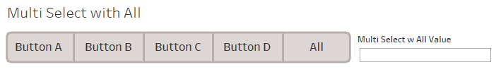
Multiple Selection Buttons with “All”
We’ve been building up to this moment – let’s add an “All” button at the end. This will let the user quickly select or deselect all the rest of the buttons, and is helpful when there are a larger number of buttons needed.
I went through a few iterations on how best to accomplish this. At first, I hard-coded the full set of button values into the parameter result when “All” is selected. This is just fine when there are a few button values and it’s not going to change over time in the future. But if your buttons are dynamic based on a data source, that won’t work. To address this, I then thought of using a second parameter to store the state of the “All” button as true/false, and then created calculations to account for all the cases of interactions in different button states.
After some time, I realized that I could get the same result with just one parameter again, by changing the button selection status and actions into two “modes.” In normal mode, values are added to the parameter string when selected, and removed when deselected like in the previous example. But when the user selects “All,” the parameter goes into an “All” mode as identified by a leading string value in the parameter. In that “mode,” the parameter tracks button deselections instead of selections. Finally, it tracks when the user clicks the last selected button to shift into “All” mode from normal mode, or deselects the last selected button to go from back into normal mode from “All” mode. Whew!
These calculations are the most complex so far, so here is a quick overview of the button action logic. I added lots of comments to help explain things as well.
- Parameter has no ALL prefix
- User selects all button – switch to ALL value
- User selects non-all button
- Selection is last inactive button – switch parameter to ALL value
- Selection is in parameter – remove button value from parameter
- Else – append button value to parameter
- Parameter has ALL prefix
- User selects all button
- Parameter has only the ALL prefix with no deselections – clear parameter value
- Else – switch parameter to only ALL value
- User selects non-all button
- Selection is last active button – clear parameter
- Selection present is in parameter – remove button value from parameter
- Else – append button value to parameter
- User selects all button
// Button Labels - Multi Select w All
CASE [Layer B]
WHEN 1 THEN 'Button A'
WHEN 2 THEN 'Button B'
WHEN 3 THEN 'Button C'
WHEN 4 THEN 'Button D'
WHEN 5 THEN 'All'
ELSE NULL END
// Button Path Map - Multi Select w All
MAKEPOINT([Button Path Y],
    CASE [Layer B]
        WHEN {MIN([Layer B])} THEN [Button Path X - Round Left End]
        WHEN {MAX(IIF(ISNULL([Button Labels - Multi Select w All]),
            NULL,[Layer B]))} THEN [Button Path X - Round Right End]
    ELSE [Button Path X - Middle Connected]
    END
)
// Button Active - Multi Select w All
// Not in ALL mode - delimited param values represent selected items
IF LEFT([Multi Select w All Value],5) != '|ALL|' THEN
    CONTAINS([Multi Select w All Value],[Button Labels - Multi Select w All]+'|')
// In ALL mode - delimited param values represent deselected items
ELSEIF LEFT([Multi Select w All Value],5) = '|ALL|' THEN
    // If in all mode with some deselections, don't show the All button as selected.
    IF LEN([Multi Select w All Value])>5 AND [Button Labels - Multi Select w All]='All' THEN FALSE
    ELSE NOT CONTAINS([Multi Select w All Value],[Button Labels - Multi Select w All]+'|')
    END
END
// Button Action - Multi Select w All
// Parameter is not in "ALL" mode - values in the parameter represent selected items
IF LEFT([Multi Select w All Value],5) != '|ALL|' THEN
    // User selects All button
    IF [Button Labels - Multi Select w All]='All' THEN '|ALL|' // Switch to ALL param value
    // User selects non-All button
    ELSE
        // Selection is the last before all are selected
        IF {COUNTD(IIF([Button Active - Multi Select w All],NULL,[Button Labels - Multi Select w All]))}
            = 2 // Count of inactive buttons remaining
            AND NOT CONTAINS([Multi Select w All Value],[Button Labels - Multi Select w All]+'|')
            THEN '|ALL|' // Switch to ALL param value
        // Selection is not the last before all are selected
        ELSEIF CONTAINS([Multi Select w All Value],[Button Labels - Multi Select w All]+'|') // Check if present in param
            THEN REPLACE([Multi Select w All Value],[Button Labels - Multi Select w All]+'|','') // Remove if present
        ELSE [Multi Select w All Value]+[Button Labels - Multi Select w All]+'|' // Add if not present
        END
    END
// Parameter is in "ALL" mode - values in the parameter represent deselected items, rather than selected items
ELSE
    // User selects All button and all buttons are already active
    IF [Button Labels - Multi Select w All] = 'All' THEN
            // All buttons are already active
            IF LEN([Multi Select w All Value])=5 THEN '' // Clear param value
            // Some deselections are already made
            ELSEIF LEN([Multi Select w All Value])>5 THEN '|ALL|' // Switch to ALL param value without deselections
            END
    // User selects non-All button
    ELSE
        // Selection is the last before all are deselected (in ALL mode)
        IF {COUNTD(IIF([Button Active - Multi Select w All],[Button Labels - Multi Select w All],NULL))}
            = 1 // Count of active buttons remaining
            AND NOT CONTAINS([Multi Select w All Value],[Button Labels - Multi Select w All]+'|')
            THEN '' // Clear param value
        // Selection is not the last before all are deselected (in ALL mode)
        ELSEIF CONTAINS([Multi Select w All Value],[Button Labels - Multi Select w All]+'|') // Check if present in param
            THEN REPLACE([Multi Select w All Value],[Button Labels - Multi Select w All]+'|','') // Remove if present
        ELSE [Multi Select w All Value]+[Button Labels - Multi Select w All]+'|' // Add if not present
        END
    END
END
To evaluate the button status against a field in another data source, you’ll use a calculation similar to the “Active” calculation we used earlier. It would be something like this, but substitute your own field instead.
// Multi Selection Dimension Eval
IF LEFT([Multi Select w All Value],5)'|ALL|' THEN
    CONTAINS([Multi Select w All Value],[Your Dimension]+'|')
ELSEIF LEFT([Multi Select w All Value],5)='|ALL|' THEN
NOT CONTAINS(REPLACE([Multi Select w All Value],'|ALL|',''),[Your Dimension]+'|')
END
And there you have it! Any of these button controls can toggle or filter data from other data sources in your workbook with a simple calculated field and a CONTAINS() function. I hope this was a helpful guide and reference, and that you’ll get great use out of this technique like I have.
In Conclusion
Tableau has some powerful tools to create custom interactive functionality. There are simply a few examples of how different features and techniques can combine to create great results and experiences in your dashboards.


