Comparing two date periods is a common requirement for almost every business dashboard. There are many different ways to compare based on the unique requirements.
In this blog, I will show you one of my favorite ways to dynamically compare two date periods. If you follow Cricket, you must have come across this type of visualization: Worm. It is a line chart on which a running sum of a metric for two date periods is plotted. It is simple, intuitive, and insightful.
Dataset
You can follow along with the Orders table of the latest (2020-2023) Superstore dataset. Add a data source filter to exclude the last 10 days from the most recent month, as shown below.

This is done so that the data simulates a real scenario of the current date period being incomplete.
Step 1: Understand the Basics
Firstly, create a parameter as shown below

Notice that the Value column entries are in lowercase, whereas the Display As entries are in titlecase. This is an application of the technique described in this blog to make the next calculations more dynamic.
Using that, create the following boolean calculations.
DATEDIFF([Date Period],[Order Date],{MAX([Order Date])}) = 0
DATEDIFF([Date Period],[Order Date],{MAX([Order Date])}) = 1
{MAX([Order Date])} returns the maximum order date in the data source. The difference between that and the row-level order date would be 0 date periods for the current date period and 1 date period for the previous date period. Check out step 1 from this blog for more background and an alternative take on these calculations.
To validate these calculations, right-click drag the [Order Date] to the Rows shelf, and double-click on the green MONTH(Order Date). Make this pill Discrete.
Then, drag the two boolean calculations next to it. Also, show the parameter. Scroll to the bottom of the list, and you will get the following.

As you can see, True gets assigned against the correct date period, in this case, Month, as expected. Play around with the parameter and watch how it changes.
Using these boolean calculations, create the following calculations to get the corresponding sales in the two date periods.
RUNNING_SUM(SUM([Sales]*INT([Date Period Current])))
RUNNING_SUM(SUM([Sales]*INT([Date Period Previous])))
INT(Boolean) returns 1 for True and 0 for False. Thus, the RUNNING_SUM will only sum the rows whose order dates are in the respective date period.
Step 2: Build the Visualization
It is not possible to directly overlay the two worms on top of each other as they are referring to different date periods. The axis needs to be common for both fields. But fortunately, there is a workaround.
On a new sheet, right-click drag the [Order Date] to the Columns shelf and double-click on the blue DAY(Order Date). Convert this to Continuous.
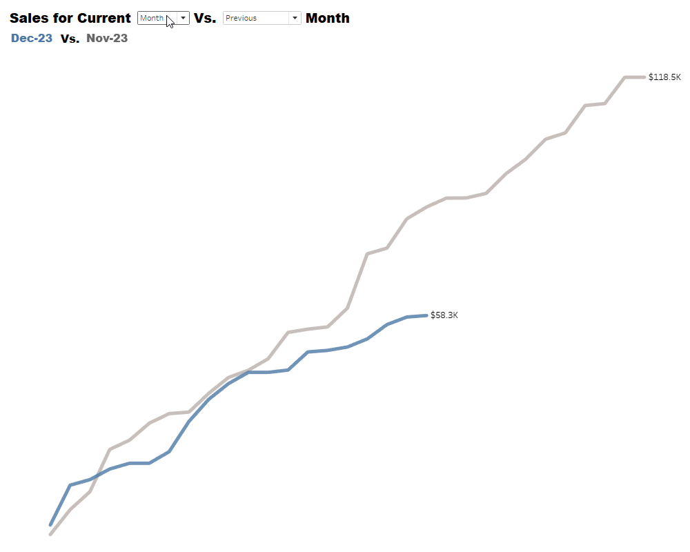
This returns the Day of the Month for the order dates. Now, drag the [Date Period Current Sales] and [Date Period Previous Sales] to the Rows shelf. Convert this to a dual axis and synchronize it. Using an achromatic color for the previous period sales is generally preferred. You will get the following.

This is exactly what was needed. However, there is a problem that is only noticeable when the [Date Period] parameter is set to anything other than Month.

Notice how even though the [Date Period] is set to Quarter, the bottom axis is only going up to 32. Tableau is adding the values of the same day of the 3 months in a quarter! You need a new calculation that returns the day of the quarter and the day of the year to fix this.
Create the following calculation.
DATEDIFF('day',DATETRUNC([Date Period],[Order Date]),[Order Date]) + 1
DATETRUNC([Date Period],[Order Date]) returns the first date of that date period. Thus, the DATEDIFF calculation will return the difference in days between the first date and the row-level date.
Right-click drag this calculation on the pill in the Columns shelf, and double-click on the first option. You will get the following.

With this, the current and previous sales worms can be overlaid on top of each other for all three date periods!
Step 3: Fix the Visualization
Recall that the last few dates were excluded using a data source filter. This was done to simulate a real-life situation wherein the current month is still in progress. This causes a small issue with the way Tableau computes the running sum.
Set the [Date Period] parameter to Month, and you will get the following.

Notice how there is a noticeable section of the Current Date Period Sales line that is horizontal. This is misleading because it implies that there were no sales in the last 10 days of the current date period.
To fix this, create the following calculation.
DATEDIFF('day',DATETRUNC([Date Period],{MAX([Order Date])}),{MAX([Order Date])}) + 1
This will return the difference between the row-level date and the maximum date for the current date period.
Using this, update the [Date Period Current Sales] calculation as shown below.
					IF MIN([Date Period Days]) <= MIN([Date Period Current Days]) THEN
RUNNING_SUM(SUM([Sales]*INT([Date Period Current])))
END
This calculates the running sum for the current date period only if the [Date Period Days] is less than or equal to the [Date Period Current Days].
This will fix the problem, and your view should look like this.

Hide the indicator showing 11 nulls in the bottom right corner.
Step 4: Add more Functionality
Oftentimes, it is necessary to compare the current date period with the same date period last year. Sometimes, it is even necessary to compare it with the historically best and worst date periods or with a custom date period. You can incorporate all these by creating a few more calculations.
But first, create this parameter.

To get the last year’s same date period, create the following calculation.
DATEDIFF([Date Period],[Order Date],DATEADD('year',-1,{MAX([Order Date])})) = 0
To calculate the best and the worst date periods, first create the following calculation.
{ FIXED DATETRUNC([Date Period],[Order Date]): SUM([Sales])}
Using this, create the following calculations.
[Date Period Sales] = {MAX([Date Period Sales])}
[Date Period Sales] = {MIN([Date Period Sales])}
To get the custom date period from the user, you will need a new parameter. However, getting the months, quarters, and years from the same parameter would be difficult and not user-friendly. So, create 3 separate parameters, one each for selecting month, quarter, and year like the one shown below for months.

Pay special attention to the highlighted values. After this, create [Quarter Selector] and [Year Selector] parameters similarly.
Using these parameters, create the following calculation.
					DATETRUNC([Date Period],[Order Date]) =
DATETRUNC([Date Period],
CASE [Date Period]
WHEN "month" THEN [Month Selector]
WHEN "quarter" THEN [Quarter Selector]
WHEN "year" THEN [Year Selector]
END)
This calculation checks whether the date period is equal to the one selected by the user.
To validate if all these date period boolean calculations work, add the 4 new date period calculations in the sheet created during step 1, containing the current and previous date period next to the month of order dates.

All the boolean calculations return the expected result. Play around with the parameters and validate more.
Next, create the following calculation.
					CASE [Compare Criteria]
WHEN "Previous" THEN [Date Period Previous]
WHEN "Last Year Same" THEN [Date Period Last Year Same]
WHEN "Best" THEN [Date Period Best]
WHEN "Worst" THEN [Date Period Worst]
WHEN "Custom" THEN [Date Period Custom]
END
Using this, modify the running sum calculation for the previous date period as follows.
RUNNING_SUM(SUM([Sales]*INT([Date Period Compare])))
Go back to the visualization, play around with the parameters, and watch how the visualization gets updated.
Step 5: Put it all Together
Add the sheet containing the visualization in a dashboard. You will get something like this.

The dashboard looks complicated because of 5 parameters. However, with dynamic zone visibility, this can be simplified quite a lot. Only one of the [Month Selector], [Quarter Selector], and ‘[Year Selector]’ parameters is needed at a time, and only when Custom is selected in the [Compare Criteria] parameter.
To set up the dynamic zone visibility, create the following calculation.
[Compare Criteria] = "Custom" AND [Date Period] = "month"
Go to the dashboard, select the [Month Selector] parameter, go to layout, and do the following.

Repeat this for the [Quarter Selector] and [Year Selector] parameters. Format the dashboard to your liking, and you will end up with something like this.
The dynamic zone visibility creates the illusion that the same parameter shows months, quarters, and years based on the selection! Always remember that dynamic zone visibility is not just a sheet-swapping feature. You can use it to hide all kinds of stuff on your dashboard to make the interactivity clean and user-friendly.
Conclusion
Hopefully, you enjoyed learning this technique of using the Worm to compare a metric for two date periods. It is simple but insightful and actionable. A simple line chart sometimes gets too noisy; it is not possible to get the month-level aggregation information.
A simple table provides the month-level aggregation, but you cannot get any information about the ups and downs in the trend. With this, you get the best of both worlds.
If you want more information on Date Comparisons in Tableau, contact our team of experts!