

Parameters in Tableau are so versatile that even people who use them all the time may only explore some of the ways in which they can be utilized. Whether you are new to Tableau or have been using Tableau for years, this blog will hopefully be a resource you can use to better understand the different ways to use parameters. We will cover 6 ways to think about parameters and give examples of each.
In this blog, to follow along with the examples, open Tableau and connect to the Sample Superstore dataset.
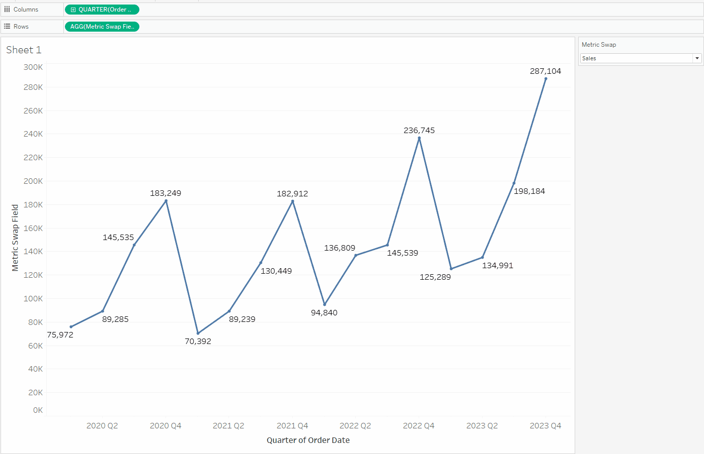
Metric Swapping
One of Tableau’s most common forms of parameter usage is inside of calculated fields. This combo is beneficial if you have several different metrics and want to allow a dashboard end-user to toggle or “swap” between the other metrics in the view. As an example, create the following parameter called [Metric Swap]:

We can then call this parameter in a calculated field using a case statement:
					CASE [Metric Swap]
    WHEN 'Sales' THEN SUM([Sales])
    WHEN 'Profit' THEN SUM([Profit])
    WHEN 'Profit Ratio' THEN [Profit Ratio]
END
Since Profit Ratio is already aggregated, the Sales and Profit fields must also be aggregated at this stage. Bring this field to the Rows shelf and Quarter(Order Date) to the Columns Shelf, and show labels.
Show the parameter and try the different values to see the line chart change dynamically. You can also adjust the sheet title to match the parameter’s name, as shown below.
If you are using Tableau Desktop 2023.1 or later, you can also dynamically change the axis title to match the [Metric Swap] parameter values:

Call this sheet ‘Metric Swapping’ as we will build on this in the next example.
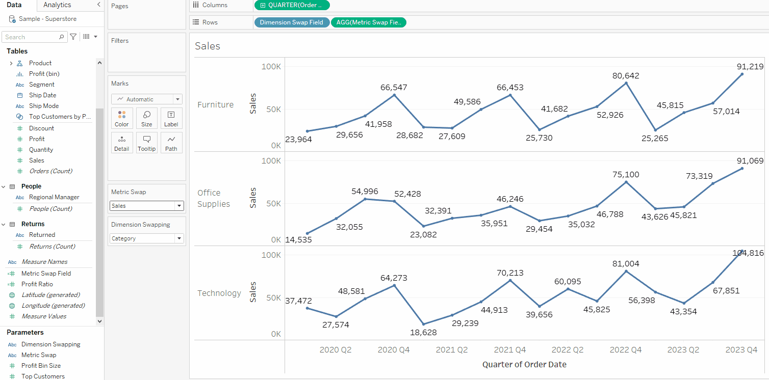
Dimension Swapping
Like the first example, you can also use parameters in calculated fields to return strings and dates, not just numeric values.
Duplicate the Metric Swapping sheet and rename it Dimension Swapping. Create the following parameter [Dimension Swapping]:

Now create the following calculated field:
					CASE [Dimension Swapping]
    WHEN 'Category' THEN [Category]
    WHEN 'Segment' THEN [Segment]
    WHEN 'Region' THEN [Region]
END
Drag this field to the Rows Shelf and display the parameter. Play around with the parameter to see it toggle between the three different dimensions.
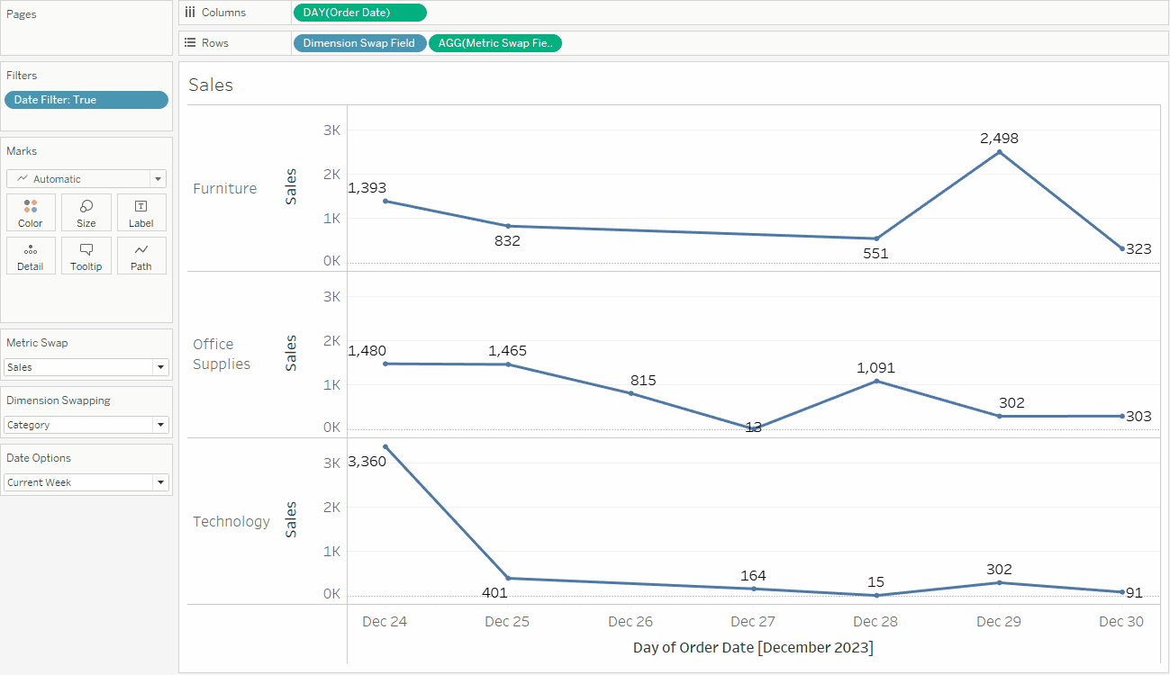
Filter Swapping
The previous two examples used parameters in a case statement in the exact same way, they just yielded different data types as a result in the calculated field (numeric and string). Any data type can be output in a calculated field using a case statement regardless of the parameter data type.
So, we can also create a calculated field with a boolean outcome that can go directly on the Filters shelf. For this example, create the following parameter that will allow the user to switch between different date options:

We can now create a calculated field with the following case statement where each case ends in a boolean (true or false) outcome.
					CASE [Date Options]
    WHEN 'Current Week' THEN
         DATEDIFF('week',[Order Date],{MAX([Order Date])}) = 0
    WHEN 'Previous Week' THEN
         DATEDIFF('week',[Order Date],{MAX([Order Date])}) = 1
    WHEN 'Current Month' THEN
         DATEDIFF('month',[Order Date],{MAX([Order Date])}) = 0
    WHEN 'Previous Month' THEN
         DATEDIFF('month',[Order Date],{MAX([Order Date])}) = 1
    WHEN 'Current Quarter' THEN
         DATEDIFF('quarter',[Order Date],{MAX([Order Date])}) = 0
    WHEN 'Previous Quarter' THEN
         DATEDIFF('quarter',[Order Date],{MAX([Order Date])}) = 1
END
Duplicate the Dimension Swapping sheet and rename it Filter Swapping. Add the [Date Filter] field to the Filters shelf and set it to True.
Change the level of granularity on the [Order Date] field in the Columns shelf to Day. Now, toggle between our different Date Options, and you can see that the timeframe in question now adjusts based on the parameter selection.
Note that at this point, you can adjust any of the parameters we have made so far to change our chart in multiple ways dynamically.
Function Argument Swapping
So far, we’ve learned that parameters can be called within calculated fields and, in particular, how we can customize each option based on the parameter’s value via a case statement.
However, parameters can also be called inside a calculated field in more complex ways. In the ways above, we have been itemizing each instance of a parameter list, but we can also just insert the parameter itself without itemizing all parameter value options.
A common way to do this is to call the parameter within a function itself. This works as long as the data type and characters match the function’s expectations for an argument.
To highlight this point, let’s take another look at the previous example, where we made the calculated field [Date Filter]. This calculation worked as expected, but it is several lines of code, and just looking at it, we can see a lot of repetitive text.
Anytime you are repeating a lot of the same text aside from some minor tweaks over and over again in a case statement, odds are you can write it more efficiently.
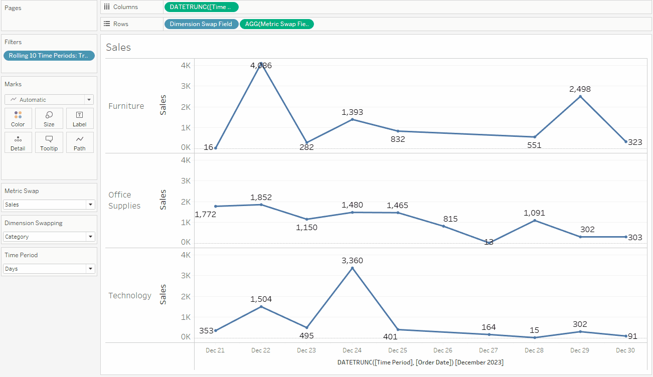
To make our date filtering example more elegant and even more dynamic, let’s first create the following parameter:

Next, create the following calculated field:
DATEDIFF([Time Period],[Order Date],{MAX([Order Date])}) < 10
This calculation will display TRUE for the records that are within the 10 most recent days/weeks/months/quarters, depending on the current selection of the [Time Period] parameter.
Now duplicate the Filter Swapping Sheet and rename it Function/Constant Swapping. Drag the new field [Rolling 10 Time Periods] to the filters shelf, replacing the [Date Filter] field, and select True. Hide the [Date Options] card and show the [Time Period] parameter card.
Also, double-click on the DAY(Order Date) pill in the Columns shelf. Replace the text ‘day’ in the DATETRUNC function with the parameter [Time Period]. It should read like this:

Click enter, change the pill to continuous, and test out what happens as you change the [Time Period] parameter. You should see the granularity level change, but always the most recent 10 points, as shown below.
What we have requires less code, but it is not necessarily better than what we have on our Filter Swapping sheet. In order to increase the dynamism, let’s think about changing some of the other elements in our calculation.
Constant Swapping
So far, we’ve touched on using parameters as text that we check in a case statement and as part of an argument in a function. What about all the other things in calculated fields? The last element in a calculated field we can parameterize are called constants, which are essentially fixed single values and will show up in calculated fields in one of the following ways:
Text in quotes (shows up as gray text)
A number (shows up as black text)
A date or DateTime in quotes (shows up as gray text)
The words TRUE or FALSE (shows up as black text)
A Level of Detail Expression (LOD) at the grain of the entire dataset (shows up in blue curly brackets)
Functions that return a constant value regardless of the grain of the data, such as TODAY() or PI() (does not look different from normal functions)
Note that this does not include non-constant functions, calculated fields, or sets. So, in the last example, while we could substitute the date grain argument in the DATEDIFF() function, we cannot swap the function “DATEDIFF()” itself with a parameter value.
Nor can we put a parameter inside extra brackets and expect Tableau to recognize that as a calculated field name or set. If we wanted to do these things, it’s best just to use a case statement like in the previous examples.
To understand this further, take a look at our calculated field [Rolling 10 Time Periods]:

The two elements boxed in red meet our criteria of a constant. As a plain number, 10 is an easy constant to spot. The LOD {MAX([Order Date])}, however, is not so obviously a constant at first.
One way to convince ourselves is to ask, will this expression return the same value for every single record? Since the LOD is doing just that–searching the [Order Date] column, grabbing the max, and returning if for each record at the most granular level–we can be confident that this is a constant.
So, let’s make this calculated field more dynamic by parameterizing these two constants. To do this, create the following two parameters:


As shown above, the parameter [Rolling X] could be all values, but you may want to cap it for your end users. Next, adjust the [Rolling 10 Time Periods] field to include these new parameters in the logic, and don’t forget to rename the field.
					DATEDIFF([Time Period],[Order Date],[Reference Date]) < [Rolling X]
AND [Order Date]<=[Reference Date]
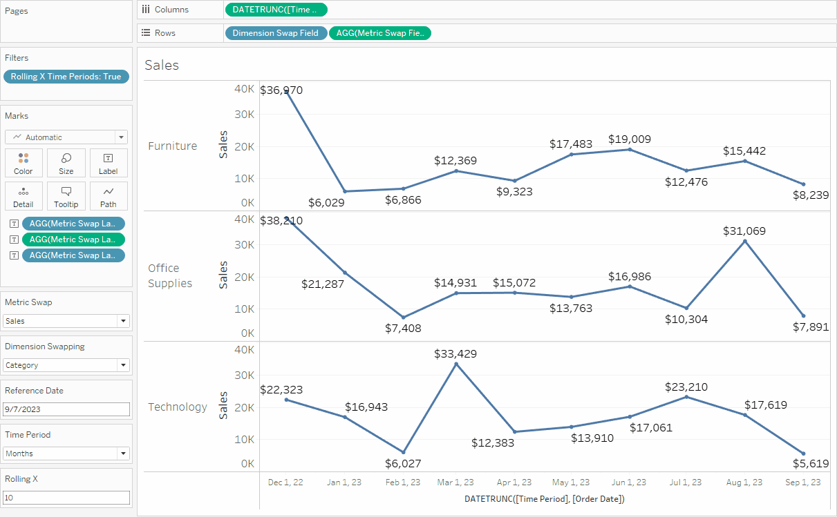
Show the parameters and test different values to see the chart dynamically change. Now, you should have complete control over how many periods you are looking back, the grain of those periods, and the reference date from which to look back.
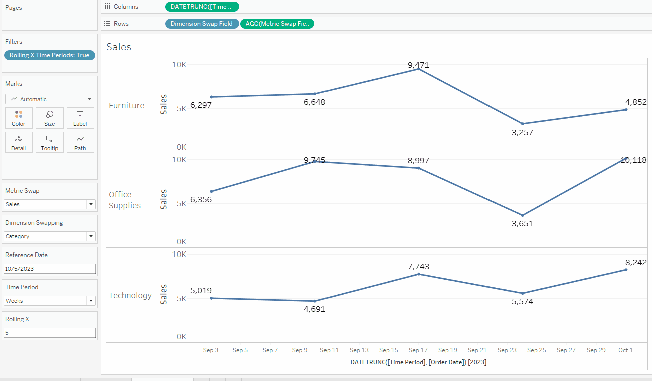
As a side note, constants like reference lines, bins, and setting top N in filters can also be parameterized, but we won’t explore examples here. Try playing around with these on your own with parameters!
Mark Swapping
To stick with our swapping trend, you can also use parameters to dynamically adjust any of the marks in the marks card, the most common of which are color, shape, label, and tooltip.
Duplicate the Function/Constant Swapping sheet and rename it Mark Swapping. For this example, we will utilize the already existing parameter [Metric Swap] to make better labels for our chart. There are a lot of ways we could make better formatting with our current labels, but let’s assume we want to have dollar sign symbols for Sales and Profit, a percentage sign for Profit Ratio, commas in numbers where appropriate, negative values in parentheses, and no decimals for the dollar amounts but 2 decimal places for Profit Ratio. To accomplish all these requirements, make three calculated fields as follows:
					ABS(CASE [Metric Swap]
    WHEN 'Sales' THEN ROUND(SUM([Sales]))
    WHEN 'Profit' THEN ROUND(SUM([Profit]))
    WHEN 'Profit Ratio' THEN ROUND([Profit Ratio]*100,2)
END)
					IF SIGN([Metric Swap Field]) = -1 THEN '(' ELSE '' END
+
CASE [Metric Swap]
    WHEN 'Sales' THEN '$'
    WHEN 'Profit' THEN '$'
    WHEN 'Profit Ratio' THEN ''
END
					CASE [Metric Swap]
    WHEN 'Sales' THEN ''
    WHEN 'Profit' THEN ''
    WHEN 'Profit Ratio' THEN '%'
END
+
IF SIGN([Metric Swap Field]) = -1 THEN ')' ELSE '' END
The first calculation gives the actual value, and while it may seem incorrect to do so, it applies the absolute value function to remove the minus symbol from negative values. However, this is desired, as the Prefix and Suffix fields will add parentheses if the value is negative.
The Prefix and Suffix fields also add the appropriate symbol in the appropriate position. The three are kept as separate fields to preserve the numeric data type of the first calculation, which will ensure we have commas where appropriate.
Drag these three fields to the Label mark in the Marks card. Edit the labels to appear in the correct order on one line. Make sure you have Allow labels to overlap other marks checked. You should see something like this:
Conclusion
We now have a highly dynamic worksheet that you could unleash on end-users who desire much control and exploration. While you may not want or need so much dynamism, the examples above showcase how dynamic a single worksheet can be (there is even more we could do!) and will hopefully guide future use cases.
I hope you have enjoyed this blog, and look for Part 2 coming soon with more advanced ways to use parameters!
If you want more information on Parameters in Tableau, contact our team of experts!


