If you’re looking for strategic updates on key email marketing metrics like top-performing emails, open rates, conversion rates, etc., this is the Tableau marketing dashboard for you!
Our Tableau email marketing dashboard makes it easy for you to examine the health and performance of your full suite of email marketing campaigns.
Who is the Ideal User of This Dashboard?
This email marketing dashboard example is designed for a marketing director or manager who wants to monitor the efficiency of their email marketing campaigns so they can inform future campaign plans.
3 Things You Can Accomplish With Dashboard
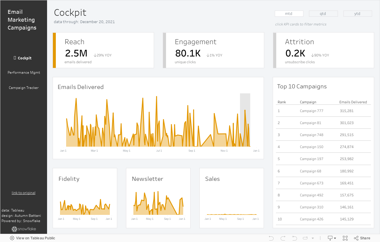
1. Cockpit
Date Toggle: Use the date selector at the top of the dashboard to view metrics for the current month, quarter, or full year. This also adjusts the YOY metrics respectively to show the same time period in the prior year. The date range is highlighted in the line chart as well.
Metric Toggle: Look at trends over time across reach, engagement, and attrition metrics by clicking directly on the KPI cards. This also updates the titles in the charts for clarity.
Synchronized Axes: Though the dashboard displays three lower-level trending charts by category to allow the user to see the performance in each area, the axes are synchronized to maintain perspective of overall contributions.
2. Email Performance Management
Select Metrics: The user can choose the metrics on the x and y-axis of the scatterplot to see the relationship between them. It highlights the chosen metric in the selector while also marking what’s already on the other axis so no redundant choices can be made. Tooltips are also updated accordingly to read where the metric exists in the view and what selecting will result in. The selections update both the chart title and axis labels for clarity.
Highlight Campaign: Click in the view to highlight a specific campaign. Users can also view performance across metrics for this campaign in the top left.
3. Email Campaign Tracker
Custom Sorting: Users can utilize the headers to sort the email campaigns by campaign number or key metrics. Sorting by a particular column highlights that column to bring it into focus and adds labels for context. Rank exists in tooltips so that the user can easily see the performance across the metrics for that campaign.
Conclusion
We hope you found this dashboard valuable as you inform your email marketing strategy efforts through monitoring reach, engagement, and attrition of your email campaigns.